Archive for the ‘Culture’ Category

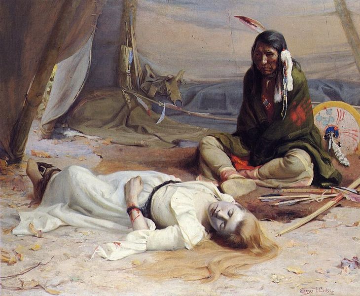
Did Winslow Homer provide a precedent for Eanger Irving Couse’s “The Captive” (1891)?

Tuesday, October 8th, 2013

.

In which the author speculates that the compositional inspiration for Eanger Irving Couse’s controversial American Western painting may have been an East Coast work by Winslow Homer

.

.

The Captive is a large studio work completed early in the career of the American artist, Eanger Irving Couse (1866-1936). Shown at the artist’s first solo exhibition held at the Portland (Oregon) Art Association in 1891 where it garnered much attention, the work was exhibited shortly thereafter at the Paris Salon of 1892. The Captive is significant as the first Native American subject attempted by and artist who would go on to achieve fame in the United States for his paintings of the indigenous inhabitants of New Mexico. The Captive is now in the collection of the Phoenix Art Museum.

This is a “staged” picture, to be sure. Yet the narrative suggested by The Captive is rooted in historical fact. The background story involves a raid conducted by the Cayuse Indians in 1847 upon a mission settlement of white immigrants in the Oregon Territory. The incident culminated with the capture of a woman, a 17-year-old school teacher named Lorinda Bewly, whom Cayuse chief Five Crows wanted to keep as a wife. The young woman refused his offer, and after two weeks she was put up for ransom. The ransom was paid by the British at Fort Vancouver.

Wikimedia Commons user Rob Ferguson, Jr., describes the setting imagined by Couse:

Couse’s painting shows us a dramatic scene – Lorinda is lying on the floor of the chief’s teepee, unconscious, with bloody bonds testifying to a terrified but courageous struggle. Five Crows is seated on the floor, staring at her and unable to fathom her behavior, her aversion to him. Couse has shown us two cultures in tragic juxtaposition, and we are able perhaps to have an understanding of each.

It is reported that two women — Couse’s wife, a rancher’s daughter from Washington state, and a local Kickitata indian — served as the artist’s model for Lorinda.

From its earliest appearances before the public, The Captive generated discussion and controversy. According to a descriptive note attached to the Wikipedia Commons image of the painting, this notoriety arose in part from the picture’s “sexual implications (rather strong for the art of the period)” and at the same time its contradictory “stereotyping of Native Americans [and] ‘noble savage’ romanticization of them.”

In our own day, this controversy returned with renewed force when the work appeared in a 1991 art exhibition, The West as America: Reinterpreting Images of the Frontier, 1820–1920, organized by the Smithsonian American Art Museum (known then as the National Museum of American Art). This ambitious show included a total of 164 works. Essays in the show’s catalog as well as the descriptive wall texts that visitors to the museum found next to each picture, sparked protests from a few historians who disputed the curatorial interpretation of artists’ meanings and intents. More noisily still, rebuke came from conservative politicians who condemned the exhibition for what they saw as its unrelieved leftist agenda.

An example of the material that incited critics is the wall label that accompanied The Captive (text written by William H. Truettner, Curator):

“From Puritan cultures onwards, the captivity theme had been an occasion for white writers and artists to advocate the “unnaturalness” of intermarriage between races. Couse’s painting is part of this tradition. The painting establishes two “romances.” The first – suggested but not denied – is between the woman and the Indian. The two figures belong to different worlds that cannot mix except by violence. (Note the blood on the woman’s left arm). The second romance is between the woman and the viewer of the painting, implicitly a white man, who is cast in the heroic role of rescuer. This relationship is the painting’s “natural” romance. These two conflicting romances account for the ironic combination of chastity and availability encoded by the woman’s body. The demure turn of her head shows that she has turned away from the Indian. Yet this very gesture of refusal is also a sign of her availability: she turns toward the viewer. It is by her role as sexual stereotype that the woman in Couse’s painting is really captive.”

I am not aware of any study or analysis by critics or art historians of the formal aspects of The Captive. This may be due to the overwhelming interest nowadays in matters racial, sexual, social and political. In particular, I have yet to find any mention of the sources or inspirations for Couse’s composition or the details he chose to emphasize. If, as seems likely, the artist relied on some existing model or templates in sculpture or painting, it has not yet been identified and announced. A moment ago, for example, I conducted a Google search, placing in the search box two titles — “The Captive” and “The Wreck of the Atlantic” — only to get in return zero results. Why “The Wreck of the Atlantic”? Let me explain the reason to consider that title as a possible precedent for Couse’s work.

*    *    *

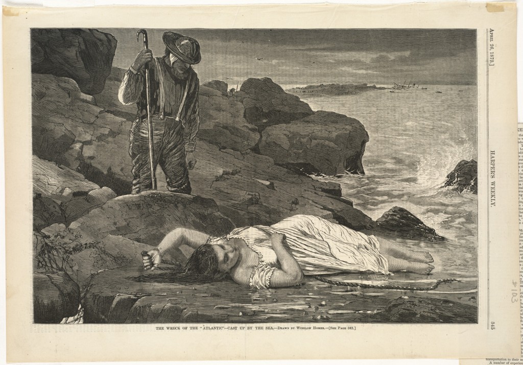
In 1873 Winslow Homer, who was coming to the end of his remarkable period as a commercial illustrator of American lives and events that dated back to the Civil War, submitted to the dominant illustrated journal of the time, Harper’s Weekly, a drawing for a wood engraving that would come to be titled, The Wreck of the Atlantic – Cast Up By the Sea. Published in the April 26, 1873 edition of Harper’s Weekly (Volume XVII, p. 345), the picture was Homer’s response to a devastating shipwreck that had occurred off the coast on Nova Scotia several weeks before, on April 1, 1873.

Of 952 passengers and crew onboard the transatlantic ocean liner, RMS Atlantic, at least 535 perished in the pitch-black night, including every woman and child except for one young boy. Historians of the event like to emphasize how this disaster captured popular interest to an extent that was not to be exceeded until four decades later with the sinking of the Titanic. Background and resources about the sinking of the RMS Atlantic can be found here; additional material and links here.

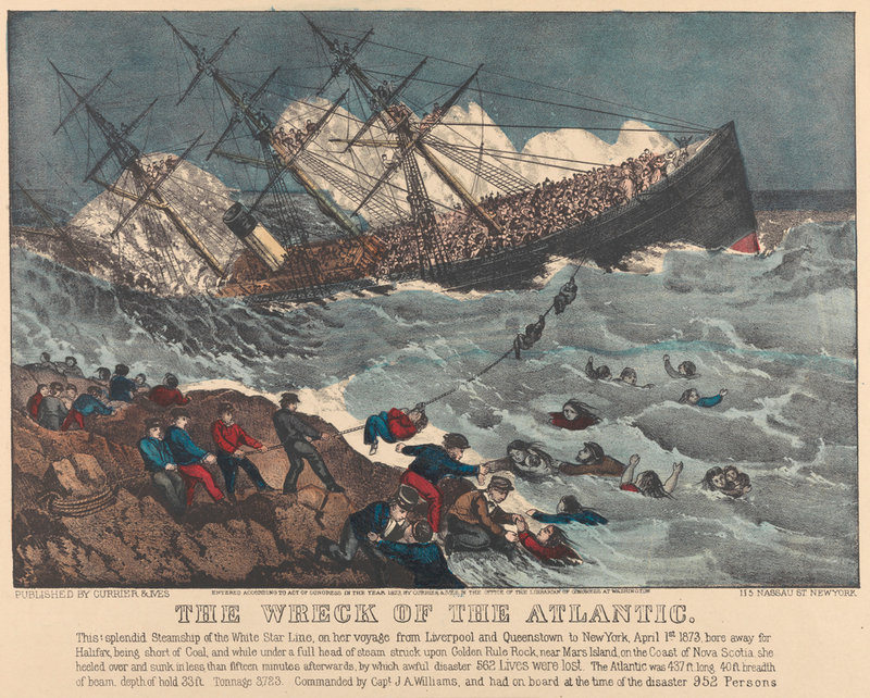
The calamity also caught the attention of the premier American printmaking firm of Currier and Ives, which quickly produced and distributed for public consumption two lithographs, here and here.

.

.

dsc00743

.

Rendered crudely, these broad, journalistic views are crammed with dramatic incidents.

Homer, in composing his picture, chose a different means to convey the tragedy. His design was conditioned in part by the fact that he had not visited the site in person. Instead, as the long-standing “artist-correspondent” for Harper’s Weekly whose artistic skills had recently outstripped his reportorial talents, he chose as his task to imagine the scene and present it to readers in a simpler but no less powerful way. An illustrator transitions to artist.

.

.

It is the day after the terrible night. Homer relegates evidence of the wrecked ship to the distant background in favor of a close-up, immediate discovery: a single victim, a woman found “cast up by the sea” (Note: the image above comes from the Boston Public Library; click on the image for an enlargement of the remarkable details possible from the medium of wood engraving.)

Homer forgoes the busy mechanics of the Currier and Ives depictions. Simply, he heightens the life-and-death drama by establishing a relationship between two figures: a drowned woman and a lone man presumably belonging to the search party called up from a nearby fishing village, dispersed along the rocky shore.

Recent commentators mention the sexual undercurrent of Homer’s treatment. An unnamed annotator of the Brooklyn Museum‘s impression of the print describes the image as “at once pathetic and erotic.” When the work appeared in “100 Days of Homer,” a recent exhibition posted on the tumblr page of the Sterling and Francine Clark Art Institute, the text observed: “In The Wreck of the Atlantic – Cast up by the Sea, Winslow Homer combines real-life events with melodrama.”

Homer’s imaginative visualization of an actual event of a shipwreck, his subjective after-image of the calamity, is at least a conceptual precedent for the course Couse chose to follow when representing an actual event (the Oregon Indian raise) and summarizing its essential meaning. Of interest to me is Couse’s replication of Homer’s formal solution to the task at hand. In both cases, picture-making starts with the relationship of two figures, as that relationship will carry the meaning.

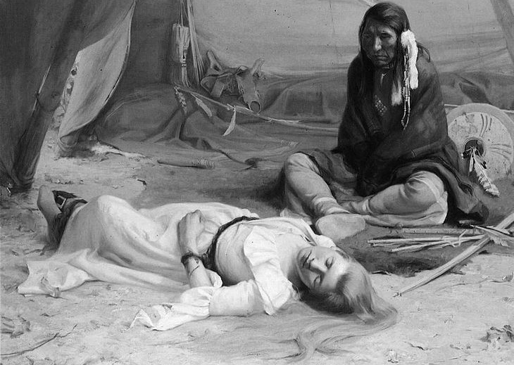
To make more apparent the affinities between the two works, it’s helpful to reverse the direction of Homer’s illustration. This reversal restores the orientation of Homer’s original drawing as transcribed onto the wood engraving block. Useful as well is replacing the colors of Couse’s painting with gray-scale values.

.

.

.

The points of congruence in the two compositions, and the parallels in related details, are many. There is an exact repetition of the relative positions the protagonists. The central energy and tension of both works — the vector of the male gaze — points at the same angle to the identically immobilized female. The supine bodies of the women trace identical forms. There are the echoed details of the drape of their chaste white garments; bare feet; left arms positioned in an unconsciously protective gesture; heads tilted demurely away from the gaze of the man and toward the viewer’s gaze; and the flowing spill of long hair. In both compositions rope is used as a poignant artifact — signifying captivity in one instance and the dashed hope of salvation in the other.

In The Wreck of the Atlantic the male rescuer, though overseeing and closely scrutinizing the female victim, is kept at a discrete remove from her body by the physical intervention of a boulder. Consequently, we read his presence as grounded and still. In The Captive the pose given to the Chief also conveys present stillness. This is achieved by grounding him in a cross-legged sitting posture. These similar pictorial strategies serve a common purpose in controlling the viewer’s reaction. Where Homer implies the present “discretion” and sympathy of the male by hiding from our view the man’s eyes, Couse similarly tempers what Truettner assumes are the viewer’s fears related to complications of gender, sexuality and race by hiding the Chief’s hands in the bondage of his blanket cloak.

And so the question arises: Was Couse aware of Homer’s The Wreck of the Atlantic as he went about planning his first mature figurative work, some 18 years after the senior artist had confronted a similar pictorial challenge?

It’s a tantalizing possibility. But I have to concede it presupposes some lucky circumstance by which a copy of the 1873 Harper’s Weekly wood engraving survived and was available to Couse.

Now, it is a fact that many copies of Homer’s engraving were made and widely distributed.  At its peak, the circulation of Harper’s Weekly reached 300,000, and it was also one of the journals that some libraries in the country made it a point to preserve. While Harper’s Weekly’s commanding subtitle  — “A Journal of Civilization”! — is forgivable puffery, the publication was well respected and considered to be as a good record of current events as any. Many individual subscribers and readers kept  (or one might say, hoarded) back copies as well, just as people in later eras saved their copies of Life magazine, National Geographic and Playboy. Homer’s magazine illustrations in particular were appreciated by discerning eyes. So it is at least possible that Couse, in want of guidance two decades later, could have had access to the image and used it as an aid when creating The Captive.

Note, however, one factor that would strengthen the case for direct influence is not present in this case. I’m not aware of any secondary iterations of Homer’s “The Wreck of the Atlantic” — no reproductions of the picture in other media that would have increased the image’s circulation and survivability. For example, we know that Homer recycled some of his wood engravings of the 1860’s and 1870’s, using them as the source for oil paintings. Examples include Waiting for a Bite, and Dad’s Coming. He presented A Sharp-Shooter on Picket Duty to the public twice, first as a painting (his own first oil painting) and then as a published wood engraving. However, I’m not aware of him replicating his picture of the shipwreck. Art historians point out that Homer’s The Wreck of the Atlantic provided a springboard to his painting of 1884, The Life Line — but that powerful work, which enjoyed significant national exposure, is a completely different composition.

*    *    *

There is, of course, another possible explanation for the affinity between The Wreck of the Atlantic and The Captive. Perhaps the central figure of an unconscious female captive in Couse’s composition was derived independently from the same source that Homer used for the central figure in his quite separate drama. unconscious female captive. As for the question of whether Couse then turned to Homer’s wood engraving for guidance when carefully positioning the secondary figure of the overseeing male, we may simply never know the answer.

The likelihood of Couse’s direct access to a model for his primary figure has support in the art historical record. According to recent scholarship, Homer himself probably relied on an existing source — a contemporaneous French painting — when drawing his drowned woman, and Couse would have had equal access to the same source. See Roger Stein, “Picture and Text: The Literary World of Winslow Homer,” in Winslow Homer: A Symposium, ed. Nicolai Cikovsky Jr., Studies in the History of Art, no. 26 (National Gallery of Art, Washington, DC, 1990), pp. 49-50; and Kathleen A. Foster, “Winslow Homer’s Life Line: A Narrative of Gender and Modernity,” available online, here (the essay is based on Foster’s book-length study, Shipwreck! Winslow Homer and “The Life Line” [Philadelphia Museum of Art and Yale University Press, 2012], which contains an analysis of the reception of Homer’s remarkable nautical rescue painting, as well as additional commentary and bibliography on its sources).

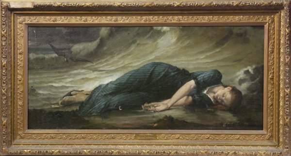
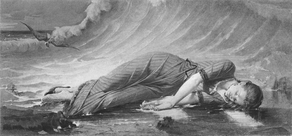
According to Stein and Foster, the painting Homer may have been inspired by is The Death of Virginia (La Mort de Virginie) by James (Jean Baptiste) Bertrand (1823-1887), 1869, oil on canvas, 32 5/8 by 72 1/2 inches.

Unlike Homer and Couse’s narratives, both of which are rooted in historical incidents, Bertrand’s painting is based on a fiction:

“Virginia [was] one of the ill-fated sweethearts described in the 1787 French romantic novel by Bernardin de St Pierre, Paul et Virginie. The novel, which was translated and widely read in Victorian England, centers around a shipwreck, during which the heroine must shed her clothes to be rescued. She refuses to sacrifice her modesty and drowns.”

Now found in the collection of Musée Bertrand, Châteauroux, France, the painting appears to be currently in storage:

.

5031_RF596_James-BERTRAND_2013-1

.

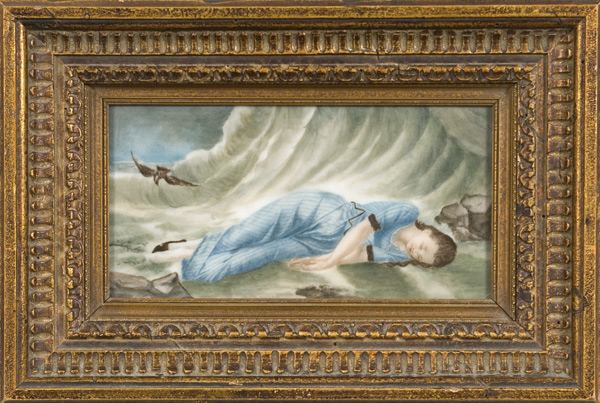
Yet, during the latter half of the 19th century, the image of The Death of Virginia was a popular one and was widely reproduced. Faithful copies (and some not-so-faithful) were made as reduced-size souvenirs for the tourist trade or for export. Below are two examples that appeared recently at American auctions. The first an oil on canvas and the second a painting on porcelain.

.

.

.

How closely Homer followed the placement and contours of the figure of Virginia when he composed his own “Cast Up by the Sea” can best be seen by comparing the two pictures as graphic works. This can be accomplished by pairing Homer’s wood engraving with a version of Bertrand’s oil painting translated into a graphic medium. One such translation was made by the international art dealer Goupil & Cie, based in Paris and with shops in New York City and other locations. In 1888 the firm began selling a gravure reproduction of “Le Mort de Virginie.” Here it is, followed by Homer’s work (once again I’ve reversed the direction of the published wood engraving to simulate Homer’s original drawing of the scene):

.

.

.

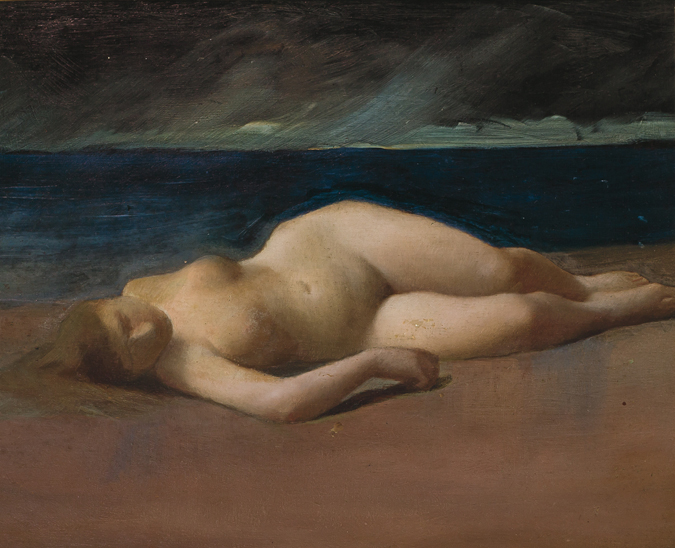
Bertrand’s picture, then, was almost surely part of Homer and Couse’s visual memory. In fact, the appeal and influence Bertrand’s painting on American artists was brought to my attention yet again when I recently came across the following image of a small painting by Kenyon C. Cox (1856-1919) that will be auctioned on October 24, 2013 at Shannon’s Fine Art Auctioneers: Reclining Nude on a Beach, oil on panel, 10 x 12″, signed on the reverse. This undated study looks to me to be an offspring of the same ancestor:

.

.

Update 03/13/2016:

Another copy of Bertrand’s The Death of Virginia has surfaced recently at auction. The painting, whose dimensions (33″ x 73″) are virtually the same as the original oil on canvas, is boldly signed by the artist and dated 1875. That date, just six years after Bertrand completed the original work, suggests an expanding interest in the image.  Photos from Myers Fine Art Auctions, St. Petersburg, FL:

.

James Bertrand - The Death of Virginia

.

43942615_4_x

.

43942615_3_x

.

What Might Have Been . . . And What Is

Sunday, September 29th, 2013

In 1999 architect Frank Gehry won the competition to design an addition to the Corcoran Gallery of Art in Washington, DC. On an adjacent vacant property the Corcoran used as a parking lot, the striking new structure would double the space available to the museum and Art School.

In an exhibit shown at the museum in 2004-2005, Gehry presented his revised design, as shown in the photos below. Note: the Corcoran’s 19th-century Beaux-Arts building is on the left side of the model.

.

.

.

.

By 2005 the Corcoran board chairman had scuttled the plan, due to funding inadequacies. In July 2011, the empty property was sold off to make way for a commercial office building. It is now nearing completion. Below are photos of the site taken September 25, 2013.

One could have a lively debate over whether the new structure is as ugly as the dull cast-concrete commercial building directly across the street, reflected — intentionally? — in its mirrored facade. But it would be hard to dispute, no matter where you stand, that here is sad instance of a missed opportunity.

.

.

.

.
.
Sic Transit Gloria Mundi (Example No. 1)

Saturday, June 29th, 2013

.

On Thursday of this week The New York TImes reported that the Metropolitan Museum of Art has decided, after 42 years, to stop issuing to each museum visitor one of its signature admission buttons. The colorful metal tags are being abandoned in favor of adhesive paper stickers. Cost is the reason.

The writers of the Times article anticipated my reaction: “In an era in which physical objects seem to be rapidly dematerializing into the digital, the loss of a durable little chunk of the Met will undoubtedly be missed.”

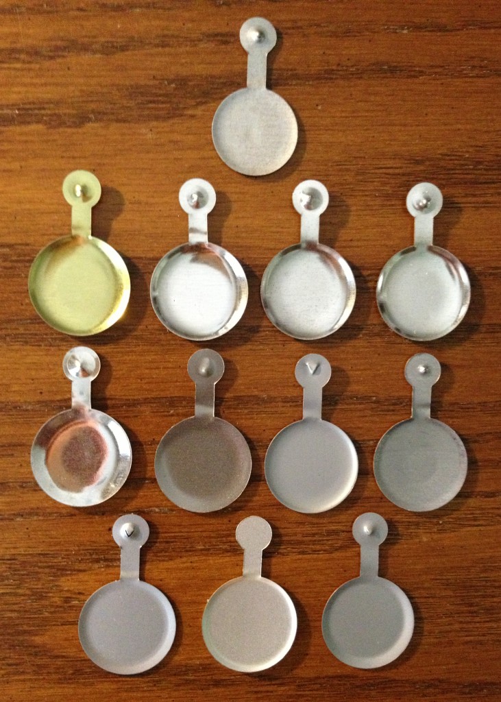
This sad news prompted me to dig out of my desk drawer some of the tags I’ve saved over the years.

.

.
.
For many, these are mementos to be saved and cherished. For a few, these objects will continue to form the basis for a collector’s hobby.  As is true when collecting objects — coins and stamps are prime examples — each individual Met badge, once acquired, becomes a piece of a larger puzzle — a puzzle whose solution leads the collector into history, technology, and design evolution. The matter of design includes material, shape, size, color, and image. The questions are endless. Just take a look at the photos of the front and back — no, let’s call them recto and verso — and ideas will pop into your head.  Why, for example, was it decided to extend the color of the disk to the stem of the current (final) design, the one featuring an “M”?  Why does the depth of the “frying pan” differ from tag to tag?

Even among my collection of a mere dozen pieces there are so many variants! I suspect among the millions of Met tags manufactured, there are many accidental variants as well — “errors” that tantalize the collector with the most coveted of attributes: rarity. Note in the second photo how the metal generally is a tin or steel gray color, except for one instance of a brass-like finish. How rare is that issuance? Even more exciting is the middle tag in the bottom row. Its unpierced stem meant this was a flawed badge, sure to fall off of the visitor’s lapel. How many of these are out there? Do I own the “Inverted Jenny” of Met badges?

Hundreds of folks have commented on the Times article, most of them nostalgically. But one of them — Alan Wright (NJ) — offers a warning aimed straight at me:

“The only thing more wasteful than those stupid metal pins is any time spent researching, writing, reading, and commenting on them.”

.

On re-reading “The Great Gatsby”

Wednesday, May 22nd, 2013

.
.

As I write this post, “The Great Gatsby” ranks as #6 among all books Amazon’s best seller list. Ever since reading the book became a mandatory right of passage in most American high schools, it has remained a perennial best seller (and a fixture on Amazon’s Top 100 Books list), but the reason for the current heightened interest is the release of a new filmed version by Baz Luhrmann. Readers have been posting reviews of the book on Amazon at a frantic rate in recent weeks. A new statement of praise, or sometimes a discordant note, appears just about every two hours around the clock. Most of these amateur reviewers identify themselves as re-readers.

Me, too.

My thoughts?

It’s not The Great American Novel. That laurel ought to be reserved for a novel of largeness and sprawl — a book that’s brawny, not slender; loud, not languid. There are candidates other than “Gatsby” that have a superior claim on the label.

It was Hemingway’s opinion that “all modern American literature comes from one book by Mark Twain called ‘Huckleberry Finn.’ There was nothing before. There has been nothing as good since.” What Hemingway didn’t realize when he rendered that judgment in 1934 was that “The Great Gatsby,” which had been released less than a decade before to positive critical reaction but disappointing sales, was even then steadily gaining an appreciative audience among common readers. And for later generations of writers, the book was about to exert an influence far beyond its weight class.

When I opened up “The Great Gatsby” once again, this time in middle age, I was impressed by how securely the novel belongs to the ongoing current of American literature. With the assistance of related sources of commentary on the novel, I also came to understand just how seriously the well-read Fitzgerald took literature’s calling and his own role within its tradition.

T.S. Eliot’s influence on the author of The Great Gatsby

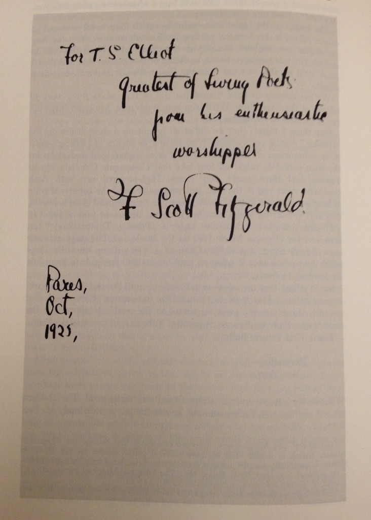
Fitzgerald, I learned, was a self-described “enthusiastic worshipper” of T.S. Eliot. He referred to Eliot as “the greatest of living poets” when inscribing a presentation copy of “Gatsby” to him in 1925:

.

.

The respect was mutual. After reading “Gatsby,” Eliot wrote Fitzgerald to say the novel “seems to me to be the first step that American fiction has taken since Henry James.”

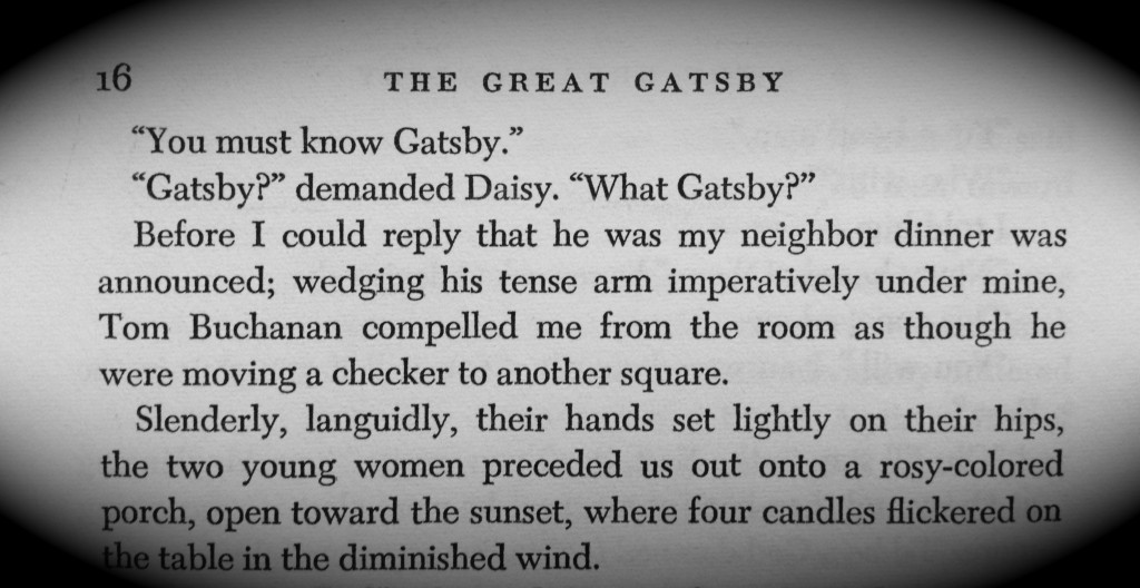
I was struck on several occasions by how much of Nick Carraway’s character and behavior fits the mold of the narrator of “The Love Song of J. Alfred Prufrock.” Nick is glad to be of use to Daisy and Gatsby. His attachment to Gatsby may well be described as that of an attendant Lord, whose actions are deferential, politic, cautious, a bit obtuse. In the end Nick recognizes himself as, perhaps, the Fool. There are details in the novel that borrow generously from the poem. For example, when observing feminine beauty, Nick is as attentive to slender, languidly-posed ladies as his English counterpart. Compare Prufrock (“I have known the arms already, known them all–arms that are braceleted and white and bare [but in the lamplight, downed with light brown hair!]”) with Nick’s observation of Myrtle’s sister Catherine, whose “bracelets jingled up and down upon her arms”).

Nick’s perambulation of Manhattan in Chapter 3 (“At the enchanted metropolitan twilight I felt a haunting loneliness sometimes, and felt it in others–poor young clerks who loitered in front of windows”) is a variation on Prufrock’s penchant for wandering at dusk through narrow streets to watch lonely men in shirt-sleeves, leaning out of windows.

Prufrock’s seaside romantic fantasy (“I shall wear white flannel trousers, and walk upon the beach. I have heard the mermaids singing, each to each”) becomes Nick’s street-side daydream (“I liked to walk up Fifth Avenue and pick out romantic women from the crowd and imagine that in a few minutes I was going to enter into their lives”). These yearnings are unrequited. The mermaids will not sing to Prufrock, and Nick’s girls are equally elusive as they “faded through a door into warm darkness.”

So too does Fitzgerald’s animistic description of the breeze blowing through the sitting room of the Buchanan mansion in Chapter 1, and its gentle demise (“the caught wind died out about the room, and the curtains and the rugs and the two young women ballooned slowly to the floor”) appear to repeat the journey — and to adopt the anthropomorphic tenor — of Eliot’s fog and smoke that licked its tongue into the corners of the evening, slipped by the terrace … and curled once about the house, and fell asleep.

In Chapter 2 Fitzgerald identifies the Valley of Ashes past Flushing as the waste land — the very title Eliot gave to what would become his most celebrated poem. Eliot finished “The Waste Land” in 1922, the year in which the events described in Gatsby take place.

If Fitzgerald’s prose can be said to converse with his poetic contemporaries, the lasting glory of his prose is its power to continue the conversation with later generations of literary lions. “Gatsby,” it seems to me, has become for American writers a primary source, an unavoidably inspiring voice.

Williams, Miller, Updike, Salinger

When Daisy castigates Tom as “a brute of a man, a great, big, hulking physical specimen,” chances are good the reader will conjure up the showdowns between Blanche DuBois and Stanley Kowalski. When Nick, organizing the funeral, despairs over the coldheartedness of Gatsby’s friends and hangers-on (Nick’s devastating two words are: “Nobody came.”), the reader may be  reminded of Willy Loman’s widow, Linda, during the Requiem scene that ends “Death of a Salesman,” as she expresses her pained confusion: “Why didn’t anybody come? Where are all the people he knew? Maybe they blame him.”

With alchemical dexterity Fitzgerald, in the opening chapter of “Gatsby,” transforms a ringing telephone into a living character capable of disordering a marriage — an audacity John Updike pays homage to in his short story of adultery, “Your Lover Just Called,” collected in “Museums & Women and Other Stories” (1972).

I was frankly surprised by the evident ties between “Gatsby” (1925) and another landmark in American writing that debuted a generation or so later — “The Catcher in the Rye” (1952).  When speaking about American voices and memorable narrators, literary critics love to cite Holden Caulfield and Huckleberry Finn. The reader is introduced to those two indelible characters as they pursue a wayward path toward maturity, shedding innocence along the way. Yet I find there is also a kinship between Holden and Nick Carraway. Although Nick is older (29 going on 30 over the course of the story he narrates), he is in many ways just as unanchored as Holden, or Huck for that matter. Each is a person whose education is not yet complete, a persona still in formation.

Both “Catcher” and “Gatsby” use the framing device of a narrator who has escaped the scene of an intensely personal experience. What Nick describes as his own “riotous excursions with privileged glimpses into the human heart” during the summer of 1922 could, with some tailoring, fit the days Holden describes for us (what he calls “this madman stuff that happened to me around last Christmas”). Both characters are now recovering from trauma and are relaying their tales from a safely distant post. Notably, in Baz Lurhmann’s re-telling, Nick has not returned home to the middle west (as in the novel) but instead finds himself, like Holden, in a California sanitarium.

Holden (in Chapter 24) and Nick (after the drunken party in Chapter 2) recount enigmatic but sexually-charged incidents with older men. Both Holden and Nick, toward the end of their stories, engage in small, symbolic acts to rid their world of indecency: Holden erases an obscene graffiti in the stairwell of his sister Phoebe’s school; Nick scrapes away an obscene word a truant scrawled on the steps of his friend Gatsby’s mansion.

More than nostalgia: “the colossal vitality of illusion”

My appreciation of Fitzgerald’s novel has been abetted by reading letters to and from the author, collected in the “Correspondence of F. Scott Fitzgerald” (1980), edited by Matthew J. Bruccoli and Margaret M. Duggan. In a 1925 letter to Scott, Roger Burlingame, an editor at Scribners and fellow novelist, observed:

“Someone once said that the thing that was common to all real works of art was a nostalgic quality, often indefinable, not specific. If that is so then The Great Gatsby if surely one because it makes me want to be back somewhere as much, I think, as anything I’ve ever read.”

Yet there is so much more that is durable about “Gatsby” than mere nostalgia, or why would its final sentence (“So we beat on, boats against the current, borne back ceaselessly into the past”) have become indelibly linked to our vision of America? One of the pleasures of re-reading the novel is to discover how carefully, how relentlessly, the author prepares us for that final revelation.

From the beginning the seeds are planted with rueful words about “the abortive sorrows and short-winded elations of men” (p. 8). Then come the author’s tossed off psychological insights about his main characters. Tom, for example, is “forever seeking, a little wistfully, for the dramatic turbulence of some irrecoverable football game.”

Hints of the what will become the ultimate phraseology (borne back, past, beat on) start to appear. At the riotous party in Chapter 3 (p. 48), “girls were swooning backward playfully  into men’s arms […] knowing that someone would arrest their falls — but no one swooned backward on Gatsby.” Gatsby declares: “I’m going to fix everything just the way it was before” (p. 99). Later, when the principal characters assemble at the Buchanan mansion on a sultry afternoon, Daisy’s voice “struggled on through the heat, beating against it” (p. 106). An hour later, the cast of five reassemble in a steaming Manhattan hotel room. Gatsby realizes he is losing Daisy, “and only the dead dream fought on as the afternoon slipped away, trying to touch what was no longer tangible, struggling […] toward that lost voice across the room.” (p. 120). Still later, as Nick and Jordan drive back to Long Island, a single sentence breaks off to becomes a separate paragraph:

“So we drove on toward death through the cooling twilight.”

The tragic power of receding time is alluded to yet again when Gatsby, on the day of his death, tells Nick the history of his relationship with Daisy. After returning from the war, Gatsby learns Daisy has married Tom, yet he is compelled to take a “miserable but irresistible” journey to Louisville, the city where the two first met:

“[Gatsby] stretched out his hand desperately as if to snatch only a wisp of air, to save a fragment of the spot she had made lovely for him. But it was all going by too fast now for his blurred eyes and he knew that he had lost that part of it, the freshest and the best, forever.” (p. 135)

The adjective you most frequently encounter in the text? Romantic and its variants.

.

Chance Meeting of Sartorial Twins

Saturday, April 20th, 2013

Washington, DC, Wednesday  morning, April 17, 2013.

.

.

.

.

Barry Bridgwood, “Hot Dogs” (1983)

Sunday, February 17th, 2013

.

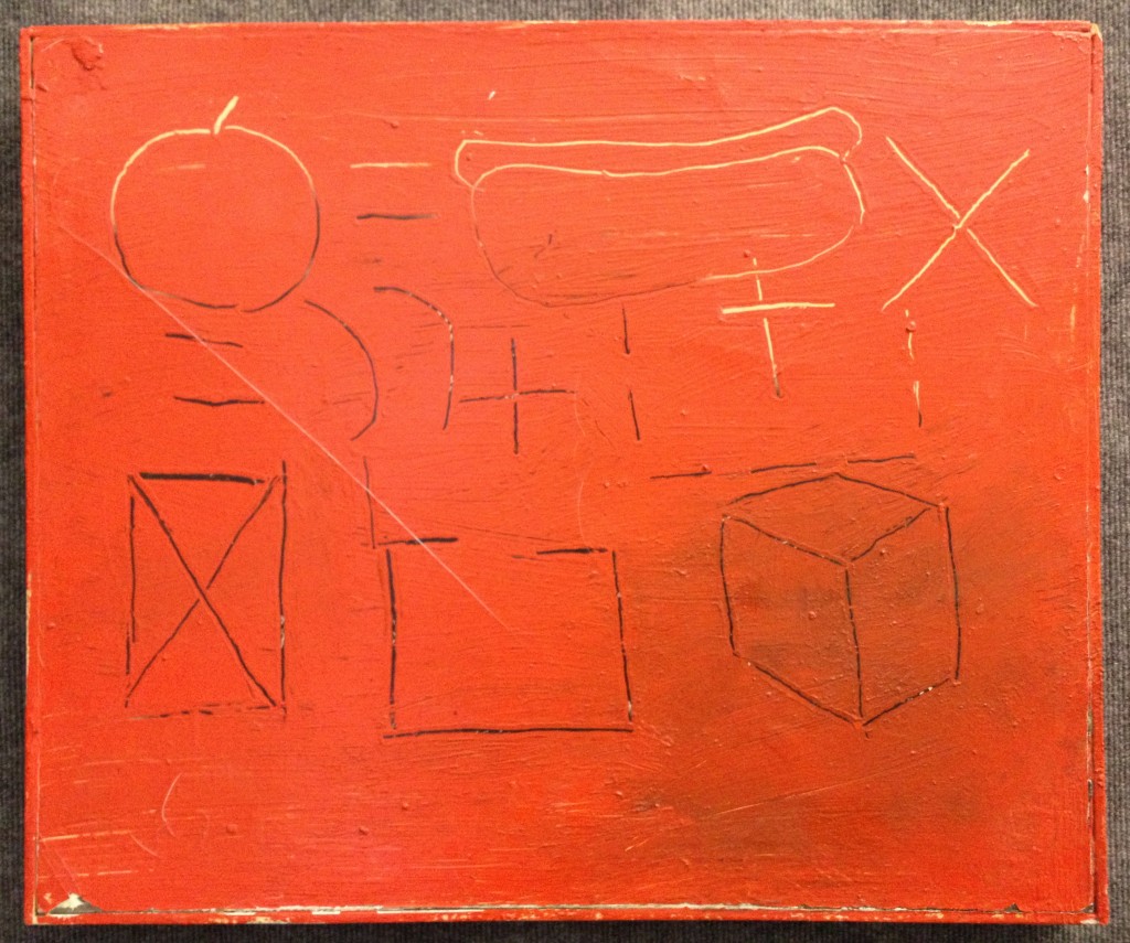
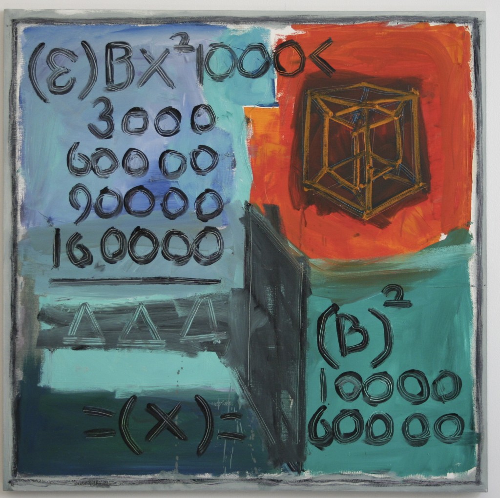
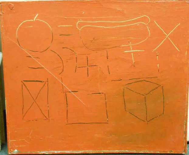
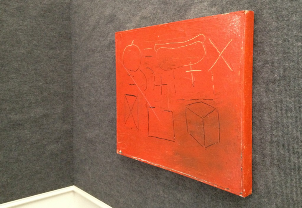
Last week I bought a painting by the American artist Barry Bridgwood. Hot Dogs is the title he gave to the enigmatic work.

Bridgwood was born in Massachusetts in 1957. He attended the Art Institute of Boston (1978-81) and the School of Visual Arts in New York City from 1981-83. Fresh from art school he joined the creative ferment of the short-lived East Village art scene of the early 1980s. From the vantage point of today, critics find it difficult if not impossible to reduce to an easy formulation the polymorphous art spawned by that time and place. As one who was there explains: “The East Village didn’t have a style per se, it was more of an explosion of artists trying to get their work out.” I see no reason to disagree, and so for now choose to defer generalizations in favor of an immediate appreciation of the artists’ works themselves, including this one:

.

.

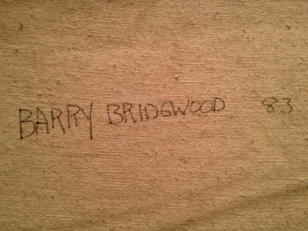
[Hot Dogs, 1983, oil on canvas with integrated strip frame, 20 3/4 x 25 inches, signed and dated verso, and inscribed “New Math Gallery”]

.

.

.

.

.

.

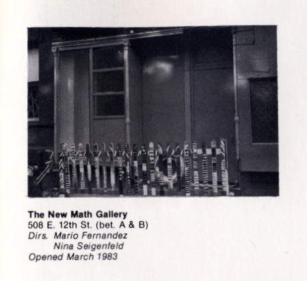
Hot Dogs was shown at one of the initial exhibits — and possibly the very first show — at one of the East Village’s pioneer store-front galleries, New Math Gallery. When in 1983 Nina Seigenfeld decided to open the gallery (with co-owner Mario Fernandez) she and Bridgwood were still students at SVA. Seigenfeld recently wrote an engaging but all-too-brief history of the gallery, describing the energy of the time and the “camaraderie and sense of community that can never be replaced.” Her article appeared in the Spring 2010 edition of Fine Art Magazine, available online here (page 36). The online site of Artists Space includes a photo of the first location of New Math Gallery; two years later the gallery moved to a larger space on Avenue A between 12th and 13th Streets, which it occupied only a short time until the co-owners decided to shut it down in 1986).

.

.

What attracted me to Bridgwood’s Hot Dogs? At first blush it was the unplaceable color of the work, at least as it appeared in the auction’s online catalog entry:

.

.

Now that the painting is hanging on a wall in my home I can report the color in the illustration was false. It is not mustard, not orange, not salmon, notred, and so the intrigue of its “actual” color remains powerful. This mercurial chroma also confounds my digital camera’s optics. I’ve been photographing the painting at various times and vantage points, and the camera simply cannot decide what the object’s definitive color is.

Then there is the subject matter of the painting. The incised drawings, which reveal a white ground in some areas and an under-layer of black elsewhere, present a conundrum.

All of the figures you see stay mute and polite within the bounds of the painting’s rectangular field. However, if the viewer is so inclined, this content may be ordered into three horizontal bands. So arranged, the analysis may follow this path:

The top band initiates what appears to be a mathematical equation. Its opening terms include contour line drawings of two recognizable objects. These are a piece of fruit with a stem (most likely an apple) and a hot dog cradled in a bun. The relationship of the two comestibles to each other and to what lies ahead is established via two basic interstitial symbols. One establishes equality (=) and the other spurs multiplication (X). The first line ends with a cliffhanger. That “times” sign is a transitive verb that asks, Times what?

In other words, my defensible assumption is the equation continues on to the next line (the middle band). There, equal symbols appear again, confusingly. The symbol for addition (+) shows up, in black and white flavors. There too are two parentheses. The usual function of parentheses in a long mathematical formula is to organize and clarify complex relationships among terms. But at this point in our scanning of the painting, exactly what is being organized is becoming ever more elusive.

Then on to the the bottom band. It may or may not be a continuation of the conversation. How do we know whether it belongs in the formula? Certainly the tone is different. Gone are the carnal suggestions of the objects met in the top line, their roundness hinting of succulence. Such temptations are abandoned, replaced with straight lines that form three geometric constructions. We see: a rectangle with an internal “X” large enough to touch its four corners; an outline of another rectangle, this one empty but with a broken top segment suggesting openness; and finally a classic cube tilted to show three of its implied six surfaces. The viewer may wish to reconsider whether the middle band is meant as connective tissue between top and bottom bands. Certainly the stability of the relationship is nowhere near certain.

An extraneous piece of the puzzle is this: The work’s title promises hot dogs (plural) yet there is only one weiner to be seen. Does the painting offer a mechanical formula to create more? Is this a blueprint for a duplicating machine whose first test run involves processing a simple frankfurter?

Equally elusive is the question of the quality (the success or failure) of the work. The art that emerged from the East Village in the early 1980’s attracted its share of haters, and this remains true today. Detractors dogtail even (or maybe especially) the artists who went on to rise furthest from its midst — Jeff Koons (childish fixations!), Keith Haring and Jean-Michel Basquiat (all that scribbling and doodling on blank slates!). Is it possible the painting now in my custody deserves the same obliquey — lazy and puerile! — and I’m just too blind to realize it? In time will my judgment change? Who knows.

Right now I’m enjoying the sight of Bridgwood’s playful handling of the enamel paint-smeared canvas that he treats as his very own schoolroom chalk board, a proprietary surface to mark with personally meaningful signs and symbols. The syntax of those signs and symbols — and the ultimate message of the painting — I will wait to decipher.

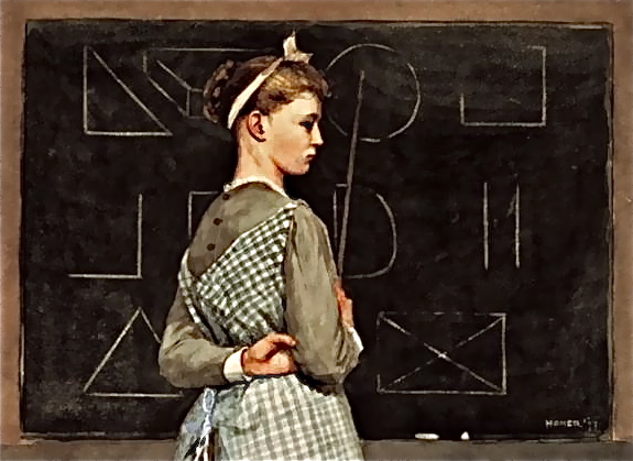
I’m reminded of the young instructor who points to figures upon a blackboard in a watercolor done a century ago by Winslow Homer titled Blackboard (1877). Do you see, there in the bottom row, a large “X” whose four limbs touch the corners of an imprisoning rectangle?

.

.

Where is the teacher who will help the eager, interpreting viewer to decode the formulas of here and now?

.

.

__________

Update 1 (02-19-2013): During my Facebook conversation with the painter, begun yesterday, Barry Bridgwood told me, “I did a lot of ‘math’ in my early 80’s paintings.” I must follow up on that remark.

Update 2 (02-20-2013): The artist generously replied to my questions about his math paintings. Highlights:

I feel the math draws the viewer into it and makes the mind think and ask questions! like a magnet! … I started to put algebra/math in my paintings as a type of a further abstraction element … Although by the mid 80’s, 1984 on, I was making mostly the computer generated work, I did keep making paintings with algebra in them … My 1st show at New Math was mainly algebra type paintings … In 1990 I had a show at Laurie Rubin Gallery in Soho that had both the computer silk screen work and “math” paintings … Many of the “math” painting sold very well, many collectors have them … There where 2 in a New York Group show in September called “Crossing Houston” at Smart Clothes Gallery on Stanton Street in the Lower East Side, an “80’s NY/East Village” show … The math paintings have started showing up in shows and the auction! It’s great to see them again! … Also, putting algebra in paintings can make them look smart. I was in a group show at Harvard University some years back called “Smart Art” !

Bridgwood’s Facebook page contains this photo, from the 2012 exhibit, “Crossing Houston,” at Paul Bridgewater’s Smart Clothes Gallery, showing two other 1980’s paintings with one of his small “computer paintings” from 1992 in between:

.

.

Update 3 (02/26/2013): During a Facebook conversation today, Nina Seigenfeld Velazquez writes, “I think Hot Dogs might have been in our very 1st show at New Math.”

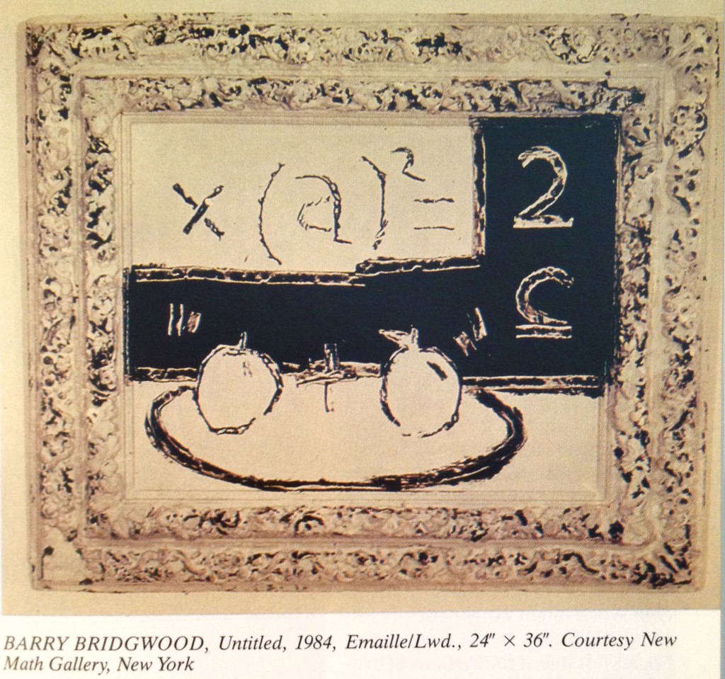
Update 4 (04/27/2013): I came across two other paintings from Bridgwood’s series of “math paintings.”

One was painted the year following Hot Dogs and features a reused frame as an integral part of the work (Untitled, 1984, enamel on board, 24 x 36″ with integrated frame). It is reproduced on page 321 of the March/April/May 1986 edition of the German art publication, Kunstforum International, in an article entitled “Tropical Codes” by Tricia Collins and Richard Milazzo. Bridgwood is one of 24 New York Scene artists profiled by the authors — a group engaged in “new conceptual work [that] entails, for the most part, a post-Simulation model involving the collapse of abstraction and appropriation into a hybrid form–a new cultural sandwich for informed mouths.”

.

.

Describing the signs infusing Bridgwood’s art of this period, Collins and Milazzo observe:

“The image (usually mathematical symbols and various fruit) is primitively scratched into the pictorial surface, constructing an unnatural painterly (hot) system of austere (cold) signs, extreme in their transparent, scientific, but, ultimately, fictional transmission of signic energy across a slow, opaque, nebulous surface.”

The second painting I recently located belongs to the collection of the Fisher Landau Center for Art, in Long Island City, New York (Untitled, 1985, acrylic on canvas, 40 x 40″, property of Emily Fisher Landau, New York).

.

.

“One sun rose on us today”

Monday, January 21st, 2013

.

Richard Blanco’s Inauguration Poem, “One Today,” is a fine poem, and it was well read by the author earlier today. The text of the poem is here; video of the author’s reading, here.

As he recited the work, Blanco made a few minor emendations to the text, some of which I suspect arose spontaneously as he gave voice to freshly written, newly memorized words.

For example, “pencil-yellow school buses” on the page became “the pencil-yellow school buses” when spoken, not so much out of intention as from the involuntary sway of vocalization. The natural urge to add emphasis most likely accounts for the written words “but always — home” becoming the spoken “but always, always — home.”

Certainly a more conscious amendment was made to the first of the personal references that appear throughout the poem. Early on Blanco mentions the legacy of his mother who worked in a grocery store “so I could write this poem.” Standing at the podium this afternoon, Blanco added, “so I could write this poem for all of us today.”

At another point he cleanly made a one word substitution, which I believe represented a thoughtful change. In the poem’s initial stanza the image of “a story told by our silent gestures moving behind windows” was improved, subtly, by replacing “behind” with the word “across.” The logic of this edit may have been the pull of consistency. Since the noun “gestures” implies movement, and “moving” is, well, moving, inserting a more dynamic preposition (across) feels right.

Others who have thought about the poem are praising it as simple and direct, not knotty, not abstruse, conventional; a little bit Whitmanesque. See comments here, herehere, and here.

In reading the poem I was struck by how smoothly Blanco introduces a major theme of the work — out of many people we are one. Note, for example, his selection of geographical features. Those introduced in the first stanza — the Smokies, Great Lakes, Great Plains, Rockies — are all of English (Anglo) origin. Blanco soon turns from grand spaces to a domestic and human scale, examining the actual lives and activities of real Americans. These anecdotal sections culminate in his listing of salutations, in a variety of voices: “hello, shalom, buon giorno, howdy, namaste, or buenos días in the language my mother taught me.” What Blanco is doing is tuning our ear to a wider spectrum. When, in the seventh stanza, he returns to American geography, he is now free to select examples that sit differently on the tongue and in the ear — the Appalachians and Sierras, the Mississippi and Colorado. It will dawn of the aware reader or listener that these are are American Indian and Spanish names. As for the Spanish ones, listen to the author pronouncing these titles with proud, lilting rolled-R’s.

The poet, who likes to say he was “made in Cuba, assembled in Spain, and imported to America,” today helped us rediscover, however modestly, the character of America.

.

“The Civil War and American Art” by Eleanor Jones Harvey

Sunday, December 16th, 2012

.

.

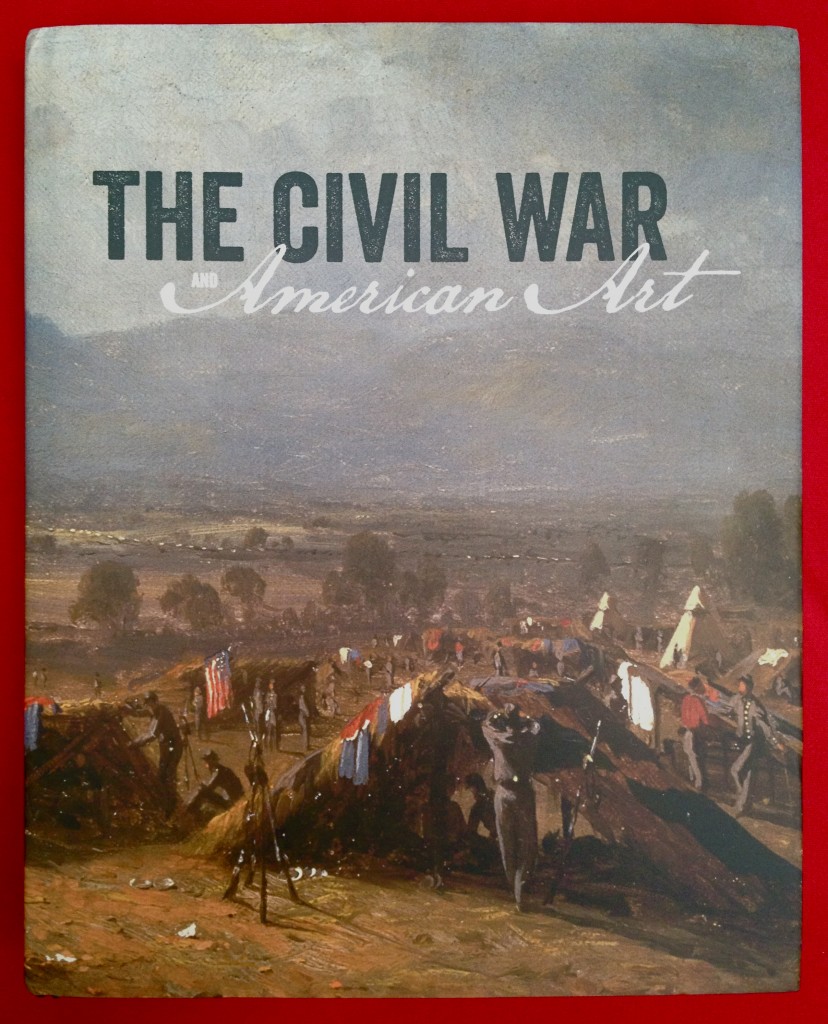
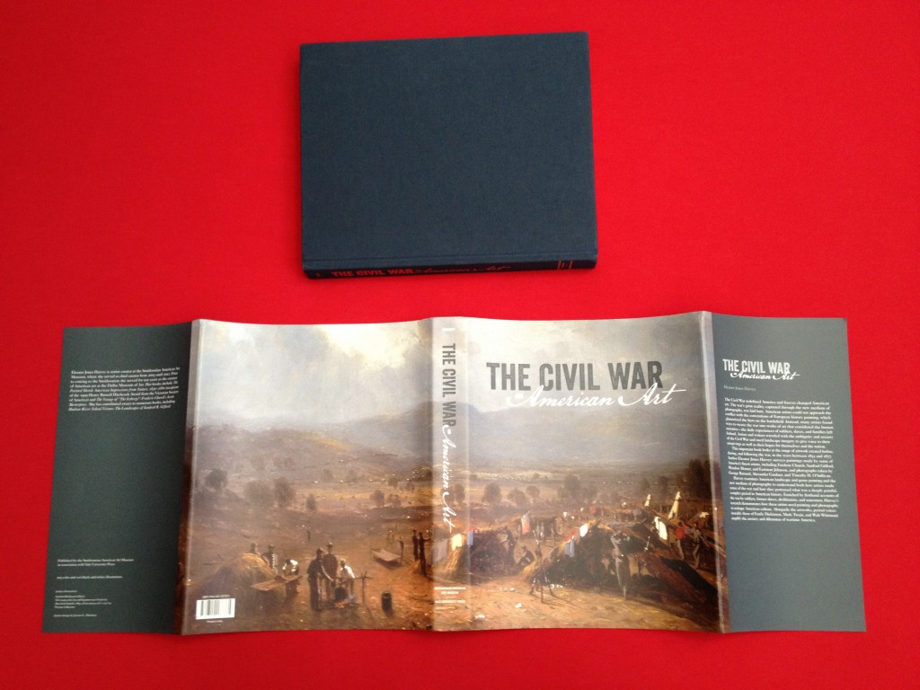
This book is published in connection with the museum exhibition of the same name, on view at the Smithsonian American Art Museum in Washington, DC, from November 16, 2012 through April 28, 2013. The show will travel to New York City where it will be on view at the Metropolitan Museum of American Art from May 21, 2013 to September 2, 2013. Both the book and the museum exhibition are experiences of such quality that they will appeal to persons beyond the camps of Civil War buffs and lovers of American Art. For me the exhibition is a must-see. The book? It is a must-have.

What impresses is how successfully all elements of the book converge.

First and foremost is the text. Eleanor Jones Harvey’s thesis is a simple one: “The Civil War had a profound and lasting impact on American Art, as it did on American culture. Both genre painting and landscape painting were fundamentally altered by the war and its aftermath.” As well, she demonstrates how photography–the third of her areas of interest–was newly empowered as an art form.

Harvey’s writing occupies pages 1 through 241 of this large book. Each generous page measures 12 1/2 by 9 15/16 inches, allowing double-column formatting of the text and providing a broad field for its many illustrations, most prominently the 77 paintings and photographs that form the exhibition. Harvey’s prose is wonderfully clear, a pleasure to dip into, blessedly free of academic jargon and devoid of esoteric pleading. She unleashes a seemingly inexhaustible supply of essential facts and observations without halting the forward momentum of her narrative and argument. This is no mean feat.

It is a pleasure to follow the author as she conscientiously uncovers layers of meaning in each of the featured paintings and photographs. Among the pieces closely analyzed are thirteen Civil War related paintings by Winslow Homer, an artist who will grow larger in your estimation thanks to the findings of Harvey’s eye and mind. She unfurls a mini-essay on each of these works, and her enthusiasm cannot help but inspire your own looking at art. If you’re fortunate enough to have access to the exhibition, as I was, this book is an enlightening spur to engagement.

.

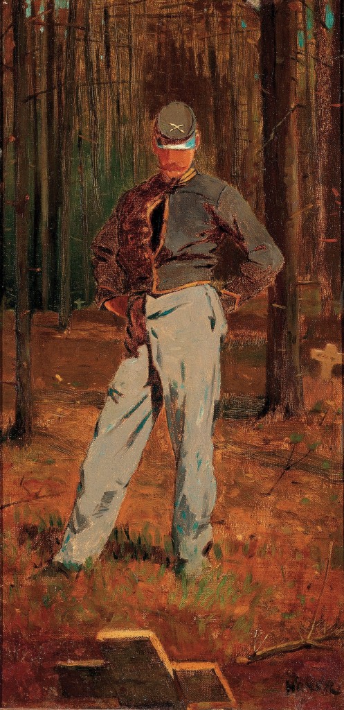
During my tour of the exhibition at the Smithsonian I spent several reflective minutes in front of Homer’s Trooper Meditating Beside a Grave, a small work (just 16 1/8 by 8 inches) that Harvey discusses on page 167.

.

.

While standing before it at the Smithsonian, I noticed two aspects of the painting not touched upon by Harvey — two understated features that will slowly surrender meaning to the patient viewer. The first is Homer’s treatment of the trooper’s stance. The artist’s depiction of feet or shoes, the natural terminus of the long-legged figure, is ambiguous, replaced with brushstrokes that create a seamless transition between the human body and the field of the dead. The vector of this transition is uncertain. Is the figure emerging from the earth . . . or subsiding into it? The second stunning detail is the trooper’s jacket whose middle buttons are opened. To a viewer this initially reads as a split in an otherwise closed seam, a way for the proudly uniformed trooper to cool himself on a warm day. Then the literal reading gives way to an alternative view, seeing a gash in his torso that opens up to reveal darkness. Homer renders this void in pure black pigment, blacker than any other application of black elsewhere on the canvas. Call it an exposure of the darkness of the heart, or the heart of darkness. We see a figure, eyeless, hollow, soulless: Death.

Each new encounter I have with Homer reinforces my belief that transition is the essential theme of his work. And how could it be otherwise for a contemplative artist whose career was birthed by the Civil War? If the vicissitudes of transition are encoded in Homer’s best work, the complementary theme of connections is of nearly equal importance. Not the least of the linkages Homer carefully constructs is that of viewer to painting. Consider this:

In a museum I stand in quiet reflection before a painting that depicts a man standing in quiet reflection before a grave. The grave is marked by a simple wooden cross. From the soldier’s perspective that cross is tilted back, as if responding directly to his gaze. It is easy for me, the viewer, to imagine the unseen face of the cross as a mirror, reflecting back to the man his own face. It is a face I study, with trepidation, for revelation.

.

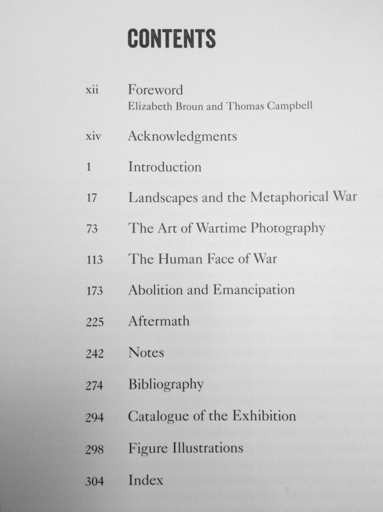
The book, “The Civil War and American Art,” contains a feast of documentation. This includes a section of Notes (32 pages); a Bibliography of over 300 sources and references (20 pages); a Catalog listing the 77 works featured in the Exhibition; and a list of the 123 Figure Illustrations found throughout this beautifully designed book. A helpful Index rounds out the volume.

If I have any quibble it is that its reproductions sometimes fall short. Especially is this so with the many images captured by the early photographers Alexander Gardner, Matthew Brady, George N. Barnard and others which are reproduced in the chapter devoted to The Art of Wartime Photography. They have a denatured look on the page, in contrast to the original source albumin prints in the exhibition which possess a life and death immediacy.

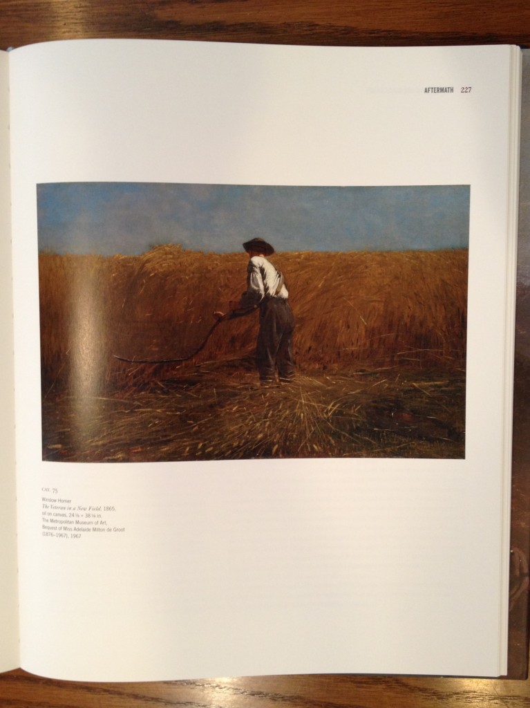
A similar deficiency-of-the-derivative occurs in the reproduction of Homer’s The Veteran in a New Field (1865). Harvey’s discussion of the painting (at pp. 225-229) mentions its “autobiographical quality,” and she specifically focuses on the former soldier’s war-issued canteen and jacket resting on the ground in the lower right corner. Here is a photo I took of page 227 on which the painting is reproduced.

.

.

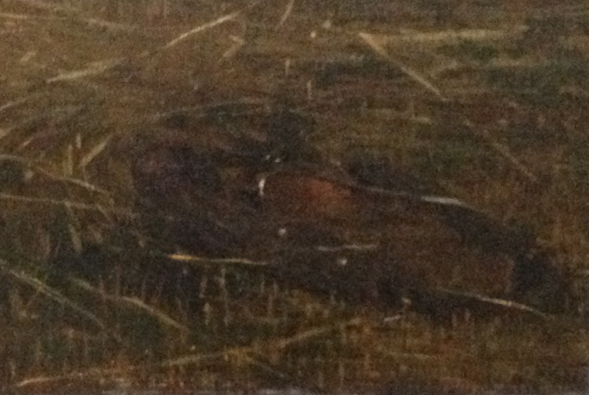
A close-up shot of the lower right corner is unrevealing.

.

.

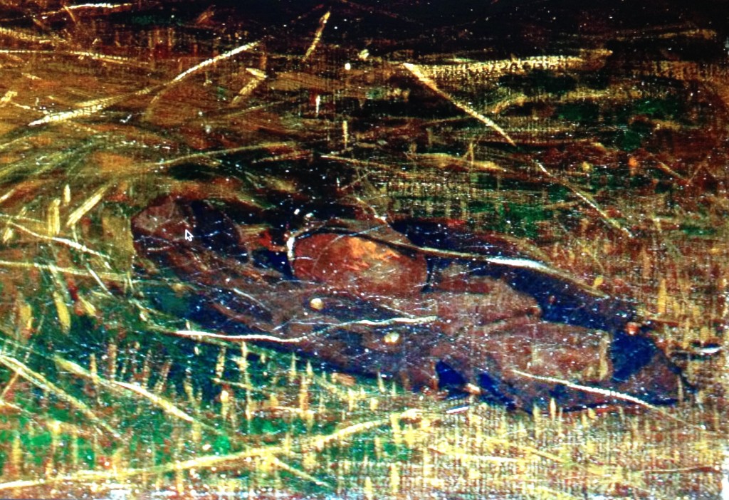
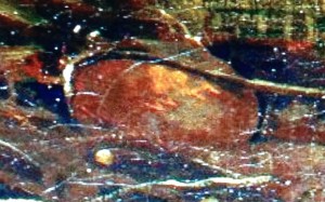
What’s not visible because of the book’s low-resolution reproduction, is a critical detail: the initials “WH” inscribed on the veteran’s canteen. This detail is best appreciated, of course, if you are in the presence of the painting itself and are able to move in for a closer look. At the end of the exhibition’s tour, The Veteran in a New Field will return to its permanent home as a treasure of the Metropolitan Museum of Art’s recently renovated wing devoted to American Art. In the meantime, you can catch a glimpse of  the “WH” inscription thanks to the Met’s online image of the painting (click on the “fullscreen” option and zoom in). Here’s a screen capture of the jacket and canteen.

.

.

.

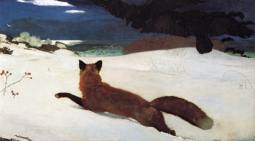
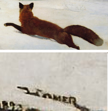
Unlike Richard Estes (or, in a different medium, Alfred Hitchcock) who plants his name (or himself) in his work as an act of whimsy, Homer sometimes does so for a meaningful reason. Most poignantly this occurs in my favorite Homer painting, The Fox Hunt, 1893 (Pennsylvania Academy of Fine Arts), where in the lower left corner of the painting his signature is immobilized by the drifting snow, echoing the pose and plight of the fox. Note also how the fox, just as the war veteran three decades before, turns his body to face away from us as he confronts a new kind of challenge on a potentially exhausting field.

.

.

.

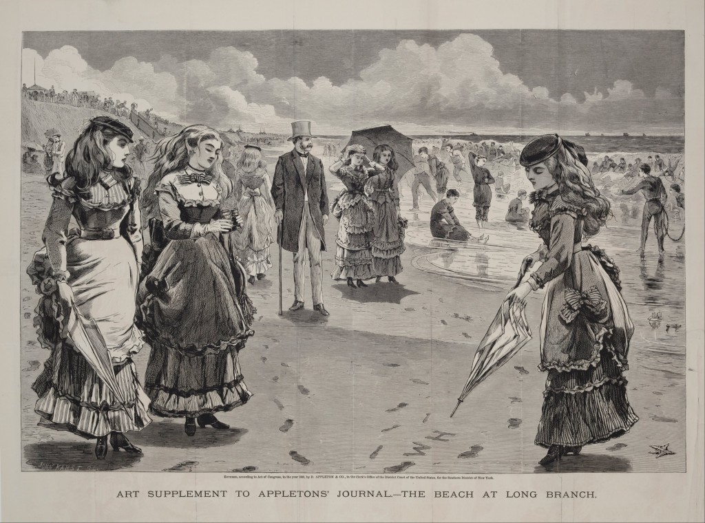
On a playful note, another example of Homer’s look-at-me urge is to be found in a wood engraving, The Beach at Long Branch, published in Appleton’s Journal, August 21, 1869 (click on the image to enlarge). Here three young women stand wondering, Who is WH? What I myself wonder is whether Homer is alluding to the Judgement of Paris episode in Greek myth. Is he pulling a tongue-in-cheek reversal on that story, assigning to the most comely of the three young women the role of selecting . . . Mr. W.H. himself ?

.

.

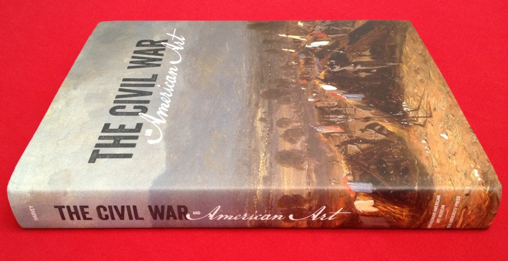
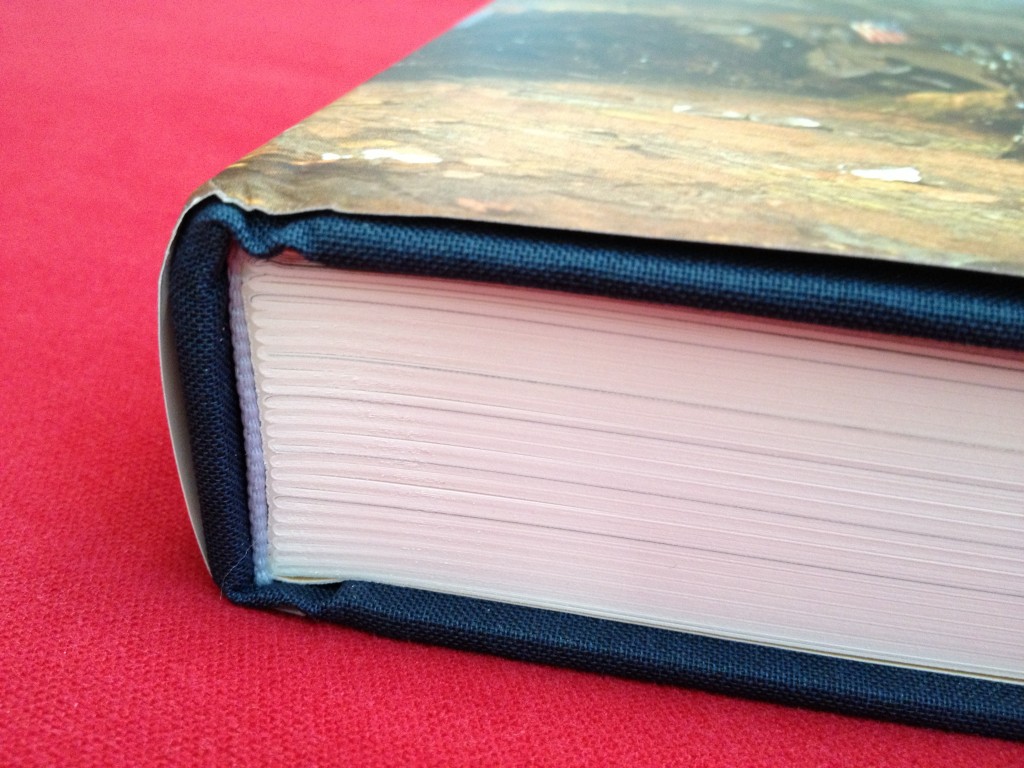
“The Civil War and American Art” is a publication of the Smithsonian Museum of American Art in association with Yale University Press. To get a sense of the book’s design, you can view the first 18 pages on Scribd.com. Some additional photos of my copy prove the values that guided its production.

.

.

.

.

.

____________________________________________________________________

NOTES and further observations

1.  An abbreviated version of this book review appears on Amazon.com, here.

2. The photograph of Trooper Meditating Beside a Grave in this post is the Announcement Image for a 2009 exhibition at the Dixon Gallery and Gardens (Memphis) and the Katonah Museum of Art, “Bold, Cautious, True: Walt Whitman and American Art of the Civil War Era,” a show organized by Kevin Sharp which explored ground similar to that of “The Civil War and American Art.”  Additional information about that exhibit is available herehere and here.

3. Faith Barrett, in her recently published “To Fight Aloud is Very Brave,” argues that poetry also had an important role in defining national identity: “Civil War poetry changed the way Americans understand their relationship to the nation.”  A November 2012 interview with Barrett can be read on the Poetry Foundation’s website , here.

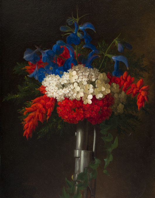
4. A new installation of American art at the Detroit Institute of Arts “explores the themes of the Civil War, Abraham Lincoln and the abolition of slavery.” The works in the small exhibition are part of the permanent collection galleries in the Richard A.Manoogian Wing of American art. Among the paintings is this 1861 still life, Patriotic Bouquet, by George Henry Hall.

.

.

5.  On the subject of communication by metaphor, in a previous blog post I argued that still life paintings — no less than landscape and genre paintings — may encode responses to the Civil War.

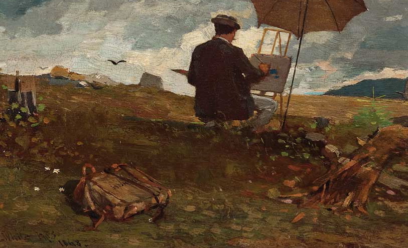
6.  Three years after he painted The Veteran in a New Field, Homer once again included himself in Artists Sketching in the White Mountains. The renewed artist has returned to his natural field. Homer’s back is turned away from us; he is intent on work. In a corner of the canvas, instead of finding a discarded canteen or jacket we now see a large case for the tools of the artist’s trade (visible in the detail, below). That is where Homer proudly affixes his signature.

.

.

“Manet and the Object of Painting” by Michel Foucault

Sunday, December 2nd, 2012

.

.

The text of this thin volume is a translation from French to English of a transcript of a recording of a lecture Michel Foucault delivered in 1971 at the Tahar Haddad Cultural Club in Tunis. Foucault’s words, in print, occupy 40 pages.

While multiple factors (time, place, language, the reduction of voice to print) conspire to keep Foucault’s lecture from fully engaging the American reader of today, what Foucault still manages to communicate are insights that, I believe, will interest the typical museum-goer.

Foucault illustrated his lecture with 13 slides. The book includes reproductions of each of those paintings, from “Music in the Tuileries” (1862) to “A Bar at the Folies-Bergere” (1881-82). Unfortunately, the illustrations are so tiny (for example, the 81.9 inches by 104.5 inches of “Luncheon on the Grass” (1862-63) are shrunk to a Lilliputian 3.2 by 4.2 inches) and so blandly reproduced (details are lost, colors misplaced, and the punch of Manet’s blacks absent) as to make them nearly worthless. Until a future e-publisher energizes Foucault’s text with interactive content, consider bringing to your reading spot both this book and a tablet on which to access the illustrations in fuller detail, such as the set of 13 gathered on one page on this site.

Additional editorial content includes an excellent introductory essay by Nicolas Bourriaud (11 pages), a very brief Translator’s Introduction by Matthew Barr, and a one-page index.

At the beginning of his lecture Foucault notes: “I am not a Manet specialist; nor am I a painting specialist, so it is as a layman that I would speak to you about Manet.” His focus is on formal analysis, and he organizes his thoughts under three rubrics: (1) the space of the canvas; (2) lighting; and (3) the place of the viewer. It is with these strategies, Foucault argues, that Manet succeeded at “inventing, if you like, the ‘picture-object’, the ‘painting-object’” — a move that made possible all of modern art.

Reading “Manet and the Object of Painting” provided me a new set of deciphering tools to use when standing before a Manet. More broadly, Foucault taught me new ways to look at representational art of all kinds.

Consider, for example, the first of his themes — Manet’s adoption of a radical approach to space that eschews traditional depth into the picture plane. Pointing to his first slide, the painting “Music in the Tuileries” (1862), Foucault notes how “there is not much depth, the figures in front are in a way masking almost completely what happens behind, from which derives this effect of a frieze.” In his second illustration, “The Masked Ball at the Opera” (1873-1874), he again points to how “the whole spatial balance is modified … Not only is the effect of depth erased, but the distance between the [front] edge of the picture and the back is relatively short, such that all the figures find themselves projected forward; far from there being depth, you have on the contrary a sort of phenomenon of relief.”

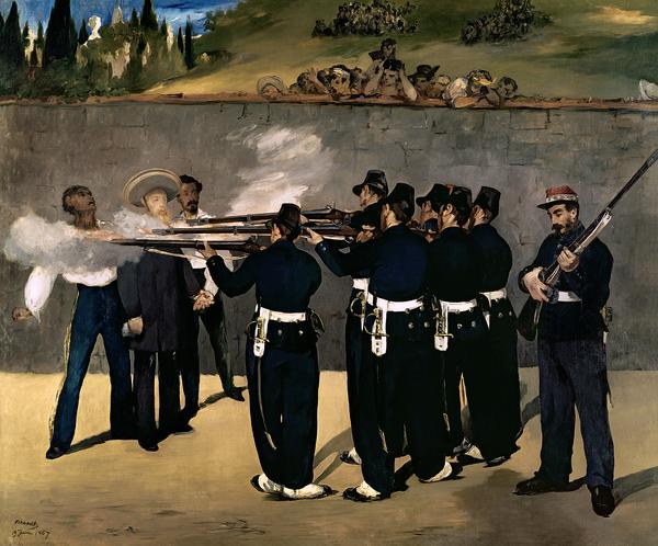
Similarly, in “The Execution of Maximilien” (1868), Manet employs “the same procedures, that is to say a violently marked and compressed closing of space by the presence of a large wall, a large wall which is no more than the repetition of the canvas itself; whereby, as you can see, all the figures are placed on a narrow band of earth.”

.

.

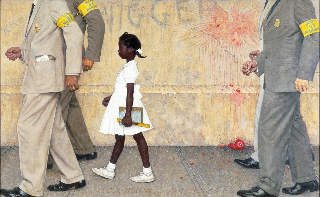
Armed with Foucault’s observations, I looked anew at the work of Norman Rockwell. This may seem an odd choice for a compare-and-contrast exercise. Yet I would argue that in many of his immediately memorable compositions Rockwell effectively reforms space in ways reminiscent of Manet. Recall Foucault’s descriptions in the preceding paragraphs: not much depth … the presence of a wall … a violently marked and compressed closing of space … the effect of a frieze. See how fittingly those strategies attach to “The Problem We All Live With” (1964):

.

.

Citing Normal Rockwell serves a secondary purpose, which is to suggest the constraints on Foucault’s perspective. First, his interest is limited to painting. Other forms of representation such as sculpture, drawing, printmaking and illustration, are ignored. More importantly, the revolt whose success Foucault convincingly attributes to Manet ended what we now are able to appreciate was merely a brief interregnum, a mode that triumphed but a few hundred years (from, say, the early 15th to the late 19th centuries) before receding into the broad flow of European artistic output. Also, non-European art — the bulk of mankind’s imaginative achievements — is not within Foucault’s ken.

You may be disappointed too if you expect Foucault to stray much beyond formal analysis into the realm of philosophy. Fortunately, that task is taken up by Nicolas Bourriaud whose superb essay I recommend be read both before, and after, reading the main text — especially if, like me, you’ve had no previous exposure to Foucault’s works of philosophy.

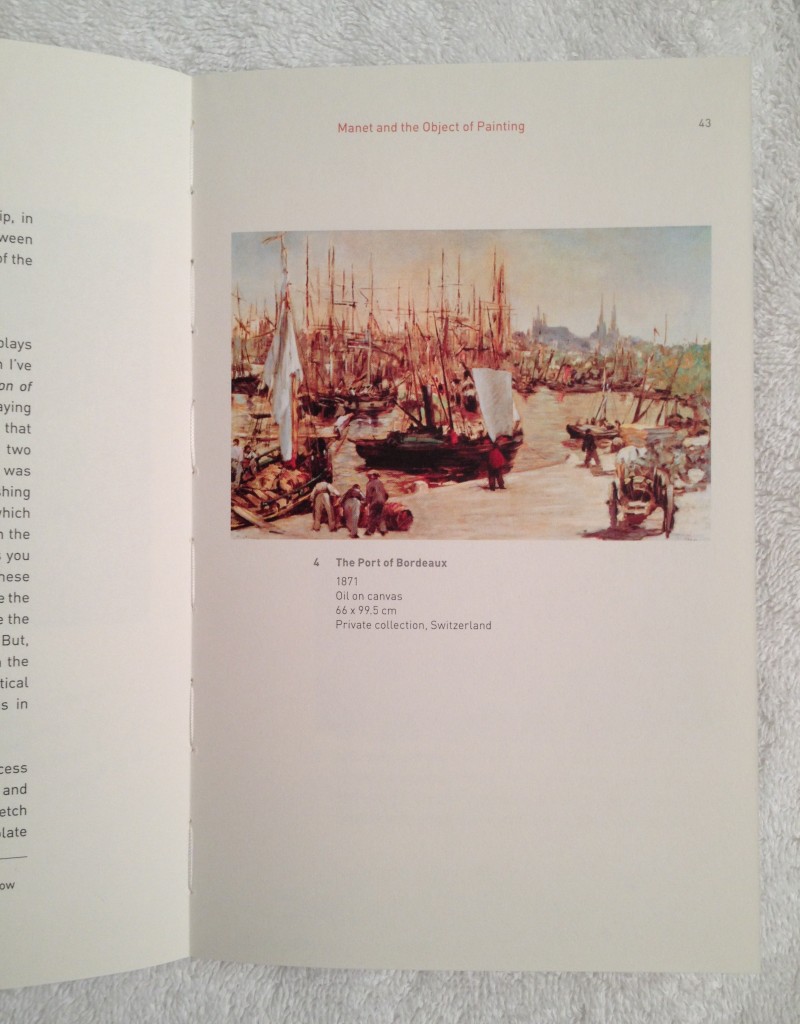
“Manet and the Object of Painting” is a handsomely produced book; I was pleased by Tate Publishing’s surprising use, in a paperback binding, of stitch-sewn signatures (click on the photos to enlarge them).

.

.

.

NOTES

1.  Available online are the initial minutes of Foucault’s Lecture on Manet, in Tunis (I estimate the entire lecture occupied an hour). The audio recording can be accessed from the right side of this French language pagehttp://michel-foucault-archives.org/?Manet. The site introduces the audio excerpt with this explanation: “En marge du Cahier de l’Herne Foucault qui reproduit deux versions des conférences de Foucault sur Manet, nous mettons en ligne quelques minutes de la conférence que Foucault donna le 20 mai 1971 au Club Haddad, conférence intitulée « La Peinture de Manet ». Foucault avait en effet le projet d’un ouvrage sur Manet, entrepris à partir de 1966, et qui était promis aux éditions de Minuit. Ces recherches donnèrent lieu à plusieurs conférences : à Milan en 1967 où il fit la rencontre d’Umberto Eco, à la Albright-Knox Art Gallery de Buffalo le 8 avril 1970 sur “Le Bar des Folies Bergères” ainsi qu’à Florence en novembre 1970, à Tokyo durant l’automne de la même année, et enfin à Tunis en 1971.”

2.  Here’s a mystery calling for a solution: The present volume (on page 27, footnote 1) indicates this lecture was part of a regular Tuesday evening series at the Haddad Center. Yet all the scholarship I’ve found cite Foucault’s Manet lecture date as May 20, 1971, which was a Thursday.

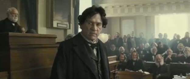
Tommy Lee Jones as Thaddeus Stevens – An Appreciation

Sunday, November 25th, 2012

.

A few days ago I saw Lincoln, the new Steven Spielberg film. I will see it again. When I do I want to pay close attention to a brief scene that, in my memory, shows the quiet side of the booming brilliance of Tommy Lee Jones’ depiction of Thaddeus Stevens.

.

.

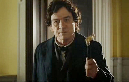
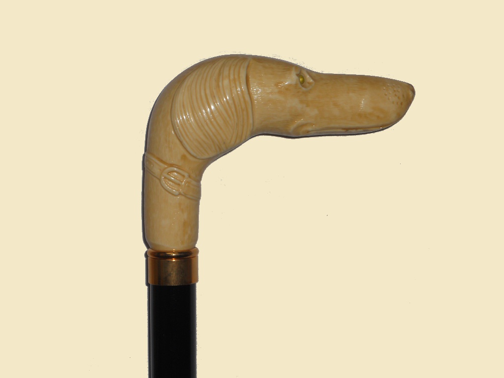
Jones portrays Stevens, long-term Representative from Pennsylvania and abolitionist leader of the Radical Republicans, as a man in motion. Born with a club foot, Stevens relies on a walking cane. The handle of that cane — made of brass or, more likely, carved ivory — appeared to me to be in the shape of a dog’s head. The dog quite possibly is a greyhound, similar to this one:

.

.

Greyhounds are known for their prey-drive. They are bred for coursing: the pursuit of game, which they catch by virtue of their speed, running by sight not by scent.

The quiet scene that so struck my fancy is the one in which we find Stevens sitting in a chair on the floor of the House of Representatives. He is there to participate in the debate over the 13th Amendment to the U.S. Constitution that will abolish slavery. The proposed Amendment is a political test and for Stevens, above all, a moral necessity. The prize of the Amendment’s passage in the House is uncertain.

As captured in Spielberg’s lens, Stevens sits alone with his thoughts while other Congressmen mill about. In one hand he clutches his cane, as if for added support. His blocky head turns and scans the chamber left and right. We follow his eyes which, the director wants us to understand, are the eyes of a wily politician surveying friend and foe, hungrily sizing up prospects.

And then comes a playful, comic detail, a gesture I strongly suspect was Tommy Lee Jones’ idea. It is simply this: Stevens slowly rotates his cane. What we see moving, of course, is the cane handle, the greyhound. Jones, the ventriloquist, covertly moves his dummy. Follow it now — an alert animal head, eyeing one side of the room and then the other. Is the run for the prize about to begin?

.

It usually takes me a second look to discover all that a great actor delivers. Today I was able to revisit a bit of Tommy Lee Jones’ performance, as found in one of the official video clips from Lincoln. It is the only one that focuses on Jones. It lasts only 32 seconds and is available on YouTube, here.

.

.

In this scene Stevens, in the very center of the floor debate, is in high dudgeon mode. Notice how the actor seizes the opportunity to marry oratory with physicality. In a subtle move (at the 0:22 mark), just as the stream of invective he directs at his opponent (George H. Pendleton) reaches a climax, Jones attempts to move forward, first glancing downward to guide his wayward foot. This seems an inconsequential gesture, the precaution of a 72-year-old man who’s unsteady on his feet. But it is more than that. It sets up the next beat. Only seconds later, Jones re-creates his awkward gait in service to his speech. This time he stamps his foot audibly on the wooden floor (“the foot of man,” he dubs this action) — pounding his words with a final exclamation point.

.

Update (11/25/2012 at 5:30 pm): Folks at the greyhound forum believe the cane Stevens carries is a greyhound cane, as does the blogger Shannon.

.