Archive for the ‘Media’ Category

Walter Cronkite (1916-2009) – An Appreciation

Saturday, July 18th, 2009

Everyone watched the CBS Evening News with Walter Cronkite. 

To read the name of that essential program, to recall the announcer’s voice that introduced it (“THIS IS the CBS Evening News with Walter Cronkite”), is to realize how fitting those few words were.  In the 1960’s and 70’s the news came to us with, and through, Walter Cronkite.  And because of who he was, an essential civic function was carried out in a manner at once graceful, authoritative, and mature.  Cronkite will never be duplicated by any other broadcaster. 

I remember him, in his early retirement years, serving as Master of Ceremonies for the initial Kennedy Center Honors programs celebrating outstanding achievement in the Performing Arts.  And, let’s be frank, who among us didn’t wish, every time we saw him in those years, for him to lead a Restoration, to return to the news anchor desk and restore class and professionalism to the field.  Who can deny that, post-Cronkite, TV journalism has been on a downhill slide that continues to this day.  

I remember the Kennedy assassination broadcast in 1963.  I remember the magnetic pull of our black and white TV, those three terrible dark days.  It was another twenty-five year before I next saw those minutes of Cronkite’s choked announcement, a man pulling off his glasses to look up at a clock so he could add reportorial precision, factness, to devastating emotion.  Twenty-five years later I was visiting the museum at the Texas School Book Depository in Dallas.  The exhibition space leads visitors in a meandering path until you hear Cronkite’s broadcasting voice, which draws you to turn a corner and see, on a monitor, him delivering the fatal news.  As I expected, this brought the adult me to tears (while on screen Cronkite regained his composure), and I felt embarrassed, surrounded as I was by a class of high school kids on a field trip, for whom this all meant next to nothing.

In 1967, as a faithful nightly viewer, I remember Cronkite announcing each week the casualty figures of the Vietnam War, and how those numbers climbed steadily into the hundreds, week after week, until the repetitive and cumulative effect of death’s ostinato wore all of us down.  Then one evening came the pricking of the boil:  Cronkite, out-of-character, pronounced the war simply not winnable.  In that extraordinary and necessary departure from routine, he shocked us awake, and changed history. 

Most of all I remember his hosting live daytime News Specials on the occasion of the launching of each Mercury, Gemini, and Apollo mission.  He played with model capsules along with his guest astronaut pals.  He demonstrated docking maneuvers.  He deftly took the role of the nation’s educator, called on Wernher von Braun to explain why a certain plan was being followed  rather than some other.  Then, after years in the making, this careful series of steps culminated in his ultimate joy, a joy sweetly child-like coming from a man with a serious senior body and beautiful Midwestern voice.  The triumph of the 1969 lunar landing.  At that moment, as at other moments, his was the breathing and his was the voice, of America.

Cronkite was the embodiment of the  principle that if you chart and follow a course that is steady, constant, and controlled, you are likely to achieve success.

For some reason I remember one other out-of-character event — the time he addressed us in the TV audience upon his return to the anchor desk after a summer vacation spent sailing.  If I recall this correctly, he actually was into his third or fourth broadcast of the week of his return to the air.  I’m talking about the time he revealed to us why his hair looked different; it had turned reddish from the sun, he explained.  Though my memory may be faulty, I don’t think I’m making this up.  The reason I remember this is, of course, because like millions of others, I had come to think of Cronkite as a member of the family, a substitute father, or as he was commonly known, Uncle Walter.  That was a rare moment when he thought he owed us something more than simply being, night after night, the epitome of professionalism. 

We now know it is all of us who owe him so much.

George Will: Engraft Him New

Saturday, April 18th, 2009

Oh, dear.  George Will is back in curmudgeon mode.  High dudgeon mode.  

Untouched by global warming, he’s stuck in a personal winter of discontent.  These days new life is emerging in Washington, “where flowers [are] springing, gaily in the sunny beam.”  But Will sees only “more clouds of grey than any Russian play could guarantee.”  Unable to “drop that long face” and prone to “nursing the blues,” Mr. Will nevertheless keeps up his prodigious output, slogging “o’er the swelling drumlie wave” to offer readers his latest column, one entitled “Demon Denim”  (or, “America’s Obsession with Denim”).  It can be found in the Washington Post, here

[Note: the preceding paragraph features a mash-up of Robert Burns and Ira Gershwin.  Specifically, quotations from “I Dream’d I Lay Where Flow’rs Were Springing,” (a Burns poem I’m memorizing for reasons later to be discussed) and the songs, “Shall We Dance” and “But Not For Me” (which, as interpreted by Ella Fitzgerald, I’m listening to in the car).  In other words, I came upon this material myself, wholly unreliant on a “Quote Boy.”  You remember “Quote Boy”?  He was the apocryphal, wild-eyed intern who, at Will’s command, excavated obscure quotations and erudite allusions, the overuse of which provides a signature tang to Will’s columns.  (“Quote Boy” appeared in Garry Trudeau’s satiric Doonesbury comic strip during the 1980’s.    Decades later, Google has become everybody’s always-available quote boy.)    . . .    I could go on and on, but for now, as the frustrated fifteenth century Judge cried in La Farce de Maitre Patelin, let us “revenons a ces moutons!”  Let’s return to my sheep, to our topic, to the subject at hand.]  

Mr. Will dislikes blue jeans.  Hates them, actually.  He says so over and over and over again in the column.  Fathers and sons dressed in blue jeans are “a sad tableau.”  Wearing jeans is “an obnoxious misuse of freedom.”   Espying a jeans-clad person, Will is inclined to think:  Shabby!  Infantile uniform!  Discordant!  Blight! 

Mr. Will, whose tenure on this mortal coil is approaching 68 years, confesses he’s worn jeans only once in his life.  The sin was committed under duress: donning denim was a prerequisite to his entering a very informal birthday party for former Senator (and ordained Episcopal priest) John Danforth.  Fresh with guilt from that dereliction two years ago, possessing little or no sense of irony, Will now lashes out at the rest of us sinners.  Do you find yourself rising from bed and reaching for your jeans?  You are, according to Will, putting on a “carefully calculated costume.”   (Alliterative appeal aside, the idiocy of this remark is breathtaking.)  When Will’s temper reaches a climax he borrows from Lord Salisbury (no surprise there) to describe the only legitimate wearers of jeans as “horny-handed sons of toil.” 

Here’s hoping the comedy team of Rachel Maddow and Ana Marie Cox, who recently giggled through a teabagging skit, discover Will’s column and decide to riff hysterically on that juicy phrase.

Some wags say Will was born old, that “senioritis” afflicted him from the very outset of his public career.  I have read his columns, and from them been informed and enlightened, for a very long time, all the way back to the 1970s when his columns appeared regularly on the back page of Newsweek.  A notable high dudgeon moment of that era, that I initially mistook as a spoof, was his movie critique entitled, “Well, I don’t love you, E.T.”   (Newsweek,  July 19, 1982).  Over the years I’ve harbored a hope of catching in his writing a tiny sign, some wee bit of evidence, some small sunny beam that might auger the start of a Benjamin Button-like process of reverse aging.  Not of body, mind you, but of spirit.  Just imagine if George Will were to retain verbal command even while freshness inspirited his perspective.  Imagine the touch of a goddess, her hands on the writer, intoning this blessing: “I engraft you, new.”  

[Two-word hint: The Bard.]

One objective statement in Will’s diatribe is the unoriginal observation that blue jeans trace their origin way back to practical workingmen’s gear, specifically, sturdy duds favored by miners treasure searching during the 1849 California gold rush.  And Will’s point?  Beats me.  Is he saying that today’s denim wearers are not mining for gold?  Well, ya’ got us there!  Is that any reason not to adapt/adopt the fabric to contemporary uses, life styles, and preferences?  Of course not.  Spend a  minute mining through Google Images and your pan will contain countless tiny, shiny photos of Mr. Will wearing a button down shirt.  He wears them on every sort of occasion, even at baseball games.  Now, it is widely believed button down shirts trace their origin to a practical solution demanded by polo players whose rowdy movements atop quick acting horses caused loose collars to go a-flapping, interfering with lines of sight.  Well.  Is Mr. Will qualified to sport that attire? 

Citing “original intent” as an argument to freeze sartorial evolution, to veto adaptive reuse, is just plain silly.  Foolish, too, in Will’s case.    

Another irony apparently lost on the author is how, notwithstanding his justified appreciation of Fred Astaire, Will’s elevation of the actor, dancer, and singer as a fashion roll model for all time does a grave disservice to the man.  Astaire had an easygoing, carefree, non-judgmental, practical, fun-loving, at times smart-alecky, live-and-let-live demeanor.  He liked to wear, instead of a belt, an old tie to hold his pants up.  Let’s say it out loud: Astaire had a quintessentially American demeanor.  His persona was a perfect match for a Gershwin tune —  two dozen of which he introduced to popular culture, largely through Hollywood movies.  And speaking of the Gershwin brothers, consider Ira’s satirical lyrics from 1938:

“The radio, and the telephone, and the movies that we know, may just be passing fancies, and in time may go.”   

Back then one imagines a coterie of literal-minded George Wills being heartened by the song’s prediction.  But I think an optimistic band of Americans sensed the passage of time would prove the wonderful irony of those words.  Happily, both Ira Gershwin and Fred Astaire lived long enough to confirm just that.  And now, in the year 2009, with Rushbo on the radio, a few billion people holding a telephone in their hands, and movies a worldwide passion, maybe it’s time to celebrate the fact that denim, too, is here to stay. 

Blue jeans are American.  Detractors, get over it.

I have never met Mr. Will.  I value his writing.  He often says first and best what others need to hear, as he did with great force during the most recent Presidential campaign.  It would please me very much if I were to bump into him (no graceful Astaire, me).  But there’s a good chance any chance encounter with Mr. Will, who lives not very far from me, would occur in informal environs — at a hardware store, say, or a CVS.  This means that, if he turned in my direction, he’d be scutinizing me as some blue jeans-clad stranger, suppressing his distaste and, gentleman that is is, keeping his thoughts (My, what a shabby, discordant, infantile uniform that fellow is wearing!) quietly to himself. 

Yet I would know what’s on his mind.

Tropicana Lessons

Saturday, April 11th, 2009

In an office where I once worked there was a supervisor who had on his desk a custom-made sign.  It faced you as you sat in the chair before him.  The sign announced the supervisor’s personal and managerial philosophy, which was this:

“Dazzle Them With Bullshit.” 

You get the picture — a boss from Dysfunctional Hell.  The day he departed there arose from survivors a collective sigh of relief.  Normalcy was restored.  We could breath again. 

The highest respect ought to be reserved for people who, when they make a mistake, are able to say the first three words in this reparative statement:  “I messed up; I’ve done better in the past and I’ll do better in the future.”  I think the ability to say those words aloud is a sign of health.  We now have a President who’s strong enough to say those words, or words to that effect, when the occasion is fitting.  See, for example, his reaction to problems encountered with Cabinet nominations: “I screwed up . . . this was my fault“).  For this he deserves kudos.  At the same time, in the business world we have more than a few leaders who can’t muster the courage to say those words, even when circumstances scream out for their expression.  Should those men and women be met with ridicule and obloquy, or let slide?   How are we to deal, individually or collectively, with persons in powerful positions who celebrate bullshit, who deny mistakes?   

I thought of this after reading Daniel Lyons’  profile of advertising guru Peter Arnell in the April 6, 2009 edition of Newsweek.   Prior to last week I’d never heard of Mr. Arnell, a man who prefers to be known as a “brand architect”.  I’m sure he doesn’t know me from Adam.  The only connection we have is Tropicana Orange Juice. 

From Lyons’ article, which I recommend, you will take away a few things.  The first is that Mr. Arnell is the person responsible for the redesign of Tropicana’s orange juice cartons, replacing iconic and consumer-friendly packaging with a new design that was swiftly and universally reviled by the consuming public.  The second thing you learn is that Mr. Arnell is a graduate of the Dazzle Them With Bullshit School.  Lyons writes: “I keep remembering something Arnell told me when we sat down to breakfast in New York. ‘It’s all bulls–t,’ he said. ‘A logo on a can of soda? Please. My life is bulls–t.” 

The third revelation of the Newsweekarticle may or may not be surprising:  Mr. Arnell is unapologetic. 

The Tropicana rebranding project was a crash and burn failure.  In February, the company announced it would reverse the makeover and revert to its tried and true packaging.  The project cost Tropicana and it parent, PepsiCo, millions of wasted dollars (some say over $35 million), not to mention the loss of accumulated good will of consumers turned off by the new look.  Of such scope was the fiasco that it will be taught as as a cautionary case study in business schools for years to come.  Arnell does not concede a mistake.  He says he doesn’t understand exactly why his work was ultimately rejected by Tropicana.  He appears to blame bloggers — I kid you not — for sabotaging the project.  More likely he does know why and is simply unable to voice those first three words, “I messed up.”  Even when he could legitimately follow that reality check with a reminder that he’s done good work in the past and hopes to do more in the future. 

This afternoon I took a photo of some cartons of Tropicana OJ on the shelf of a nearby supermarket.  It shows we are halfway back to normal. (Note 1: the hypnotic, film noir look is due to my cell phone camera capturing the “striped” waves of fluorescent store lighting.  Note 2: I bought the two cartons on the right).  

tropicana-13

Soon, the two cartons on the left will be purchased, their contents consumed, and their packaging recycled and reused as something else.  So this is a ripe moment to draft a post-mortem, even though I am late to the table.  Many, many others have expressed their views, as summarized here and as reported in The New York Times, here.  Let me begin with the question, what exactly was wrong with Arnell’s design?   My answer is, many things.

1.  The “Can’t See the Forest” phenomenon.  Arnell and the folks at Tropicana who cheered on the redesign (you imagine a meeting when they all enthused, in group-think unison, “Pure genius! We love it!”) forgot a key point.  A consumer’s first impression of a new version of a commonly purchased product occurs when he sees it on the supermarket store shelf.  In the case of OJ, cartons of different varieties are presented as a  packed mass of objects on several shelves.  The begetters of this fiasco — and especially Arnell — fixated on the single object.  Oops!  The introduction of New Tropicana was not akin to July 2007 when someone showed you the iPhone they just got, and you delighted in its design excellence as you held it in your hands.  No, the the first time I and most everyone else saw the new box was while standing in front of the refrigerated juice section of a supermarket.  Arnell and his client also forgot that they had no way to wipe from consumers’ memories their fond attachment to the classic design they had been buying (in my case, had long been buying).  Finally, they forgot that during the transition to the new design, there would be days, as stores were restocked, when shelves would contain both old and new designs, literally side by side, allowing for direct comparison and preference expression.  Once the transition was completed, here’s what I and other consumers saw (photo taken several weeks ago):

 tropicana-2


Tropicana occupies a large space.  Dozens of cartons face the consumer, in row after row.  I remember I was confused.  “What’s happened?” I asked myself.  A clot of other customers was milling about too, similarly confused, although I think if you were to have drawn “thought bubbles” over their heads, theirs would have shown an angry “WTF??” (this supermarket draws many students from a nearby university).  When massed, I thought the new containers looked cheap, especially since the Tropicana real estate was bordered, left and right, by the cartons of competitors (Minute Maid, anyone?) who still had more pleasing, traditional designs.  Of practical importance, all the varieties now looked the same (previously, varieties were clearly identified below the cap in a color-coded field, such as blue for Low Acid).  In that mass of bland boxes how can you spot your particular preference and quickly go on your way?

  2.  The redesigned tree.  As a stand-alone object, the carton also fails miserably.  Its character is industrial (contradicting the healthy, organic vibe juice should impart).  It is minimalist (an IKEA-like style most Americans read as “cheap,” “discount,” or “generic” and not worth the premium price Tropicana exacts).  It is consciously manipulative (especially in that off-putting, vertically-aligned, sans serifs, “Tropicana” — you wonder, am I in a library where we’re forced to read the spines of books by cocking our heads the right?  Why, dammit, when the carton is plenty wide for all necessary text to be horizontal?).  The new design is thin and cold (compare the rich warm orange tones in the iconic design; it’s as if the juice in Arnell’s carton has been watered down to a paler orange, an unattractive dilution).  It is hard to read (the consumer wants to locate her favorite variety of Tropicana without stumbling;  notice the easily spotted variety name on the classic design and compare it to the redesign in which text disappears into a game of “hide-the-ball”  [hint: “low acid” appears in tiny type on the left side, beneath the words “Pulp Free”]).  It is, in short, too consciously design-driven (which American consumers generally read as arrogant)  It’s as if Tropicana intended to market its product as Juice for Mac Lovers. 

3.  I’m a genius, you’re a Philistine, now pay me homage.  Additional stumbles lay at the “design arrogance” doorstep.  One is how the designer’s affectation for lower case letters trumps user friendliness, such as when seven easy-to-spot capitalized letters (LOW ACID) are replaced with seven hard-to-find lower case letters, telling the seeker of that special product how little respect Tropicana has for his needs.  You’re in my control, you picky unlettered consumer.  Another example is the problematic orange colored shape.  It’s not easy to “read.”  Is it just a shape?  A distended bladder?  A spill of juice?  The answer arrives only when you take the carton and rotate it.  Voila!  It’s a juice glass.  Now this, of course, is very clever.  Very interactive.  It displays the designer’s playfulness, his desire to think outside the box, or more precisely, outside the front plane of a four-sided carton; his rebellion against the tyranny of frontality; his need to sculpt.  But for those consumers not majoring in art or design, this comes off not as clever, but as “clever.”  It is something that in no way assists us as consumers.  We don’t feel better knowing that Mr. Arnell has found a way to conquer the tyranny of frontality, the constraints of the flat picture plane.  We’re buying OJ, not a Rauschenberg.  Look again at those cartons wedged on the shelf.  They are not ready to rotate.  The full image of a juice glass remains hidden, out of sight.  Come to think of it, if you wanted to play with half-revealed images, with a puzzle that requires two pieces for completion, then why not work within the constraint of side-by-side shelf placement, why not print the orange half glass on the right side of some cartons and on the left side of others, so that shelf stockers could play at completing the pictures down the rows, so that consumers would see a chorus line of couples?  Then the wit would be less onanistic, more consumer interactive.  (Dear Tropicana, For $35M I’ll explain my design plan in an exhaustive Arnellesque memo.)

Had PepsiCo’s executives paused to think at an earlier phase prior to the expensive roll-out; had Tropicana’s marketers placed mock-ups of their proposed redesigned cartons at a typical point of sale — in situ — in a supermarket where folks actually interact with the product;  had they observed the negative reactions of loyal customers; had they seen people’s frustration at not being able to find their favorite type of Tropicana — then surely they would have caught these flaws and nixed the plan.  

All of this points to questions that ought to be raised from the floor at the next Pepsico Shareholders Meeting:  What was the nature and extent of the “market research” that you say supported greenlighting this fiasco?  How much did this mistake cost us?  Specifically, what was the cost of the roll-out; the cost of the recission; the cost in sales lost to competitors?  What were you — the business leaders of the company we shareholders own — thinking?

To the folks at the New Yorker Cartoon Caption Contest: Hurry up and find me funny already.

Sunday, February 15th, 2009

Seven times I have tried to get the New Yorker magazine to recognize my cartoon-caption-writing prowess.  Seven times I’ve been snubbed.  Not one of my seven entries has been crowned with the laurels of finalist (for each contest three finalists are chosen), let alone winner.  Each stinging rejection was unfair.

Demonstrably unfair.

Let me demonstrate.

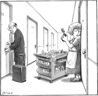
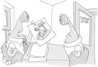
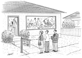
Below are the seven initially silent cartoons, each followed by four captions suggested by contest entrants.  Every set of four includes my own submission mixed in with the three finalists. See if you can spot the the one — mine — that somehow just doesn’t belong in the same class.

. . .

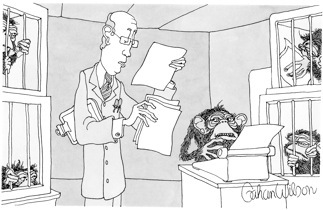
“Have you considered writing this story in the third monkey rather than the first monkey?”

“This page — the one that begins, ‘Who’s there?’ — keep working on that.”

“We’ll have to run it by our infinite number of editors.”

“Sorry, guys. It’s another rejection letter. ”

. . .

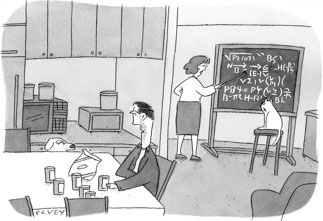
“You want to impress me? Drive to the store and get me more beer.”

“Lemme tell ya — and this is from personal experience — knowing how to roll over and play dead comes in much more handy. ”

“Don’t worry—they’ll never actually build it.”

“Trust me, my lessons have way more real-world applications.”

. . .

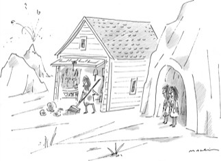
“He’s always thinking outside the rock.”

“His heart is set on finding a vintage woolly Plymouth.”

“He needed a place to park his wheel.”

“Yeah, but the weirdest thing was, once he built it I suddenly felt compelled to give him a list of things to do around it.”

. . .

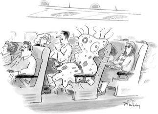
“I hate connecting through Roswell.”

“Just a mild case of the sniffles, she says.”

“I don’t care if he’s single-celled, he should have bought two seats.”

“This guy’s wife lets him drink on the plane!”

. . .

“Oh, now you want to talk, when all week it was ‘Do Not Disturb.’”

“Final warning, Mr. Weber. We don’t take kindly to shampoo thieves.”

“I can fluff your pillow the easy way or the hard way.”

“The time is 11:59. You have one minute to check out.”

. . .

“On what planet do you imagine this would be funny?”

“Lemme put it this way — when it comes to funny, me and you don’t see eye to eye.”

“It would work better with an alien.”

“It’s just not funny if she looks so sexy.”

. . .

“The seller is extremely motivated.”

“According to the listing, there’s also a full basement.”

“The heating system is pretty old but very reliable.”

“I strongly recommend that you read the fine print on this one.”

. . .


If the judges at the New Yorker are to be believed, in each instance above you’ve encountered, amid the glorious sounds of three Stradivarius instruments, the raw bleat of a kazoo. You spied a set of rings finely crafted by Tiffany, Cartier, and Harry Winston, to which I contributed a cigar band. Below each cartoon are three sweet flowers, plus a sprig of crabgrass from yours truly.

OK, I’ll stop now and proceed to the question:

Can you tell in each instance which is the dud caption?

Isn’t it obvious?

No?  You say . . . no?

Oh, thus am I vindicated, and bitter no more.

______________

Answer: In each set of four captions, the winner as selected by the New Yorker is first, my own rejected entry second, and the two non-winning finalists third and fourth.

Drudge Dreck

Thursday, February 5th, 2009

I check out the Drudge Report every day, though I’m getting close to ditching the habit.  Why?  It’s not because the site features the mean and the vulgar (hey, cheap thrills are its main draw), nor that Drudge has lost the talent for news scoops (TMZ wins that race nowadays), nor the overall editorial sloppiness (a recent page has a headline posted on the left side, matched by an only slightly differently worded headline down the right side, both of which link to the same AP story; and then there are those recurring howler typos).

No, it’s because the site’s Adolescent Quotient, once recessive, is becoming dominant — and I don’t mean that in a good way.

Consider a photo posted this week:

Clinton


Of the gazillion photos of Hillary, that’s the image Drudge chose to illustrate a piece he trumpeted with the headline, “FEELING JAPANESE: Clinton eyes Asia for first trip abroad.”  Back to the photo: Get it?  Hillary squints her eyes to near slits, to form Asian eyes!  Ha! ha! ha! 

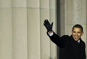
Or consider the image Drudge chose to post, top and center, a few days before the Inauguration:

barackobama1


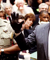
Your eyes move to the center point, an upraised hand in a tight black leather glove.  Got that in your focus?  Now, what memory might it summon up?  Hmmm . . .  Could it be  — ?

 wave-with-glove


Yes, it’s getting embarassing looking at this stuff.   Maybe the time has come, as we were admonished lately, to put aside childish things?