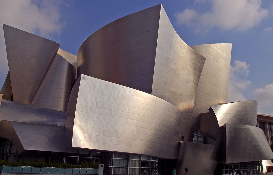
As with all great works of architecture, Frank Gehry’s Walt Disney Concert Hall in Los Angeles (completed in 2003) richly rewards visitors willing to engage their senses, reconnoiter the structure, enter its interior courtyards, experience the squeeze and release through tight and open spaces, enjoy its forms and gestures, admire its skin in changing light, absorb its physical beauty, and breathe sympathetically with its rhythms.
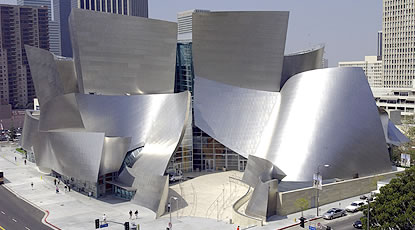
Professional photographers of the structure usually try to capture the totality of its iconic presence, highlighting the mass of shapes Gehry based on sailing, “wing on wing, the wind behind you.”

Rarely is the building photographed from a ground level perspective directly across South Grand Avenue. (In the photo above, you see a bit of the street’s asphalt in the lower left corner.) This may be for the simple reason that the six-lane corridor is a noisy crossing, a sorry, off-putting, quotidian presence estranged from the visionary building emerging from its flank. Then too, Gehry fans may be avoiding photographing the site from that perspective for fear of adding support to a common criticism of Gehry’s designs: that his buildings do not seem to relate “organically” to their surroundings. And yet by standing on the east side of South Grand Avenue you’ll find yourself in the best position to see a defining architectural detail.
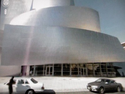
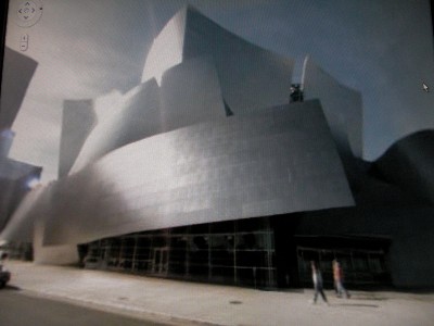
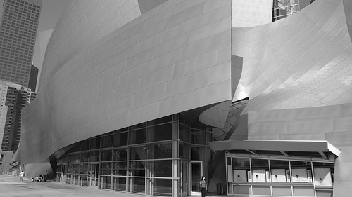
Google Maps, through its street view function, allows you to “walk” — or more accurately, to “drive” — past the street level facade. Unfortunately, individual photos taken from the drive-by Google Van are of disappointing quality, as evident in the two screenshots below.


Flickr and other photo sharing sites contain pictures with finer resolution. Here is a virtually identical shot, from a slightly more oblique angle (credit: core.formula on Flickr):

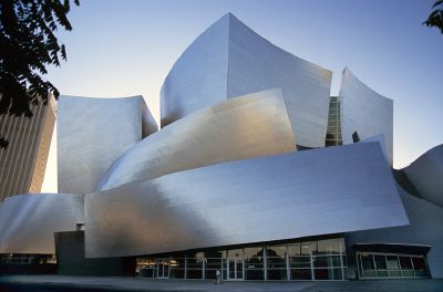
Finally, here is a full frontal shot, apparently taken from across the street (the ideal vantage point), looking straight-on at the sidewalk entrance to the building:

All four photos include the detail that is of interest to me. Focus for a moment on the base of the composition and the single, wide, rectangular shape that swoops across and projects outward from the building. Of the dozen or so curving pieces or individual “sails” that comprise the skin of the structure, this one stands apart somehow. Viewed unkindly, you might conclude it is an afterthought, an empty, ungainly, tacked-on piece, a doodle, a patch protecting the lowest portion of the building. I disagree. I think it is different for a reason. There are clues, if we open our eyes.
This particular piece has a more subtle rotation, is less of an arabesque, and more of a standard shape, than the other pieces. Although made of unadorned sheet metal (stainless steel), it manages also to look like a blank billboard, floating with no apparent support above glass walls and doors. Stretched horizontally with a slight incline from left to right, the entire form seems to be lifting up to grant you entrance to the ground floor. Viewed in isolation, it is a kind of tabula rasa.
So, if the other individual pieces are whimsical cut-outs, enjoyable for their own sakes, what extra meaning does this frontal plane possess? What does it remind you of? What is it referencing? Or, to ask the question another way, what do you want to project upon it?
One reference, consistent with the theme of the building as a whole, might be to a nautical flag flowing in a sustaining light breeze. Although this is a reasonable thought, I think Gehry’s intention was something else entirely.
On closer inspection you notice ten horizontal lines of crimping, ten visible seams if you count the top and bottom edges as “lines.” (This is best seen in the next-to-last photo above; in person, the lines are even more plain to the eye.) As a matter of engineering, of course, these lines are merely the residue of a structural technique binding expanses of sheet metal, lapping the pieces together. You may also notice that scores of individual stainless steel sheets are the constituent notes making up the whole. These small units (rectangles positioned horizontally) together compose a similarly-shaped, but much larger form. This may be an example of a phenomenon mathematicians call self-similarity.
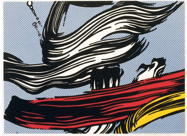
The horizontal, seamed striations lend a pronounced grain to the convex swoosh, reminiscent of Roy Lichtenstein’s brushstroke paintings and prints from the mid-1960s:


So we have an unfurled nautical flag and the choreography of a painter’s brushstrokes — both suitable ideas to associate with the architecture of this cultural center. But I return again to the singularity of that expansive sheet above the entrance, to its discernible separateness even while it participates in the dance of the overall composition. I think it wants to communicate something on its own.
It wants to sing.
Step back a moment and ask, What is the purpose of this complex building? To house a particular form of art: music. Philosophers devoted to the study of aesthetics consider music to be the highest form of art. Music is unencumbered by the compromise of physical form. It avoids constraints afflicting sculpture, dance, and architecture. Goethe declared that architecture is frozen music. It would not be surprising if a thoughtful and gifted architect such as Frank Gehry, tasked with designing a grand physical container for music making, were to choose to comment on this subject somewhere in his design of the Disney Concert Hall. I think what Gehry decided to say is writ large in that floating blank sheet with ten horizontal lines. Or, inching closer to the answer, he’s saying something ought to be writ large there.
As in Poe’s The Purloined Letter, the object of our search may be hidden in plain sight, so obvious that it becomes all too easy to overlook.
Remember that Gehry is a leader in adopting new tools to assist in the visualization, modeling, and execution of his visionary designs. A man who cares passionately about the tools of architecture would no doubt reflect on the tools of the sister art, music, that his commission has bound him to serve. (A side note: When I attended the final performance of the Los Angeles Philharmonic’s inaugural season at Disney Hall, I saw Gehry and his wife in their customary seats; the architect is an inveterate concert-goer.)
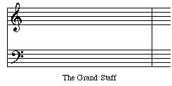
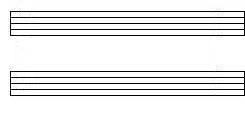
What I believe Gehry has chosen to emblazon across the entrance to his work is a replica of — an homage to — the essential tool for the communication and dissemination of music. Here is the transformation:


The Grand Staff of music — a framework upon which notes are marked in relation to ten lines, five above middle C and five below — has in Gehry’s hands become a grand architectural gesture. Remember also that this place is the Walt Disney Concert Hall — a place where imagination, creativity, and engineering magic can turn a pre-scored skin of metal into a giant treble clef (there to hold an unfolding melody) and an equally giant bass clef (there to host a supportive harmony).
A place where music begins.
_________________________________________________________
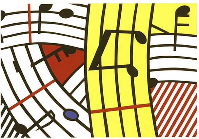
UPDATE 07-13-2009: A different Lichtenstein print, created in 1995, recently came to my attention. Roy and Frank, humming the same tune:
