Posts Tagged ‘Obama’

James A. Jefferys, American Painter (1889-1969)

Friday, May 15th, 2009

In the preface to his book of essays, “L’Envers et L’Endroit” (“The Wrong Side and the Right Side,” 1958), Albert Camus wrote:

I know this with sure and certain knowledge: a man’s work is nothing but this slow trek to rediscover, through the detours of art, those two or three great and simple images in whose presence his heart first opened.

Most people cannot claim the mantle of artist. Still, most of us face the same urge to recapture early joys. This is sometimes disparagingly referred to as “reliving your childhood.” You see it at baseball games, where old men sit in the stands vicariously joining in the play on the field. You see it when a new mother selects a first doll for her daughter. You saw it last year when many Americans who, 40 years before, had joined Robert F. Kennedy in his improbable and sadly aborted 100-day quest for the Presidency, found themselves rejuvenated by another political campaign powered by hope and renewal.

I love snow for a simple reason: it instantly transports me back to childhood. To capture that feeling and make it available in every season, I collect art depicting snow in the city. One of the pieces in my collection is this 10-by-12 inch oil sketch, “Drifting Snow,” dated 1910, of an intersection in Philadelphia:
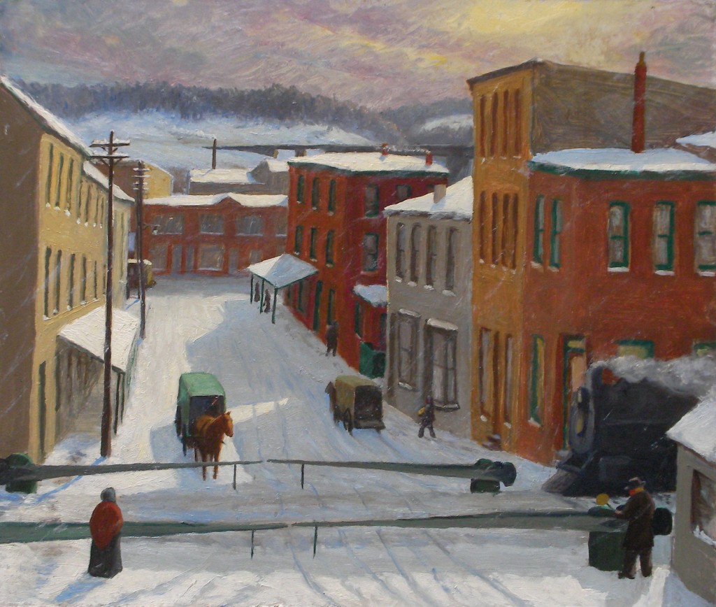
James A. Jefferys, Drifting Snow, Manayunk, 1910

The artist, James A. Jefferys, lived in the city’s Manayunk neighborhood. He indicated the scene’s location in a hand-written inscription on the verso: “Drifting Snow. Sketched from 2nd floor front Room of H.D. Richards showing R.R. Gate Tender at Cresson & Short Leverings St Manayunk Phila 2-14-1910 By James A. Jefferys [?]20 Grape St”. To 21st century eyes, the picture’s most interesting detail may be the train engine entering from the right. There’s something odd about this vision of a train encroaching on an urban streetscape normally reserved for less daunting vehicles. It puts me in a surrealistic mood. I’m ready to imagine the train’s next stop is someone’s living room, as recorded in Magritte’s painting, “Time Transfixed.”

Historical notes: In 1929-1930, Reading Railroad replaced the Cresson Street train tracks with an elevated structure. The name Manayunk is derived from the Lenape Indian word “manaiung“, which means “river” or “where we go for drink.” Manayunk is an old blue-collar industrial neighborhood (textile and paper mills thrived in the 19th century) currently undergoing gentrification. It rises from the banks of the Schuylkill upriver from Wissahicken Creek, a few miles from center-city Philadelphia.

As for the artist, a Google search uncovered only sparse information about James Jefferys’ presence in Manayunk. Geneology sites contain references that supply birth and death dates of 1889-1969 and show his continual presence in Philadelphia (interrupted by service in World War I).  Yet I’ve found nothing about his activity as a painter; no records of his artistic training, exhibitions, or awards.  Possibly he was a self-taught artist.  The 1910 painting shows a careful but tentative hand of a novice painter (he was only 21 at the time) uninfluenced by academic training. He kept painting, though. Possibly he worked in a related field such as sign-making, illustration, advertising or publishing. This early sketch reveals an intuitive sense of atmosphere and color. To my taste the painting is pleasing and very American.

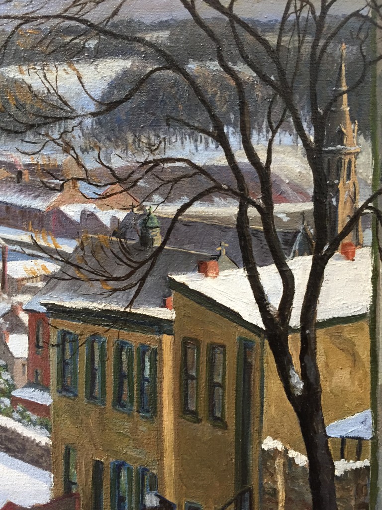
Three years after buying the snow sketch I came across, at auction, another painting by Jefferys that I thought would be a fine addition to the collection. I was happy to place the winning bid for this 1938 oil on canvas:
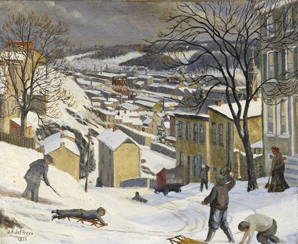
J.A. Jefferys, "Boone & Grape Sts., Manayunk"

[Boone and Grape Streets, Manayunk, oil on canvas, 1938, 20 x 24 inches, signed and dated lower left recto; inscribed on verso: “Boone & Grape Sts / J.A. Jefferys / 4310 Terrace ST / Myk PA”.  Rago Arts and Auction Center, Lambertville, NJ, Fine Art Auction, May 15, 2008, Lot 226.]

Jefferys’ note on the verso of the smaller snow scene, done nearly three decades before this painting, placed his residence somewhere on Grape Street. This means he would have been very familiar with the street’s trecherous upper reaches, depicted here. The Terrace Street address  listed on the back of the 1938 work places him just two short blocks from Boone and Grape. I imagine him walking out the front door of his modest row house one cold day during the Great Depression, turning left up Terrace Street. A few steps into his trek he thinks twice about whether to take a detour down the steep Cotton Street steps leading directly to Boone.  He decides to keep on the safer sidewalk, on up to Grape Street, where he turns left to make the final trudge downhill to the intersection at Boone. There, in front of him, is a scene of immediate activity and distant calm. He is glad to have come upon something demanding to be captured on canvas.

What were Jefferys’ working methods as an artist? Did he do a pencil sketch then and there? Did he bring a camera? Or did he leave the house carrying a fresh canvas, easel, and plein air materials, instinctively knowing this would be a productive day?

If you stand at the same vantage point today, as you can do in absentia thanks to Google Maps Street View, it is clear Jefferys took some liberties with distant perspective, bending space to create a more thrilling atmosphere. That is what artists do.

Repeating elements seen in his 1910 sketch, the upper portion of the picture features mills and factories, the soft hills beyond the river, and finally a spacious wintry gray sky. But Jefferys’  talents have moved well beyond the primitive mode of 1910, now embracing a style similar to that of John Sloan and of a younger cohort of social realist painters who emerged in the 1930s. He has well captured in paint a landscape cushioned in white, the cold air alive. He introduces a stronger narrative. The foreground tableau is a tale of play and toil, where boys’ shouts compete with the muffled metalic scraping  of shovels handled by the old man at left and old woman at right. Tiresome work is consigned to the margins, peripheral to the central energy of sledders, who evade a snowball fight and zoom like dare-devils deeper into the world.

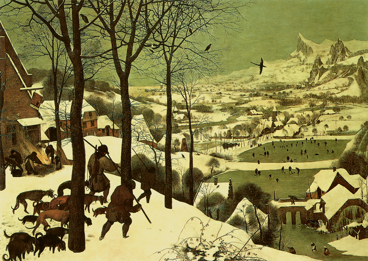
I am struck by how the composition, whether by chance or intention, is so reminiscent of one of the most beloved paintings in art history, Bruegel’s Hunters in the Snow.
bruegel-hunters-in-the-snow-31

In an interesting  online essay entitled, “How Can We Be Composed?- Bruegel’s Hunters in the Snow,” Nancy Huntting quotes from Eli Siegel’s commentary in Art as Composition:

“Pieter Bruegel’s Hunters in the Snow is a picture that tells us, Everything can be composed. Lines can be composed. The general direction of the picture is at a slant, or diagonal; the trees are assertively vertical; there are horizontal lines with the snow. Varying white shapes differ and coalesce. Houses, as volumes, mingle with snow as weight, and with space. Birds are diagonal, vertical, horizontal. The immediate in the picture mingles with a various middle ground, and a spacious, rising, misty background. Here is reality’s plenty caught hold of by Bruegel and arranged.”

Siegel’s formal analysis helps explain why a painting is so arresting. But it forgets the power of the sentimental elements (using the “s” word in its non-pejorative sense) of a painting — elements which, to an opened heart, provide pleasures all their own.

___________________________________________

UPDATE (August 2009)

In the Comments section, below, you’ll find an email from the artist’s grandson, Jim Jefferys, who came across this blog posting and wrote to me in June, 2009.  A few months later he sent along some photos and these additional information about his grandfather’s artistic efforts:

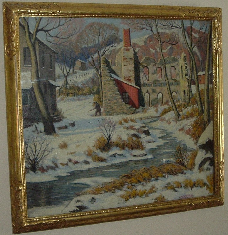
“The first picture is a snow scene with a chimney in center (oil on canvas, rather large – 36 inches square). This painting was to be given to the first male Jefferys in each generation. After me it goes to my son. … The painting I’m told was a fireplace that my great, great grandfather built when he came to this country. The building, after years and years of neglect, is the way my grand father saw it and painted it on a snowy day. A lot of his snow scenes were painted outdoors when it was snowing. My aunt can tell you he would take her as a little girl sledding in Manyunk, with oils, brushes and easel in tow. So, that’s the answer to your one question — he did paint in the snow.”
Copy of pic25679

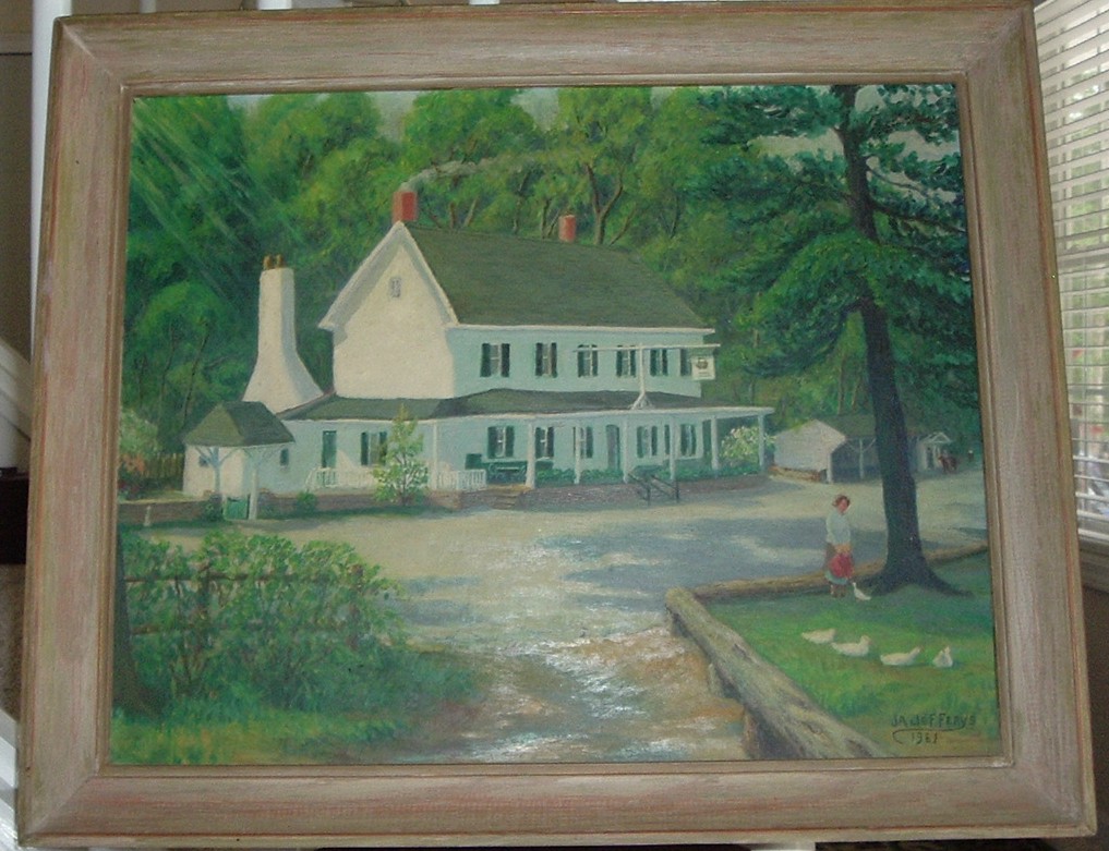
“The second picture is the old Mill inn in Hatboro PA. which still stands to this day. [Note: unfortunately, the JPEG file for this painting could not be opened.] I was born and raised in that area. This building is still there and even though it has had renovations it still looks the same. The painting (watercolor) was completed on the day I was born. It was given to my father the next day for him to hold for me. Third picture (oil on canvas) is of Valley Green in Fairmount Park, Philadelphia. The building still there today and looks the same. I used to go trout fishing there when I was 16 years of age. It was one of my father’s favorite pictures.”
Copy of pic13043

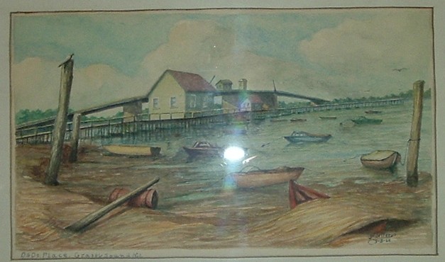
“Fourth picture [JPEG file was not openable] is a castle in Germany he did during  WWI (oil on canvas). He also did a portrait of Von Hindenburg when he was there after Germany surrendered. That picture is around somewhere, as one of the relatives has it. Fifth picture [JPEG file not openable] is a small painting of a run-down farmhouse (oil on canvas). I don’t know anything about it, just that I liked it and my grandfather gave it to me after I graduated from high school. Sixth picture is a watercolor of Dad’s Place in North Wildwood, NJ. It is still there and I was with my grandfather when he started the painting , back when we did not have bug spray for green flies, etc. I asked for the painting and he gave it to me. He knew if he gave it to me I would not forget the good times I had going to the shore with him.”
Copy of pic01563

“Seventh picture is down the shore somewhere, probably the same area,      but this home is probably gone from storms now. It was a twin set (my    sister has the other) and was painted the same summer as the Dad’s Place picture.”
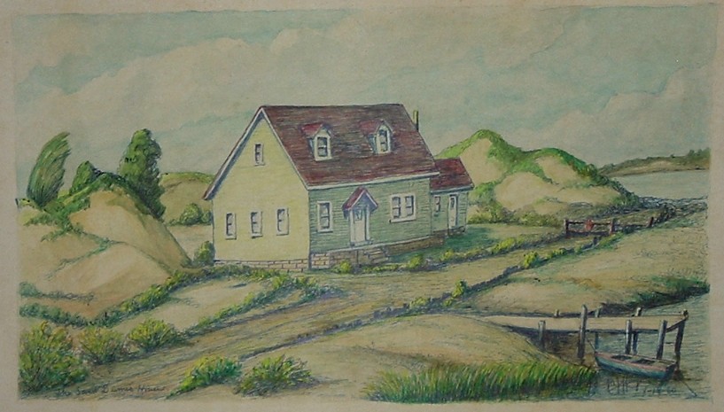
Copy of pic25834

.

UPDATE (September 2014)

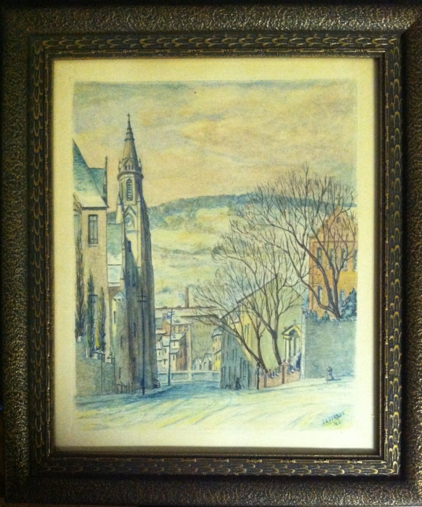
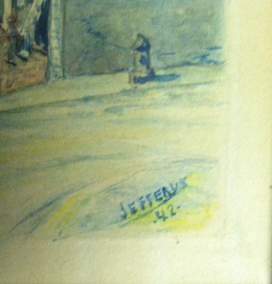
Here are photos of a 1942 watercolor by the artist, depicting the church and rectory of Saint John the Baptist in Manayunk. These photos were provided to me recently by Rev. John J. Kelly (see Comments section) who found the picture in a back room of the rectory. He writes: “The painting is quite realistic and a fine depiction of Rector street. On the left is Saint John’s, two schools and the  Church which still stands. On the Right is the Rectory  which still stands; so too do the walls at the top of the street and on Rector street.  It appears that the houses are all still intact. What is noticeably different is at the bottom of Rector street there is no high wall and SEPTA train tracks are missing from the painting.”

.

.

.

For comparison purposes, below is a detail of Jefferys’ 1938 painting, Boone and Grape St., Manayunk, showing the spire of Saint John the Baptist church and the roofs of two schools, from a higher perspective.

.

.

UPDATE – April 2015:

A new Google search for “James A. Jefferys” uncovered additional biographical information. The future artist was born in March of 1889 and died in July of 1969. The year 1938, when Jefferys painted the snow scene he titled Boone and Grape Street, Manayunk, shown at the beginning of this article, was a year of tragedy for the artist. In 1938 he lost both of his parents: (James Jefferys, 1851-1938) and mother (Anna Judge, 1864-1938).

The July 18, 1969 edition of the Des Moine Register newspaper published a short obituary for James A. Jefferys. It provides intriguing details about the artist’s early years:

“James A. Jefferys, 80, a portrait and landscape artist who painted European royally at the front during World War I, [died] in Philadelphia. He painted portraits of King Albert of Belgium and the Prince of Wales and later Edward VIII when they visited the front. He also made pen and brush sketches of battles.”
Tropicana Lessons

Saturday, April 11th, 2009

In an office where I once worked there was a supervisor who had on his desk a custom-made sign.  It faced you as you sat in the chair before him.  The sign announced the supervisor’s personal and managerial philosophy, which was this:

“Dazzle Them With Bullshit.” 

You get the picture — a boss from Dysfunctional Hell.  The day he departed there arose from survivors a collective sigh of relief.  Normalcy was restored.  We could breath again. 

The highest respect ought to be reserved for people who, when they make a mistake, are able to say the first three words in this reparative statement:  “I messed up; I’ve done better in the past and I’ll do better in the future.”  I think the ability to say those words aloud is a sign of health.  We now have a President who’s strong enough to say those words, or words to that effect, when the occasion is fitting.  See, for example, his reaction to problems encountered with Cabinet nominations: “I screwed up . . . this was my fault“).  For this he deserves kudos.  At the same time, in the business world we have more than a few leaders who can’t muster the courage to say those words, even when circumstances scream out for their expression.  Should those men and women be met with ridicule and obloquy, or let slide?   How are we to deal, individually or collectively, with persons in powerful positions who celebrate bullshit, who deny mistakes?   

I thought of this after reading Daniel Lyons’  profile of advertising guru Peter Arnell in the April 6, 2009 edition of Newsweek.   Prior to last week I’d never heard of Mr. Arnell, a man who prefers to be known as a “brand architect”.  I’m sure he doesn’t know me from Adam.  The only connection we have is Tropicana Orange Juice. 

From Lyons’ article, which I recommend, you will take away a few things.  The first is that Mr. Arnell is the person responsible for the redesign of Tropicana’s orange juice cartons, replacing iconic and consumer-friendly packaging with a new design that was swiftly and universally reviled by the consuming public.  The second thing you learn is that Mr. Arnell is a graduate of the Dazzle Them With Bullshit School.  Lyons writes: “I keep remembering something Arnell told me when we sat down to breakfast in New York. ‘It’s all bulls–t,’ he said. ‘A logo on a can of soda? Please. My life is bulls–t.” 

The third revelation of the Newsweekarticle may or may not be surprising:  Mr. Arnell is unapologetic. 

The Tropicana rebranding project was a crash and burn failure.  In February, the company announced it would reverse the makeover and revert to its tried and true packaging.  The project cost Tropicana and it parent, PepsiCo, millions of wasted dollars (some say over $35 million), not to mention the loss of accumulated good will of consumers turned off by the new look.  Of such scope was the fiasco that it will be taught as as a cautionary case study in business schools for years to come.  Arnell does not concede a mistake.  He says he doesn’t understand exactly why his work was ultimately rejected by Tropicana.  He appears to blame bloggers — I kid you not — for sabotaging the project.  More likely he does know why and is simply unable to voice those first three words, “I messed up.”  Even when he could legitimately follow that reality check with a reminder that he’s done good work in the past and hopes to do more in the future. 

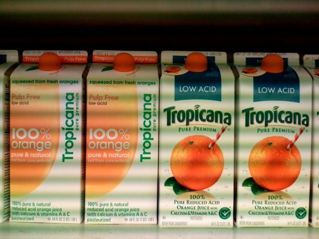
This afternoon I took a photo of some cartons of Tropicana OJ on the shelf of a nearby supermarket.  It shows we are halfway back to normal. (Note 1: the hypnotic, film noir look is due to my cell phone camera capturing the “striped” waves of fluorescent store lighting.  Note 2: I bought the two cartons on the right).  

tropicana-13

Soon, the two cartons on the left will be purchased, their contents consumed, and their packaging recycled and reused as something else.  So this is a ripe moment to draft a post-mortem, even though I am late to the table.  Many, many others have expressed their views, as summarized here and as reported in The New York Times, here.  Let me begin with the question, what exactly was wrong with Arnell’s design?   My answer is, many things.

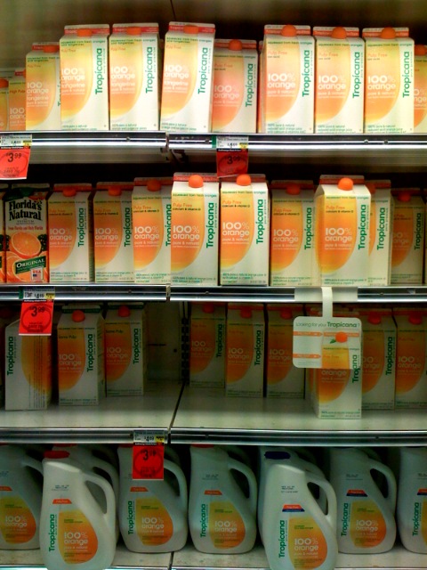
1.  The “Can’t See the Forest” phenomenon.  Arnell and the folks at Tropicana who cheered on the redesign (you imagine a meeting when they all enthused, in group-think unison, “Pure genius! We love it!”) forgot a key point.  A consumer’s first impression of a new version of a commonly purchased product occurs when he sees it on the supermarket store shelf.  In the case of OJ, cartons of different varieties are presented as a  packed mass of objects on several shelves.  The begetters of this fiasco — and especially Arnell — fixated on the single object.  Oops!  The introduction of New Tropicana was not akin to July 2007 when someone showed you the iPhone they just got, and you delighted in its design excellence as you held it in your hands.  No, the the first time I and most everyone else saw the new box was while standing in front of the refrigerated juice section of a supermarket.  Arnell and his client also forgot that they had no way to wipe from consumers’ memories their fond attachment to the classic design they had been buying (in my case, had long been buying).  Finally, they forgot that during the transition to the new design, there would be days, as stores were restocked, when shelves would contain both old and new designs, literally side by side, allowing for direct comparison and preference expression.  Once the transition was completed, here’s what I and other consumers saw (photo taken several weeks ago):

 tropicana-2


Tropicana occupies a large space.  Dozens of cartons face the consumer, in row after row.  I remember I was confused.  “What’s happened?” I asked myself.  A clot of other customers was milling about too, similarly confused, although I think if you were to have drawn “thought bubbles” over their heads, theirs would have shown an angry “WTF??” (this supermarket draws many students from a nearby university).  When massed, I thought the new containers looked cheap, especially since the Tropicana real estate was bordered, left and right, by the cartons of competitors (Minute Maid, anyone?) who still had more pleasing, traditional designs.  Of practical importance, all the varieties now looked the same (previously, varieties were clearly identified below the cap in a color-coded field, such as blue for Low Acid).  In that mass of bland boxes how can you spot your particular preference and quickly go on your way?

  2.  The redesigned tree.  As a stand-alone object, the carton also fails miserably.  Its character is industrial (contradicting the healthy, organic vibe juice should impart).  It is minimalist (an IKEA-like style most Americans read as “cheap,” “discount,” or “generic” and not worth the premium price Tropicana exacts).  It is consciously manipulative (especially in that off-putting, vertically-aligned, sans serifs, “Tropicana” — you wonder, am I in a library where we’re forced to read the spines of books by cocking our heads the right?  Why, dammit, when the carton is plenty wide for all necessary text to be horizontal?).  The new design is thin and cold (compare the rich warm orange tones in the iconic design; it’s as if the juice in Arnell’s carton has been watered down to a paler orange, an unattractive dilution).  It is hard to read (the consumer wants to locate her favorite variety of Tropicana without stumbling;  notice the easily spotted variety name on the classic design and compare it to the redesign in which text disappears into a game of “hide-the-ball”  [hint: “low acid” appears in tiny type on the left side, beneath the words “Pulp Free”]).  It is, in short, too consciously design-driven (which American consumers generally read as arrogant)  It’s as if Tropicana intended to market its product as Juice for Mac Lovers. 

3.  I’m a genius, you’re a Philistine, now pay me homage.  Additional stumbles lay at the “design arrogance” doorstep.  One is how the designer’s affectation for lower case letters trumps user friendliness, such as when seven easy-to-spot capitalized letters (LOW ACID) are replaced with seven hard-to-find lower case letters, telling the seeker of that special product how little respect Tropicana has for his needs.  You’re in my control, you picky unlettered consumer.  Another example is the problematic orange colored shape.  It’s not easy to “read.”  Is it just a shape?  A distended bladder?  A spill of juice?  The answer arrives only when you take the carton and rotate it.  Voila!  It’s a juice glass.  Now this, of course, is very clever.  Very interactive.  It displays the designer’s playfulness, his desire to think outside the box, or more precisely, outside the front plane of a four-sided carton; his rebellion against the tyranny of frontality; his need to sculpt.  But for those consumers not majoring in art or design, this comes off not as clever, but as “clever.”  It is something that in no way assists us as consumers.  We don’t feel better knowing that Mr. Arnell has found a way to conquer the tyranny of frontality, the constraints of the flat picture plane.  We’re buying OJ, not a Rauschenberg.  Look again at those cartons wedged on the shelf.  They are not ready to rotate.  The full image of a juice glass remains hidden, out of sight.  Come to think of it, if you wanted to play with half-revealed images, with a puzzle that requires two pieces for completion, then why not work within the constraint of side-by-side shelf placement, why not print the orange half glass on the right side of some cartons and on the left side of others, so that shelf stockers could play at completing the pictures down the rows, so that consumers would see a chorus line of couples?  Then the wit would be less onanistic, more consumer interactive.  (Dear Tropicana, For $35M I’ll explain my design plan in an exhaustive Arnellesque memo.)

Had PepsiCo’s executives paused to think at an earlier phase prior to the expensive roll-out; had Tropicana’s marketers placed mock-ups of their proposed redesigned cartons at a typical point of sale — in situ — in a supermarket where folks actually interact with the product;  had they observed the negative reactions of loyal customers; had they seen people’s frustration at not being able to find their favorite type of Tropicana — then surely they would have caught these flaws and nixed the plan.  

All of this points to questions that ought to be raised from the floor at the next Pepsico Shareholders Meeting:  What was the nature and extent of the “market research” that you say supported greenlighting this fiasco?  How much did this mistake cost us?  Specifically, what was the cost of the roll-out; the cost of the recission; the cost in sales lost to competitors?  What were you — the business leaders of the company we shareholders own — thinking?

Drudge Dreck

Thursday, February 5th, 2009

I check out the Drudge Report every day, though I’m getting close to ditching the habit.  Why?  It’s not because the site features the mean and the vulgar (hey, cheap thrills are its main draw), nor that Drudge has lost the talent for news scoops (TMZ wins that race nowadays), nor the overall editorial sloppiness (a recent page has a headline posted on the left side, matched by an only slightly differently worded headline down the right side, both of which link to the same AP story; and then there are those recurring howler typos).

No, it’s because the site’s Adolescent Quotient, once recessive, is becoming dominant — and I don’t mean that in a good way.

Consider a photo posted this week:

Clinton


Of the gazillion photos of Hillary, that’s the image Drudge chose to illustrate a piece he trumpeted with the headline, “FEELING JAPANESE: Clinton eyes Asia for first trip abroad.”  Back to the photo: Get it?  Hillary squints her eyes to near slits, to form Asian eyes!  Ha! ha! ha! 

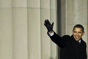
Or consider the image Drudge chose to post, top and center, a few days before the Inauguration:

barackobama1


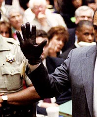
Your eyes move to the center point, an upraised hand in a tight black leather glove.  Got that in your focus?  Now, what memory might it summon up?  Hmmm . . .  Could it be  — ?

 wave-with-glove


Yes, it’s getting embarassing looking at this stuff.   Maybe the time has come, as we were admonished lately, to put aside childish things?