.
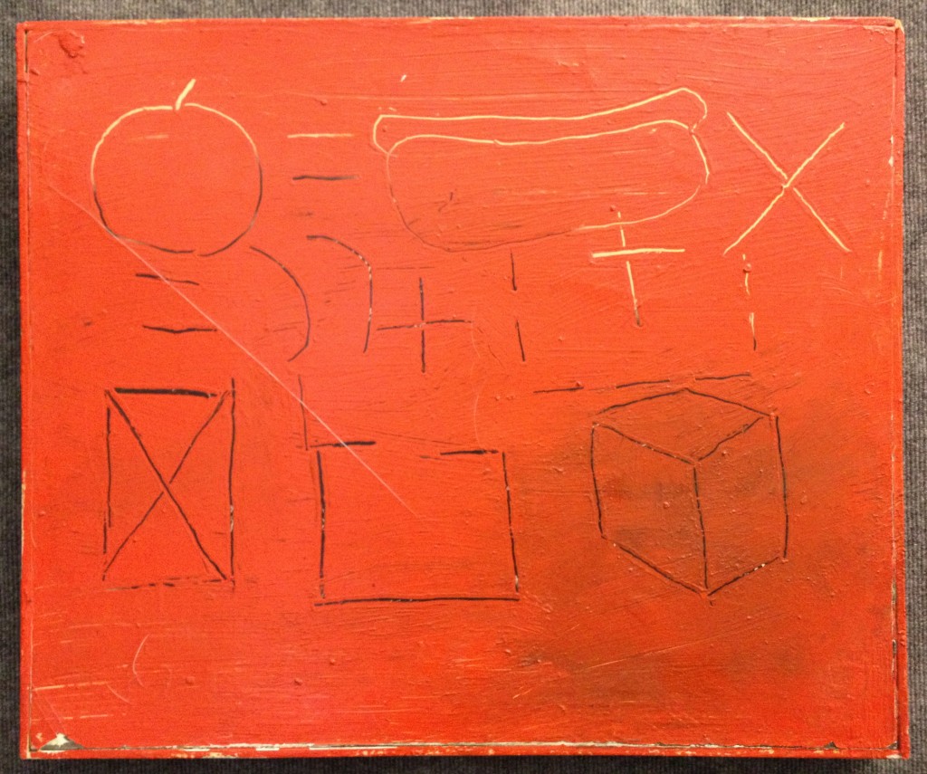
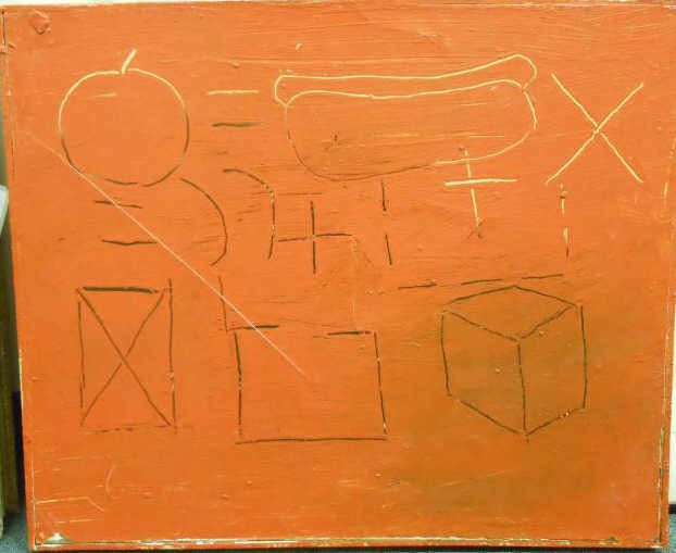
Last week I bought a painting by the American artist Barry Bridgwood. Hot Dogs is the title he gave to the enigmatic work.
Bridgwood was born in Massachusetts in 1957. He attended the Art Institute of Boston (1978-81) and the School of Visual Arts in New York City from 1981-83. Fresh from art school he joined the creative ferment of the short-lived East Village art scene of the early 1980s. From the vantage point of today, critics find it difficult if not impossible to reduce to an easy formulation the polymorphous art spawned by that time and place. As one who was there explains: “The East Village didn’t have a style per se, it was more of an explosion of artists trying to get their work out.” I see no reason to disagree, and so for now choose to defer generalizations in favor of an immediate appreciation of the artists’ works themselves, including this one:
.
.
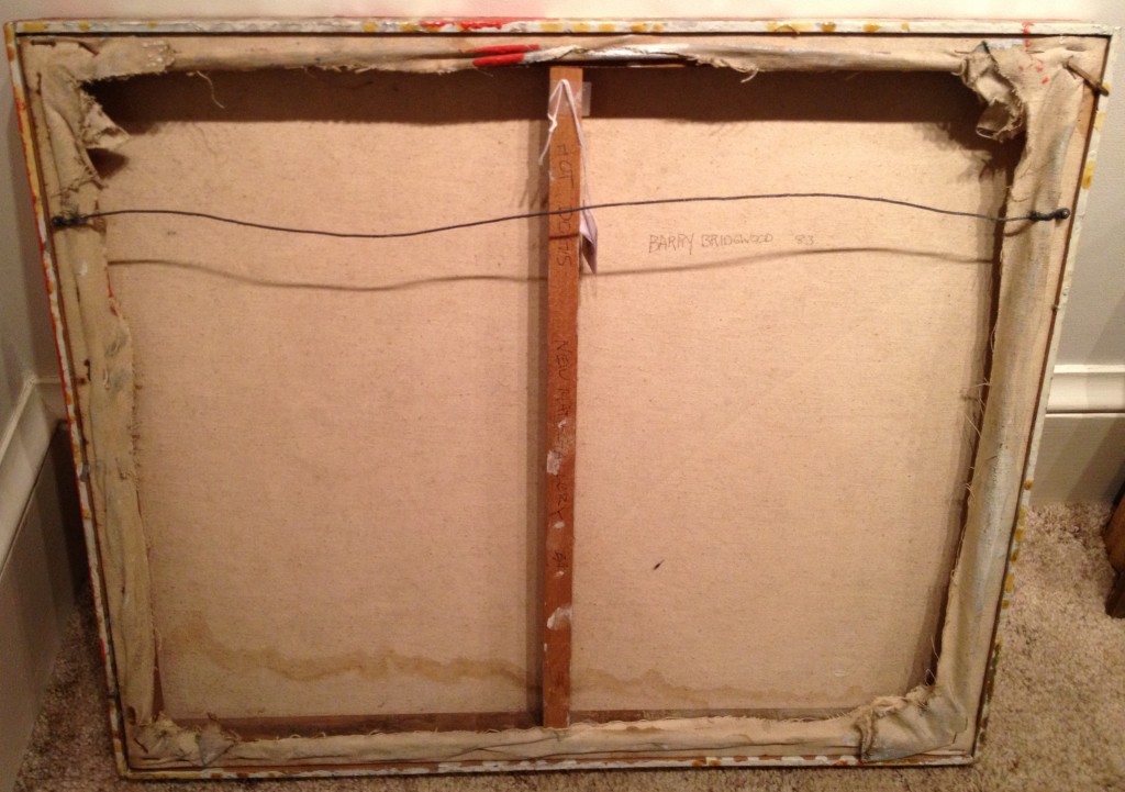
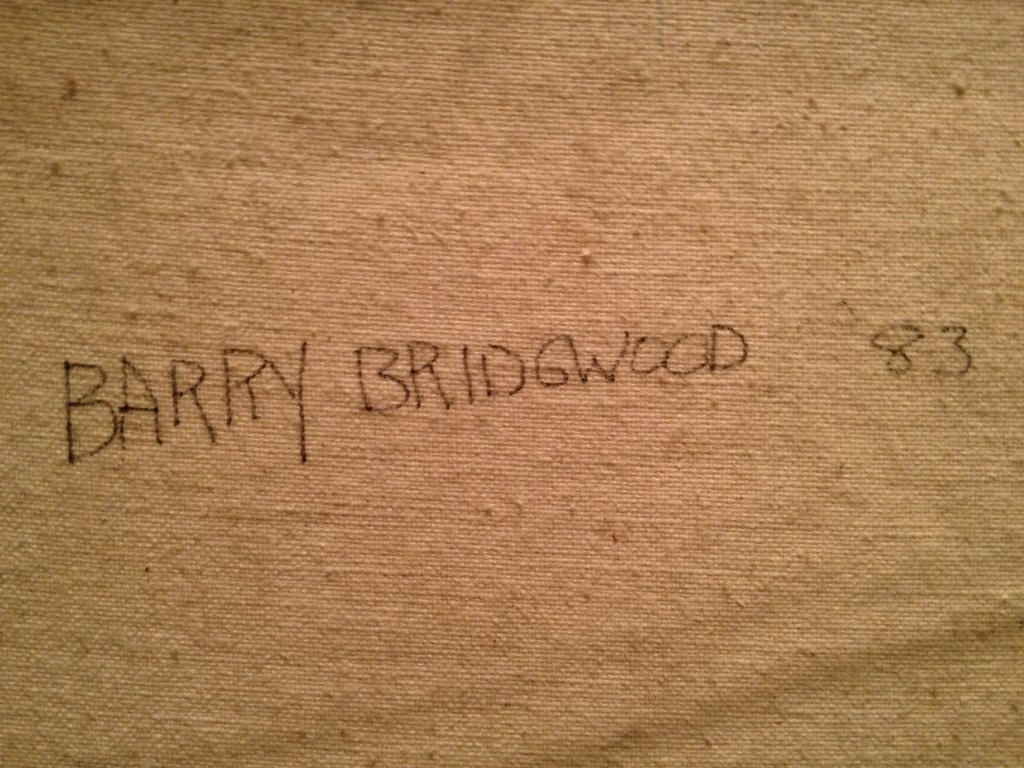
[Hot Dogs, 1983, oil on canvas with integrated strip frame, 20 3/4 x 25 inches, signed and dated verso, and inscribed “New Math Gallery”]
.
.
.
.
.
.
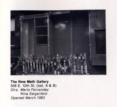
Hot Dogs was shown at one of the initial exhibits — and possibly the very first show — at one of the East Village’s pioneer store-front galleries, New Math Gallery. When in 1983 Nina Seigenfeld decided to open the gallery (with co-owner Mario Fernandez) she and Bridgwood were still students at SVA. Seigenfeld recently wrote an engaging but all-too-brief history of the gallery, describing the energy of the time and the “camaraderie and sense of community that can never be replaced.” Her article appeared in the Spring 2010 edition of Fine Art Magazine, available online here (page 36). The online site of Artists Space includes a photo of the first location of New Math Gallery; two years later the gallery moved to a larger space on Avenue A between 12th and 13th Streets, which it occupied only a short time until the co-owners decided to shut it down in 1986).
.
.
What attracted me to Bridgwood’s Hot Dogs? At first blush it was the unplaceable color of the work, at least as it appeared in the auction’s online catalog entry:
.
.
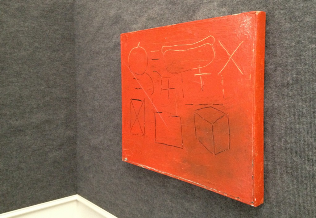
Now that the painting is hanging on a wall in my home I can report the color in the illustration was false. It is not mustard, not orange, not salmon, notred, and so the intrigue of its “actual” color remains powerful. This mercurial chroma also confounds my digital camera’s optics. I’ve been photographing the painting at various times and vantage points, and the camera simply cannot decide what the object’s definitive color is.
Then there is the subject matter of the painting. The incised drawings, which reveal a white ground in some areas and an under-layer of black elsewhere, present a conundrum.
All of the figures you see stay mute and polite within the bounds of the painting’s rectangular field. However, if the viewer is so inclined, this content may be ordered into three horizontal bands. So arranged, the analysis may follow this path:
The top band initiates what appears to be a mathematical equation. Its opening terms include contour line drawings of two recognizable objects. These are a piece of fruit with a stem (most likely an apple) and a hot dog cradled in a bun. The relationship of the two comestibles to each other and to what lies ahead is established via two basic interstitial symbols. One establishes equality (=) and the other spurs multiplication (X). The first line ends with a cliffhanger. That “times” sign is a transitive verb that asks, Times what?
In other words, my defensible assumption is the equation continues on to the next line (the middle band). There, equal symbols appear again, confusingly. The symbol for addition (+) shows up, in black and white flavors. There too are two parentheses. The usual function of parentheses in a long mathematical formula is to organize and clarify complex relationships among terms. But at this point in our scanning of the painting, exactly what is being organized is becoming ever more elusive.
Then on to the the bottom band. It may or may not be a continuation of the conversation. How do we know whether it belongs in the formula? Certainly the tone is different. Gone are the carnal suggestions of the objects met in the top line, their roundness hinting of succulence. Such temptations are abandoned, replaced with straight lines that form three geometric constructions. We see: a rectangle with an internal “X” large enough to touch its four corners; an outline of another rectangle, this one empty but with a broken top segment suggesting openness; and finally a classic cube tilted to show three of its implied six surfaces. The viewer may wish to reconsider whether the middle band is meant as connective tissue between top and bottom bands. Certainly the stability of the relationship is nowhere near certain.
An extraneous piece of the puzzle is this: The work’s title promises hot dogs (plural) yet there is only one weiner to be seen. Does the painting offer a mechanical formula to create more? Is this a blueprint for a duplicating machine whose first test run involves processing a simple frankfurter?
Equally elusive is the question of the quality (the success or failure) of the work. The art that emerged from the East Village in the early 1980’s attracted its share of haters, and this remains true today. Detractors dogtail even (or maybe especially) the artists who went on to rise furthest from its midst — Jeff Koons (childish fixations!), Keith Haring and Jean-Michel Basquiat (all that scribbling and doodling on blank slates!). Is it possible the painting now in my custody deserves the same obliquey — lazy and puerile! — and I’m just too blind to realize it? In time will my judgment change? Who knows.
Right now I’m enjoying the sight of Bridgwood’s playful handling of the enamel paint-smeared canvas that he treats as his very own schoolroom chalk board, a proprietary surface to mark with personally meaningful signs and symbols. The syntax of those signs and symbols — and the ultimate message of the painting — I will wait to decipher.
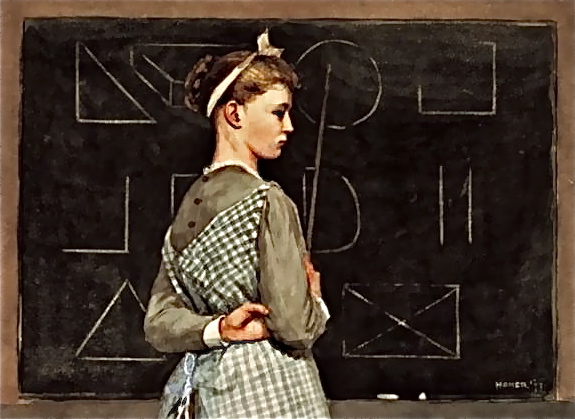
I’m reminded of the young instructor who points to figures upon a blackboard in a watercolor done a century ago by Winslow Homer titled Blackboard (1877). Do you see, there in the bottom row, a large “X” whose four limbs touch the corners of an imprisoning rectangle?
.
.
Where is the teacher who will help the eager, interpreting viewer to decode the formulas of here and now?
.
.
__________
Update 1 (02-19-2013): During my Facebook conversation with the painter, begun yesterday, Barry Bridgwood told me, “I did a lot of ‘math’ in my early 80’s paintings.” I must follow up on that remark.
Update 2 (02-20-2013): The artist generously replied to my questions about his math paintings. Highlights:
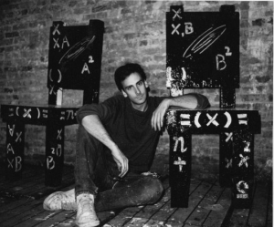
I feel the math draws the viewer into it and makes the mind think and ask questions! like a magnet! … I started to put algebra/math in my paintings as a type of a further abstraction element … Although by the mid 80’s, 1984 on, I was making mostly the computer generated work, I did keep making paintings with algebra in them … My 1st show at New Math was mainly algebra type paintings … In 1990 I had a show at Laurie Rubin Gallery in Soho that had both the computer silk screen work and “math” paintings … Many of the “math” painting sold very well, many collectors have them … There where 2 in a New York Group show in September called “Crossing Houston” at Smart Clothes Gallery on Stanton Street in the Lower East Side, an “80’s NY/East Village” show … The math paintings have started showing up in shows and the auction! It’s great to see them again! … Also, putting algebra in paintings can make them look smart. I was in a group show at Harvard University some years back called “Smart Art” !
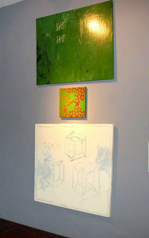
Bridgwood’s Facebook page contains this photo, from the 2012 exhibit, “Crossing Houston,” at Paul Bridgewater’s Smart Clothes Gallery, showing two other 1980’s paintings with one of his small “computer paintings” from 1992 in between:
.
.
Update 3 (02/26/2013): During a Facebook conversation today, Nina Seigenfeld Velazquez writes, “I think Hot Dogs might have been in our very 1st show at New Math.”
Update 4 (04/27/2013): I came across two other paintings from Bridgwood’s series of “math paintings.”
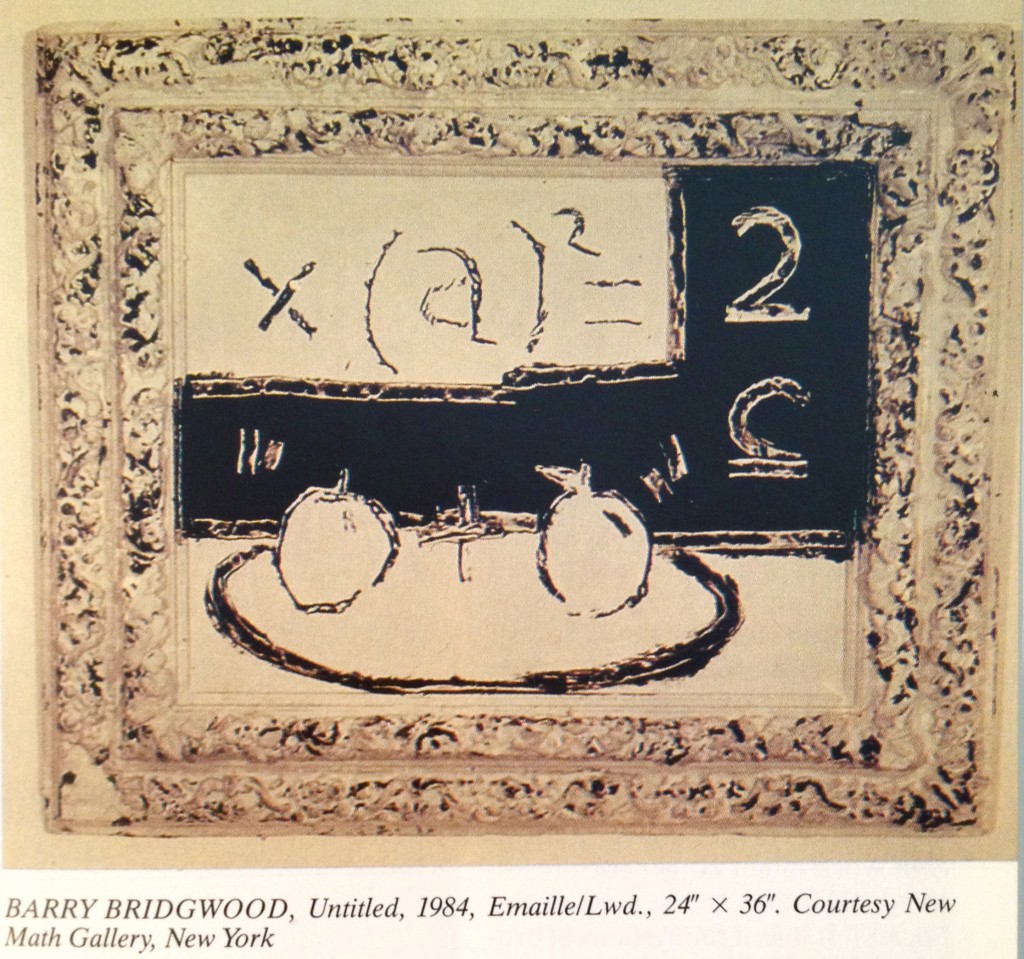
One was painted the year following Hot Dogs and features a reused frame as an integral part of the work (Untitled, 1984, enamel on board, 24 x 36″ with integrated frame). It is reproduced on page 321 of the March/April/May 1986 edition of the German art publication, Kunstforum International, in an article entitled “Tropical Codes” by Tricia Collins and Richard Milazzo. Bridgwood is one of 24 New York Scene artists profiled by the authors — a group engaged in “new conceptual work [that] entails, for the most part, a post-Simulation model involving the collapse of abstraction and appropriation into a hybrid form–a new cultural sandwich for informed mouths.”
.
.
Describing the signs infusing Bridgwood’s art of this period, Collins and Milazzo observe:
“The image (usually mathematical symbols and various fruit) is primitively scratched into the pictorial surface, constructing an unnatural painterly (hot) system of austere (cold) signs, extreme in their transparent, scientific, but, ultimately, fictional transmission of signic energy across a slow, opaque, nebulous surface.”
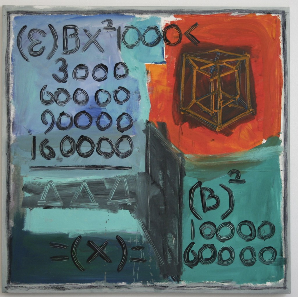
The second painting I recently located belongs to the collection of the Fisher Landau Center for Art, in Long Island City, New York (Untitled, 1985, acrylic on canvas, 40 x 40″, property of Emily Fisher Landau, New York).
.
.
