Archive for the ‘Culture’ Category

An Apple that was America

Saturday, November 10th, 2012

.

Recently I acquired a small still life painting by the 19th century American artist Edward Chalmers Leavitt (1842-1904):

.

Still Life with Apple on a Marbletop
Oil on canvas, signed lower right and dated 1862.
6.5 x 8.75 inches

.

Depictions of apples are very common in nineteenth century American art, and it’s not hard to understand why.

The apple’s renown can be traced to decades of widespread cultivation of apple trees throughout the growing nation. Successful harvests yielded not only abundant and flavorful table fruit, but an important beverage: millions of gallons of hard cider which thirsty Americans consumed with abandon.

For a young nation still in the process of defining itself, the apple was an object poised to take on symbolic importance. The natural stages of apple production — seeds, saplings, trees, new blossoms, nourishing fruit — furnished metaphors for nation-building. And when the new nation was in need of home-grown myths, they annointed Johnny Appleseed, whose legend is substantially rooted in fact.

.

William Gropper, “Johnny Appleseed,” lithograph (another version, here)

.

Johnny Appleseed became a hero of a quintessentially American kind, as his story blends both moral and practical lessons. Likewise the humble fruit he championed. Americans saw in the apple something they were temperamentally inclined to invest with representational authority.

By the middle of the nineteenth century the apple had achieved a status approaching that of a national symbol. Twice in his journals (in 1848 and in 1851) Ralph Waldo Emerson declared the apple to be “our national fruit,” and he later voiced that same judgment without fear of contradiction in lectures devoted to “Country Life” delivered to audiences in Boston and Worcester (1858) as well as in Brooklyn (1859):

“The apple is our national fruit. In October, the country is covered with its ornamental harvest. The American sun paints itself in these glowing balls amid the green leaves, the social fruit, in which Nature has deposited every possible flavor; whole zones and climates she has concentrated into apples.”

This background adds to our understanding of Still Life with Apple on a Marbletop and the artist who painted it.

In 1862, Edward Chalmers Leavitt, a young man eager to extend his artistic reach beyond an early talent for drawing, decided to capture an apple’s essence in oil paint on canvas. This small painting may be the earliest surviving work by him, according to my research. Indeed not much is known with certainty about Leavitt’s training and early career as an artist. His first participation in an art exhibition occurred five years after Still Life with Apple on a Marbletop, when a work labeled “Fruit Piece (painting)” appeared at an exhibition sponsored by the Rhode Island Society for Domestic Industry. In his later years Leavitt achieved local prominence as the premier still life painter in the city of Providence, churning out grandiose and meticulously detailed compositions reflecting America’s material prosperity at the end of the century. These later commercial works, designed for an upper middle class market, are a long way away from his early apple.

A single apple on a shelf: what could be simpler, more humble, more innocent?

.

.

.

But look closer. Doesn’t this begin to look like more than the commonly encountered image of an apple? I think the answer is yes. Many a curious thing is to be found in Leavitt’s depiction of America’s fruit. Some things extraneous. Some things pointing beyond the literal, beyond the space the artist constructed to house his apple. Perhaps something with a personal meaning.

What I see in the painting now set before me is this:

Here, in a simple depiction of an apple on a marble shelf, the artist has encoded the state of the nation in 1862.

I interpret the painting as a representation of the country as seen through the eyes of a young man during the eventful year of 1862. Yes, I’m engaging in some speculation here. I may never find confirmation of my premise. But what I do have in hand already are two things: a tantalizing biographical fact, and the evidence of the painting itself.

Here is the interesting fact: Edward Chalmers Leavitt, born and educated in Providence, Rhode Island, decided at the age of 19, at the outbreak of the Civil War, to volunteer to serve the Union cause. Exactly when in 1862 he painted Apple on a Marble Tabletop may never be determined. But there is little doubt in my mind that throughout the months of 1862, Leavitt, like other young men of his time and place, must have followed intently every scrap of news and rumor that came his way about the campaigns and battles of the war. That second year of the Civil War saw the further terrible sundering of our nation. Blood was spilled on the battlefield; tears were spilled on the homefront.

The painting itself — its iconography — is intriguing. My reason to believe Leavitt had a higher aspiration for his painted apple, that he intended this apple as a commentary on contemporary events, is grounded in three elements of the picture. These details telegraph a message.

1.   The geography of battle

First there is the matter of how Leavitt depicts the physical setting the apple occupies. Within a very small format (just 6 1/2 by 8 3/4 inches) the artist has created a narrow and shallow display space. On reflection, however, this space broadens out to encompass a larger space. This in turn allows the apple to assume a larger meaning. What did Leavitt do to transform the space?

I find it significant that instead of attempting to replicate the look of marble as would other painters of the period, Leavitt purposely designs the stone’s signature mineral veins to achieve something other than mere verisimilitude. I’ve never before seen an American still life artist paint marble in this way. The veins, as ordered by Leavitt, are like meandering rivers that spread out across a wide territory. More broadly still, these lines suggest geographical markers or boundaries of territory. Some of these geographical cues refer to natural formations (we think of rivers) while others are man-made (notice the straight east-west line marking the meeting of the interlocked planes — creating “north” and “south” halves of the painting).

.

.

Both the flat backdrop slab of marble and the flat shelf that projects outward toward the viewer are of equal prominence. While we perceive these as two separate surfaces, they can also be read as sections of one partially unfolded but not yet fully flattened map, thanks in part to the implied continuation of veins from one plane to the other. Indeed, on the left side of the picture we seem to be able to observe a river, formed in the north, grow as it wends its way south. The web of arteries, while mysterious, strongly suggests this decipherment. But what, in a larger sense, is the meaning of this eerie feature of Leavitt’s composition? What does it signify in the American context of 1862?

I believe the landscape-like element of this still life represents the geography of the American Civil War.

For Leavitt to use his painter’s brush to conjure up rivers, creeks and runs in the year 1862 was inevitably to awaken the names of skirmishes and battles lately entering people’s consciousness and speech: Bull Run, Wilson’s Creek, Middle Creek, Shiloh. Even if it was the convention of just one side of the conflict (the Confederacy) to name battles after the nearest river or run, those names would have been in the thoughts and on the tongues of everyone, north and south, following news of the war, reading newspaper accounts and pouring over illustrated maps. I cannot claim the lines Leavitt etched into his unfolded stone map correspond to any actual geographical boundaries or waterways met in the path of war. They don’t have to. It served Leavitt’s purpose to create a general schematic of the water-carved fields of battle. What Leavitt intended has been successfully evoked.

.

.

.

.

Notice also what happens to us, as viewers, when we entertain the notion, even if only for a moment, that this apple is resting on a huge expanse of territory. In our mind’s eye the apple balloons in size. Our sense of scale goes kerflooey, as happens when we look at a surrealistically large apple in a painting by Magritte.

.

.

At the very least, our sense of the meaning of the apple expands to include new possibilities.

.

2.   The inflicted wound

The apple has suffered a bruise. It’s a distinctive wound.

.

.

For centuries still life artists have used the trope of imperfections in the skin of a piece of fruit to signify the impermanence of beauty, illustrating the poet’s observation, “everything that grows holds in perfection but a little moment.” Yet this is almost always conveyed through depictions of naturally occurring flaws, inherent decay rising to the surface or the natural decomposition of skin post-ripeness. Apples, for example, may be shown with lesions of apple scab disease.

In contrast, the bruise Leavitt painted has a different look and meaning. It appears its cause was an irregular action, an unnatural source, something external. A plausible reading is that the wound is one inflicted by an opposing human hand, when the violent pressure of a finger and nail left a ghostly outline on the skin.

This wound occupies the southwest quadrant of the face of the apple the artist presents to the viewer. From the vantage point of Leavitt’s New England roots and his Providence, Rhode Island, home base, to the southwest is the very direction he would point, when locating the depredations of the major Civil War engagements in the year 1862. Think of Shiloh (Tennessee); Gaine’s Mill (Virginia); 2nd Battle of Bull Run (Virginia); Battle of Richmond, Kentucky; Antietam (Maryland); and Fredericksburg (Virginia).

.

3.   The blood of battle

One aspect of the apple delights the eye at first glance — or at least delights the eye of a viewer who assumes this to be an innocent representation of an apple. Two drops magically cling to the apple’s skin. These two drops belong to the tradition of trompe l’oeil still life, whose practitioners applied embellishments of this sort to impart a reality to the painted object (depicting a fly alighting on the fruit is another off-used trick). Later in his career Leavitt himself would return to the practice, in one instance dotting a cabbage leaf with drops of water, and on another occasion affixing raindrops to the yellow roses and leaves in a painting from 1885:

.

.

But note that in these later examples the drops of moisture are of an entirely different character. We understand the drops on the cabbage leaf were applied externally (from refreshing rain or from being washed by man) as were those on the rose (again, from rain). In contrast, the drops on the apple appear to come from inside the apple. Just as a matter of gravity it’s hard to fathom how a drop of water could be placed on the shear side of the apple and retain its globular form. Instead we must imagine a puncture, a hole in the skin from which a vital essence slowly is escaping. The top drop appears to have just emerged. We imagine it will grow larger. The heavy bottom drop falls like a tear.

.

.

It does not matter that science can explain why the drops are red, and can assure us the drops are only behaving as lenses relaying the red color of the apple skin. No: despite such knowledge we are seized by one terrible thought.  This is blood. The apple is bleeding.

This apple was America.

If you also admit the possibility of seeing Leavitt’s apple as a human torso, then what the young artist depicted is a mature and consequential image. In symbolic form he shows us the scene that follows the triggering scene drawn by Winslow Homer and published in Harper’s Weekly in 1862 (The Army of the Potomac–A Sharp-Shooter on Picket Duty). Homer called the actions of the sharp-shooter “near murder.”

.

.

___________________________________________________________

Notes and additional observations

1.  As I write and post this piece, the Smithsonian American Art Museum is preparing to open an exhibition, The Civil War and American Art, that will be on view from November 16, 2012, through April 28, 2013. Later the exhibition will travel to the Metropolitan Museum of Art, New York City, May 21 through September 3, 2013. Although the accompanying scholarly catalogue, authored by Eleanor Jones Harvey, is not yet available to me (Amazon currently lists a future release date of November 27, 2012), I’ve just read an illustrated essay, apparently an excerpt from the catalog, in American Art Review, Vol. XXIV, No. 6, 2012 (November-December), pp. 80-85. In it the author reveals her thesis that the Civil War had a profound effect on the mission, content, and uses of art in America. She focuses her analysis on landscape painting and photography as well as postwar genre painting. While those are the most obvious arenas, let me suggest the investigation into signifiers should not stop there. Still life may also respond to a war’s wounds. In the hands of an engaged artist, even a mere apple can be a nation.

2.  I’ve mentioned that the web of veins in the marble platform have a mysterious aura, a mystery that activates a viewer’s desire for decipherment. In this way they remind me of the puzzling lines in the backgound of some Jasper Johns works from the 1980s and ’90s (lines whose source and meaning art scholars have scurried to uncover):

.

.

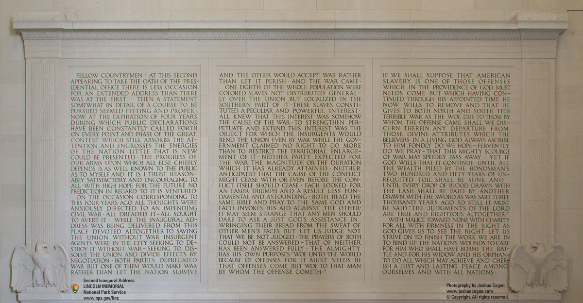
3.  If, as I argue in this essay, Leavitt set his American apple upon a generalize map of the battlegrounds of Civil War America, it seems almost unnecessary to call attention to the shadow cast by the apple  — the shadow of death and mourning — falling across the land. The apple cannot escape from the narrow shelf; its fate awaits. Three years later, mourning the spilling of every drop of blood, ruminating on the terrible course of events, Lincoln sadly recalled: … AND THE WAR CAME.

.

One New Acquisition (and two discoveries)

Sunday, September 9th, 2012

.

This spring I added a piece to my collection of mid-19th-century oil sketches by American artists. The painting, by William Hart (1823-1894), is an oil on canvas, 12 by 19 1/2 inches, titled “Rocks on the Shore.”

.

.

Sometimes it takes time for a work of art to reveal its hidden beauty, not to mention the circumstances of its creation. This painting is a good example of a slow reveal.

So far I’ve been led to two revelations.

*  *  *

The first discovery emerged when I decided to uncover the work’s original appearance. A century and a half of accumulated dirt and time-yellowed varnish had obscured its glow. As always I relied on the technical skills of Arthur Page, a veteran painting conservator. His studio removed the grime and old varnish that had veiled the artist’s original accomplishment.

This photo is from an early stage of conservation treatment (note the upper left quadrant).

.

.

The result of the cleaning was striking. Revealed was a fresh, high-keyed painting of a bright day that attracts the viewer’s eye. The scene Hart depicts has an immediate impact. This is a sign of a fine plein air sketch — a painting completed, or at least begun, in the open air, as the artist engages in a face-to-face encounter with the natural environment, discovered here-and-now.

.

.

Some of the details that emerged, brightly:

.

Signature in the lower right corner

.

Pencil outlines

.

Hart’s facility in handling a colorful, paint-laden brush

.

The artist’s attention to the smallest phenomenon, such as grasses rooted in the boulder’s crevices (click on photo for enlargement)

.

*  *  *

The second discovery I made was the location Hart chose to capture in paint. As I’ll explain, the path to a final determination of that site was not smooth, because the search was first waylaid by a false identification made by an art historian.

Aside from the artist’s signature, no other inscriptions appear on the canvas, verso or recto, nor on its original stretcher. This meant finding the scene’s location and the date Hart painted it would have to depend on information external to the work itself.

The auction catalog’s description of the piece contained a bit of speculation:

“This fine example of the subject [a rocky shoreline] by Hudson River landscapist William M. Hart [sic: William Hart never used a middle initial; “WM” is how he abbreviated “William”], a Scottish emigre who settled with his family near Albany, New York, […] probably records a spot of coast in Maine, near Grand Manan where he frequently painted.”

I, too, thought Maine was a good guess. But exactly where in Maine? Surely such a dramatically-wrought promontory, whose every cut and curve, plane and shadow, was meticulously traced by Hart’s eye and hand, must be some familiar spot. It must have been known and appreciated by Hart’s fellow itinerant artists who traveled up and down the New England coast in search of scenes of picturesque and sublime content. What other artists were drawn to record this vista? Did their works survive?

Surfing online for answers, I found a few other examples of Hart’s own paintings of sites where rock terrain met the sea.

.

.

.

.

But these paintings were of different formations, and none of the information connected to them pointed to the location of my painting.

Then, a Eureka moment — or so I thought at the time.

Paging through John Wilmerding’s “The Artist’s Mount Desert: American Painters on the Maine Coast” (1994) (currently out of print), I came to the chapter devoted to William Stanley Haseltine (1835-1900). Haseltine, like Hart, was a member of the second generation of the Hudson River School, America’s first native school of landscape painting. He is best known for his precise renderings of the rocky coast of New England. Starting in the late 1850’s and continuing well into the next decade, Haseltine traveled from Rhode Island’s Point Judith to Maine’s Mount Desert Island, along the way executing drawings and oil sketches that he then used as source material for larger works he would complete in his studio. Bold rock formations were his inspiration.

On page 112 of Wilmerding’s book there is an illustration of one of Haseltine’s many beautifully-rendered drawings from 1859. It is titled, “Thunder Hole, Mount Desert Island” (pencil and grey wash on paper, 15 1/8 x 21 9/16 inches, private collection):

.

.

If you examine the central monolith in the drawing and compare it to the William Hart painting you will discover — it is a match!

*  *  *

When Haseltine recorded this view of a massive rock formation overlooking the sea, it appears he stood further back from the water than where Hart managed to climb. Haseltine also positioned himself a bit to the right. This resulted in slightly less than the entire huge craggy mass at the apex of the composition being visible, when compared to the view recorded by Hart. Regarding that dominating monolith, there’s no mistaking the fact that it revealed  the complexity of its facets to Haseltine and Hart in identically clear fashion. I’m hard-pressed to find any significant differences.

.

.

.

.

.

.

.

.

.

Both artists recorded the site at about the same time of day; the sun casts shadows of similar direction and depth. Yet of the two artists, I sense Haseltine, ever the geologist, was the more faithful transcriber of the position and shape of the flanking structures on the left and right. Hart, less a literalist, seems to have taken liberties in portraying the structures to the left and right of the focal point whose beauty most intrigued him. This is also understandable when you consider Haseltine’s aesthetic approach when drawing with pencil and ink wash involved creating an interesting black, grey and white design that floats upon the white expanse of a flat sheet of paper. To the extent Haseltine wanted to reformulate the actual scene in front of him, he could accomplish that without rearranging the physical matter before him, but by modulation of tone — assigning various shades of grey to each stationary element in service to his two dimensional design. Hart proceeded differently. In creating his sketch in oil paints, he enjoyed the added resource of color. While generally respecting the fidelity-to-nature imperative of mid-19th century painting, Hart would allow his composition to stray from the actual. He felt free to rearrange matter at the behest of other, superior values.

In a later chapter in “The Artist’s Mount Desert” (pp. 129-130), Wilmerding grants only passing mention to William Hart (applying to him words of faint praise such as “competent” and “clever in a modest way”), though he does say that records exist showing Hart was painting at Mount Desert from 1857 to 1860.

With these bits of evidence falling into place (and with Wilmerding’s ostensibly reliable scholarship), I was fully prepared to re-title this William Hart painting, “Thunder Hole, Mount Desert” (ca. 1859).

And yet there was something that bothered me — a nagging question arising from a practical observation. It was this:

Why does Thunder Hole look so different today?

*  *  *

Today, Thunder Hole is a tourist stop for visitors to Acadia National Park on Mount Desert:

Nothing symbolizes the power of Acadia National Park as much as Thunder Hole does. When the right size wave rolls into the naturally formed inlet, a deep thunderous sound emanates. The cause is a small cavern formed low, just beneath the surface of the water. When the wave pulls back just before lunging forward, it dips the water just below the ceiling of the cavern allowing air to enter. When the wave arrives full force, it collides with the air, forcing it out, resulting in a sound like distant thunder. Water may splash into the air as high as 40 feet with a roar!

Videos of the phenomenon are available here and here.

Thunder Hole is on the east side of the Island, south of Sand Beach and just north of Otter Cliff:

.

.

Changes in light and moisture can alter the color of the cliffs from grey to pink, orange, even red:

.

.

.

Dynamics defined the site. But still I wondered, had the erosion of wind and water so altered the structures meticulously depicted by Haseltine and Hart that, today, the distinctive central rock formation has been transformed into . . . this?

.

.

I didn’t think so.

*  *  *

Nearly two hundred miles to the southwest of Mount Desert Island, on a peninsula called Nahant on the coast of Massachusetts, a remarkable geological formation greeted the rising sun. The formation was known familiarly as Pulpit Rock, and it attracted generations of tourists until it, along with a Natural Bridge connected to nearby rocky features, were destroyed in a fierce winter storm in February, 1957.

In the nineteenth century, among the many American artists drawn to Pulpit Rock was William Stanley Haseltine. In 1865 he finished a major oil painting that depicted the scene with reverential awe, backlighting the principal rock with divine illumination (Pulpit Rock, Nahant, 1865, oil on canvas, signed and dated ‘W.S.Haseltine/1865’ (lower right), 28 by 49 3/4 inches; the basis for the title is discussed in the Overview and Lot Notes sections of an auction catalog listing, here):

.

.

Competing with artists to memorialize the site were early photographers. Many photographic views of Nahant’s Pulpit Rock and Natural Bridge were published during the post-Civil War craze for stereoscopic views .

.

.

.

.

s-l1600

.

Pulpit_Rock,_Nahant,_from_Robert_N._Dennis_collection_of_stereoscopic_views

.

If you compare the first of the stereoscopic views of Pulpit Rock, above, with the drawing Haseltine made a decade earlier, you will discover — the location is a match.

.

.

.

It’s likely Haseltine used his 1859 drawing as a reference when, six years later, he began to compose his studio painting, Pulpit Rock, Nahant, although for the latter work he chose to strip away all but the central monolith, in effect de-cluttering the site for dramatic impact.

Other American landscape and seascape artists were lured to the notorious location to record Pulpit Rock from a variety of perspectives, including Thomas Cole, whose quickly rendered sketch is available here. Later in the nineteenth century, William Trost Richards positioned himself on a vantage point similar to that of the photographer of the third and fourth stereoviews, above. The result was a small watercolor (Pulpit Rock, Nahant, signed with initials ‘W.T.R’ and dated ’76’ lower right, inscribed with title lower left, 6 x 5 inches).

.

.

Souvenir postcards continued to spread images of Pulpit Rock and Natural Bridge into the twentieth century.

.

.

.

* * *

Plainly, Wilmerding was in error when asserting that the drawing by Haseltine illustrated on p. 112 of “The Artist’s Mount Desert: American Painters on the Maine Coast” was a sketch of Thunder Hole on Mount Desert Island, Maine. What’s especially regrettable is that at pp.  118-119, in his explanatory text interpreting the drawing, Wilmerding weaves an elaborate commentary premised entirely on an erroneous identification of the site. He concludes, “this drawing achieves a particularly powerful sense of location, capturing the face and personality of Thunder Hole.”

The question also arises: Where were the book’s editor and its pre-publication readers? Were they unfamiliar with the Nahant’s Pulpit Rock and its depiction by American artists?

Is there an inscription on the Haseltine drawing that may have misdirected Wilmerding and others? If so, that adds another demerit to the situation — namely, the frustratingly incomplete information Wilmerding and the book’s editor(s) chose to provide to interested readers of “The Artist’s Mount Desert.”

Here is the full description of the Haseltine drawing found in the book’s the list of Illustrations (p. 188, ill. 110):

“110. William Stanley Haseltine, Thunder Hole, Mount Desert Island, 1859. Pencil and grey wash on paper, 15 1/8 x 21 9/16 in. Private collection.”

This description presumes to assign an accurate title — Thunder Hole, Mount Desert Island — to the work. Yet, in an ostensibly scholarly context, the reader finds no information supporting the title given to this object — none of the information that, nowadays, even commercial auction houses provide when inventorying and cataloging a drawing of this caliber. Such data include:

Whether the piece is inscribed with a title, and if so, where (in this case, no inscription is visible to the reader in the reproduction of the drawing on p. 112);

What medium was used in making the inscription (pencil, ink, other);

Whether the inscription appears to have been made contemporaneously with the drawing’s completion, or whether there is something to establish or suggest that the inscription was added years later; and

Whether the inscription is by the hand of the artist, or by another hand, and if the latter, whether that person was someone knowledgable about the artist’s work (e.g., spouse or other family member, executor, knowledgable collector or scholar).

Information of this kind is essential to provide a base for subsequent scholarship.

Attention to these fine points is not an exercise in minutiae. It is a discipline that helps to avoid factual error.

.

I have retitled my William Hart painting, Pulpit Rock, Nahant, ca. 1859.

.

On Seeing “Death of a Salesman” in NYC

Sunday, May 20th, 2012

.

.

Yesterday afternoon I attended a performance of Arthur Miller’s “Death of a Salesman” at the Barrymore Theatre. The cast of 14, directed by Mike Nichols, was headlined by Philip Seymour Hoffman (Willy Loman), Linda Emond (Linda Loman) and Andrew Garfield (Biff Loman).

The anticipation of a crowd of eager theatre-goers as they entered the theater is something I tried to capture in a video, uploaded here. What I cannot adequately capture is the general force and impact of the production we saw.

Instead, here are particular things that struck me:

Numbers.  Someone could write an entire essay on the use and meaning of numbers in “Death of a Salesman.”  Years, ages, dimensions, limits, prices and payments — the script is chock-full of them. The characters measure their lives with numbers. From the early flashback scene in which Linda recites the household bills needing to be paid (16 dollars on the refrigerator, nine-sixty for the washing machine, three and a half on the vacuum), to the later scene when Willy’s neighbor Charley lends him support (the usual 50 dollars plus, this time, 110 to pay for insurance), all the way through to an ending where we find Willy wondering over his life “ringing up a zero,”  you can hardly catch your breath before some new numbers are announced, debated, corrected, and chewed over some more. There are the sinking salary requests made by Willy as he pleads with Howard to keep him on the payroll after he’s “put 34 years into this firm.”  Willy starts at 65 dollars a week (“I don’t need much any more”), then lowers himself to 50 (“all I need to set my table”), then bottoms out at a beggarly 40 (“that’s all I’d need”). There are Linda’s imprecise references to Willy’s age (is he 60 or 63?); Ben repeating the limits of his jungle adventure (17 when he walked in, 21 when he walked out); and Willy’s precise recollection of lumber stolen for a home improvement project (those beautiful 2-by-10s). We hear of Biff’s failing math grade of 61, just 4 points way from passing — those 4 points something Willy declares he’ll gain for his son. Then a circular debate over how much of a loan Biff should request from Bill Oliver (10 thousand? 15 thousand?). There’s Linda’s mention of their 25-year home mortgage (she’s compelled to note that Biff was just 9 when they bought the house). Amid this onslaught of figures, our apprehension grows. Are numbers for Americans the preferred way to follow and ultimately judge a life?

Insurance. When, in order to aid his elder son, Willy strikes a bargain with death — twenty thousand dollars from an insurance policy (those numbers again!) — there is an echo of the climactic plot device in Clifford Odets’ “Awake and Sing,” in which a no longer useful man similarly chooses a disguised suicide to bankroll the future of his grandson.

Athletics. How fine and assuring it was to be an audience member watching Hoffman, Garfield and Finn Wittrock (who played Hap Loman) in an early flashback scene as they tossed a football around, between stage left and stage right, in a precise, easy manner.

Comedy 1. There were some awkward bursts of laughter from the audience, as when Willy repeatedly berates Linda when she tries to join in the family conversations. His bullying putdowns got laughs that were scarily undeserved. I wonder whether this was simply embarrassed laughter from otherwise psychologically astute adults who were already on to (and forgiving of) Willy’s gross and contradictory ways? I’m not sure. I think another factor might be our collective exposure to years of TV situation comedies where belittling is a staple, where similar putdowns are accompanied by canned laughter. The two times when Hap interjected his inapposite news — “I’m getting married, Pop!” — the audience roared with laughter. Were some among us hearing the voice of TV’s womanizing Joey Tribbiani (Matt LeBlanc), interrupting the banter of his Friends with yet another impossible statement?

Comedy 2. Yet how truly funny Miller can be, funny intentionally and on his terms, as in the restaurant scene in which the headwaiter, Stanley (Glenn Fleshler), tosses out  a handful of lines that anticipate Neil Simon.

Blocking. For this production Nichols resurrected the set designed by Jo Mielziner for the original 1949 production. His direction featured blocking that places an emphasis on the actors’ profiles, from our viewing perspective. I’m guessing this was dictated by the set design, but I wonder whether it also is a borrowing from Nichols’ film direction. There are superb details. The last time we see Willy he is in his hoped-for garden. Centered down-stage, he looks straight ahead into the audience, talking not to himself (remember Miller conceived of the play as taking place in Willy’s skull) but in these final moments to us. This I thought was a perfect thing.

The lines we all know, still new. How right it was for Linda Emond not to specially deliver, not to call special attention to, her  attention must be paid lines. How right a choice it was for her to allow those words to emerge as a seamless part of her argument for loyalty.  How right her decision to permit those words to appear new, just as they were received as new by audiences attending the original production. The same sureness was evident during her speech at the funeral scene, done so quietly, a simple “I can’t cry . . .”.

Delayed catharsis. Then something occurred I’d never seen before at a staged performance of a tragedy. When the tragedy is ended and the curtain falls and then rises to reveal the cast, by convention the magic is broken and we return to our lives. But at the end of this “Death of a Salesman,” the full cast of 14 appeared linked hand-in-hand, and the entire troupe was dour faced. The four principals stood before us in the middle of the line with faces frozen in the very same shock, sorrow, and grief of the funeral scene. They remained so. Our loud standing ovation could not break the cast’s concentration, could not entice them to adopt the ecstatic mood of our side of the proscenium. Catharsis would not be shared just yet. It was as if a spell had taken hold of the actors and would end only if we sufficiently witnessed their pain. And so, after what felt like minutes, the focus resolved on Hoffman, who moved ever so slightly forward. The burden lifted when he smiled with pride.

.

.

Also in attendance. At play’s end, after exiting the row, I noticed the actor John Turturro walking up the aisle behind me, and though I tried my best to overhear the conversation he was having with others about the performance, I was not close enough to hear particulars. Drat. A compensatory thrill came earlier.  Sitting in seat K-115, the aisle seat, was an elderly gentleman who, I learned, was 97 years old. His caretaker, a young woman, sat between us. After he cracked a joke about hoping to see at least three more years’ worth of  plays, I asked if he had seen this play before. Yes, he replied, he saw it during its first Broadway run. (That would have been in 1949 or 1950!)  I wanted to ask if he would tell me more of what he remembered, but the show was about to start and he had turned his attention to the stage.

Trivial questions I have.  What is Linda’s backstory? Was Willy eligible for Social Security benefits? What are the odds the insurance company will successful rebuff the family’s claim? Viewing the Loman house as a character, were Miller and Mielziner familiar with the illustrations Virginia Lee Burton created for her 1942 children’s book, “The Little House“?

Why did this production succeed? A revealing, hour-long interview with Nichols and his three leads, conducted when the when the play was still in rehearsal, can be found here.

Time for effusiveness.  The topmost quotation in the sign posted next to the stage door is right on the money. Hell, the whole sign is right on the money:

.

.

“The Collected Writings of Joe Brainard”

Sunday, April 1st, 2012

.

.

A Special Publication of the Library of America, this is a generous volume. It contains a three-page preface by the book’s editor Ron Padgett (a poet whose friendship with the author dates back to their high school days in Tulsa, Oklahoma); a ten-page Introduction by novelist Paul Auster; followed by over 500 pages of writings interspersed with the author’s own drawings and cartoons. Rounding out the book are pages of helpful editorial content: a Chronology; a Note on the Texts; and a Glossary of Names. The names belong to fellow artists, writers, dancers, musicians and associates mentioned by the shy-but-gregarious, serious-but-gossipy, frivolous-but-solemn, Joe Brainard.

The volume leads off with I REMEMBER, the autobiographical book Edmund White once labelled “a completely original book” and Paul Auster calls “a modest little gem.” There is an undeniable charm and relentless spell to it. Baby Boomer readers especially will be nodding their heads non-stop in recognition:

“I remember putting on sun tan oil and having the sun go away.”

“I remember catching lightning bugs and putting them in a jar with holes in the lid and then letting them out the next day”

“I remember Christmas cards coming from people my parents forgot to send Christmas cards to.”

“I remember red rubber coin purses that opened like a pair of lips, with a squeeze.”

“I remember wax paper.”

Over the years the simple template of I REMEMBER has influenced thousands of students in American creative writing classes, jump-starting imagination. Foreign writers too have followed its trail. One is Édouard Levé, whose Autoportrait is a pour of thousands of self-contained, self-referential declarative sentences — chips off the Brainard block.

And yet I REMEMBER fills only the first quarter (pages 3-134) of this Collected Writings volume. The bulk of the book falls into the category of Miscellany. To get a sense of the scope of these nearly 100 pieces, see the book’s Table of Contents on the Library of America site, here. Truth to tell, these pieces, which cover the hunt for love to the hunt for cigarettes and everything in between, include many misses among the hits. Take for example the illustrated piece on page 391 entitled “Matches.” It reads in its entirety: “If I strike say 60 matches a day (and I do) in a year’s time that would be — let me see — that would be — I hate math.” But the prevailing tone is a winning youthful energy, casual, humorous, miniaturistic. In his 1971 “Bolinas Journal” (reprinted at pages 285-333), he revealed his credo as simply “trying to be honest.”

Without doubt this book will appeal to Brainard “completists” — readers so taken by the delights of “I Remember” that from this intimately personal raconteur, from this easy sharer of confidences, they demand to hear more, more, and more.

The critic Michael Dirda recently observed that while THE COLLECTED WRITINGS “may not be a fully canonical Library of America title,” it is still “a superbly engaging bedside book.”  I agree. After the opening section devoted to the minimalist yet somehow magisterial “I Remember,” this becomes a book to be dipped into at leisure.

A note to readers who care about books as objects, especially the matter of their binding: Unlike volumes in the main Library of America series which are Smyth sewn (allowing you to open the book wide and bend back the covers without “breaking” or otherwise harming the binding), THE COLLECTED WRITINGS OF JOE BRAINARD is a “Special Publication” that features a different design and production. The trim size is larger (good), but notch binding is used here, a disappointment as it renders the book less elegant than regular LOA volumes.

I see I’ve used a lot of numbers in this review. A final one is 52. That is the age of this still-young author at the time of his death in 1994. The coldness of numbers masks the warm effect of THE COLLECTED WRITINGS OF JOE BRAINARD. In its pages you meet a big-hearted guy.

.

[A version of this review appears on Amazon, here.]

.

04-07-2012: This morning I came across an adoring review by Alberto Mobilio in the April/May 2012 online issue of Bookforum, here. Mobilio argues, convincingly, that “I Remember” is best read as an incantatory poem, one that epitomizes “that peculiarly American aspiration to self-mythologize in the face of an otherwise relentlessly quotidian world.”

“Spring and All” by William Carlos Williams

Friday, November 25th, 2011

.

.

Spring and All was first published in France in 1923 in an edition of 300 copies. Years later Wallace reflected on the book’s nonchalant, playful debut:”‘Nobody ever saw it — it had no circulation at all — but I had a bit of fun with it … Chapter headings are printed upside down on purpose, the chapters are numbered all out of order, sometimes with Roman numerals, sometimes with Arabic, anything that came in handy” (I Wanted to Write a Poem, pp. 36-37).

If you covet a one of those first edition copies, in fine condition, be prepared to shell out a thousand dollars or more.

The book’s contents have reappeared in subsequent Williams compendiums, but for those of you with a book collector’s sensibility, and for poetry readers who seek transport back to an earlier cultural era via the objects of that era (test: were you wide-eyed drinking in the set designs in Woody Allen’s “Midnight in Paris”?), this facsimile edition is the next best thing to holding the original.

In the decades since its original publication there’s been no shortage of sophisticated critical analysis of the meaning and significance of SPRING AND ALL. My amateur thoughts include a belief that the book’s once unorthodox mixture of prose and poetry sections has less power to bother readers of today. In the prose sections I grew to appreciate the gaps, the churn, the elisions, the introduction and abandonment of thoughts: we are witnessing a mind doing its work. When Williams delivers fully formed thoughts his breathing is apparent: I heard not the nervous, arhythmic and shallow breaths of today but the inhalations and exhalations of an earlier America, deep and full and sufficient to the ideas whose communication they carry.

I happen to like his use of commas.

There are stretches that have a dated feel (remember, the freshest cataclysm infecting Williams’ world view was The Great War) and some of his affections are now obscure (how many know who Dora Marsden was; or Alfred Kreymborg, whose writing Williams declares “still has value and will tomorrow have more”?). But hail the author’s ready audacity, as when he draws a broad conclusion about modern art trends by looking at a reproduction of a single painting by Juan Gris — and that reproduction not in color but in black and white! Especially in its epigrammatic statements on art and life, there is an affinity between Spring and All and Robert Henri’s The Art Spirit.

You reach page 74, Chapter XXII. You pause. It’s as if you’ve been meandering down a museum’s long corridor of displays of things interesting and things not so interesting and then you’re directed into an intimate side-room and brought face to face with a solitary object that hits you, your eye, your mind, with unexpected force: a sixteen-word poem about a red wheel barrow whose haiku economy proceeds to gestate in your presence.

To speak of the book itself, as physical object: it is sure to please. More meaty than the proverbial slim volume of poetry (it’s over 100 pages), this facsimile is finely constructed with clearly printed text on cream paper, wrapped in powder blue-gray covers that have a mysterious, sensuous, suede-like feel.

Williams writes: “The better work men do is always done under stress and at great personal cost.”

Let this better work be your pleasure.

.

A version of this review appears on Amazon, here.

Rilke on Rodin

Tuesday, September 6th, 2011

.

.

Here is a volume smartly conceived by its small press publisher, Archipelago Books. The book is nearly square in size to accommodate long-lined text printed on quality paper. It is sturdily bound in a partial cloth binding. This has the look and feel of a gift book, and one with the surprise of sophisticated content. If the editor’s plan was to see what happens when you assemble in one package the work of three powerful communicators — a living master essayist on matters literary, a titanic sculptor who ushered in new forms, and a poet striving to understand and explicate the invisible — that plan succeeds in sparking insights.

The book opens with an Introduction by William Gass, a long-time Rilke maven and an unsparing arbiter of things cultural. Gass stylishly fulfills his setting-the-stage duty. Using multiple perspectives (historical, aesthetic, biographical, psychological) he helps the reader understand why the young poet developed an awed appreciation for Rodin (the man and his work). We learn how Rilke absorbed the sculptor’s personal and aesthetic credo (“il faut travailler, rien de travailler”) with lasting effect on his mature poetic output.

All that Rilke learned from Rodin he expressed to the world in two significant pieces which make up the bulk of this book: an essay written at the very start of his personal association with the elder artist in 1902; and a public lecture written at the end of their relationship in 1907. Daniel Slager provides fine new translations from the German of both of these texts. Also found tucked within the pages of this book are four groups of eight glossy color photographs by Michael Eastman: a total of 32 close-up images of major pieces by Rodin that Rilke (and Gass) discuss.

The book contains 88 pages of text; this modest nominal count is misleading since in fact the material is the equivalent of about 150 pages in a standard-sized book. As a reading experience the book feels large thanks to the breadth of Professor Gass’ encyclopedic observations, paragraph after paragraph, and thanks to the seemingly unstoppable eruption of Rilke’s insights, sentence after sentence. Rilke reconnoiters the mountain of Rodin, tossing off witticisms (“Fame is no more than the sum of all the misunderstandings that gather around a new name”), evocative imagery (on The Burgher of Calais: “The figures withdraw within themselves, curling up like burning paper”), and grand judgments (“The artist’s task consists of making a world from the smallest part of a thing”). There are extended passages, describing pieces of art and art making, in which Rilke’s prose itself achieves a mountainous beauty.

True, the pieces that make up this assemblage are available elsewhere: Rilke’s essays are available in other volumes (for example, Where Silence Reigns: Selected Prose); Gass’s Introduction is reprinted in his book of essays, A Temple of Texts (American Literature Series); and there are many illustrated art books devoted to Rodin’s work. But as a package, I consider this particular book to be a fine and rewarding enterprise.

.

“Lunch Poems” by Frank O’Hara

Friday, August 5th, 2011

.

.

Frank O’Hara’s reputation seems caught in a holding period, an awkward stage preliminary to his work becoming universal and timeless. Consider, for example, the final scene in the opening episode in the second season of “Mad Men,” the cable TV series set in the world of advertising as practiced in New York in the early ’60s. We see the show’s protagonist, Don Draper, picking up a slim volume of O’Hara’s poems (“Meditations in an Emergency,” 1957). He recites the final lines from “Mayakovsky.” There is an ambivalence to the scene. Was O’Hara chosen less for the intrinsic merit of the poetry than to set an easy marker for a zeitgeist, the same thing the producers accomplish by highlighting the period-specific cut of Draper’s suit and hair? With friends like these, will O’Hara ever escape the mannerist ghetto of the “New York School“?

And so some readers may pick up “Lunch Poems” (first published in 1964) after seeing it praised as an emblematic cultural document of mid-twentieth century America. Yet even if the time-bound aura of O’Hara is the come-on, what makes you stay enthralled in his circle is his voice — a “thinking” voice as vitally American as Whitman or Frost.

There are 37 poems in “Lunch Poems” and their quality as well as their accessibility varies. The poems span a period from 1953 to 1964. This book is not a “best of” O’Hara collection, yet it does contain what may be his most durable poem.

A few of these short pieces are so recondite that they lose me. In a few others O’Hara raises an opaque scrim to suggest beauty beckoning from the other side, and these poems begin to “click” only after multiple readings. But the majority of the poems are freshly-minted coins granting immediate access to a lively, urbane worldview. While general knowledge of the New York cultural scene in the ’50s and early ’60s is helpful, these poems, at their best, easily communicate to us in a way undimmed by the passage of time.

Here is an endless succession of the poet’s friends, lovers, artists, musicians, and the parties, meals and conversation they create. Here are O’Hara’s travel experiences and his love of foreign languages (you could write an essay on the myriad uses of French in O’Hara’s poetry). The man wears his erudition lightly on his sleeve. He’s enamored by both the high and the low in American culture: “I am ashamed of my century for being so entertaining but I have to smile” (Naphtha, 1959). Another poem from the same year, Rhapsody, contains a premonition of his early death (at age 40) a few years later: “I historically belong to the enormous bliss of American death.”

Most delightful are his street-level ruminations, spinning in all sorts of directions, nurtured during mid-day breaks away from his curatorial duties at the Museum of Modern Art. A typical flight occurs in A Step Away From Them, which begins: “It’s my lunch hour, so I go for a walk among the hum-colored cabs.”

A new survey ranking the most walkable cities in America placed New York on top. Teju Cole’s recently published novel, “Open City,” set in contemporary Manhattan, is a current example of a continuing tradition of perambulating literary protagonists. A half century ago, O’Hara was walking these same streets, looking, speculating, daydreaming about the city. A fragment in an untitled poem from 1959 asks, “Where does the evil go when September takes New York and turns it into ozone stalagmites deposits of light?”

The cityscape serves as a platform for accessible philosophizing, as found in one of his best works: “The Day Lady Died”. Is there another poem where so much meaning resides in its title? At first glance the title rattled me, threw me off stride. In it I heard a rhythm, but an uncertain one. Then came the answer hit me: simply reverse “Day Lady” to reveal “Lady Day” — the nickname of blues singer Billy Holiday, whose dark night of the soul ended in 1959. The displaced “day,” her missing “day,” had to be displaced, it had to go missing from O’Hara’s page. The text of the poem recounts the day the poet walked the streets and avenues of Manhattan attending to errands. These everday events end when he spies a tabloid newspaper’s front page announcing Holiday’s death. It is the day after death, the first of many days denied her.

In the poem’s final stanza — in which O’Hara recalls hearing Holiday perform at the Five Spot Café — he accomplishes a wonder. He turns death into something other than displacement and omission. Memory overpowers death, converging time present and time past.

.

(An abbreviated version of this review is posted on Amazon, here.)

Edward Hopper’s “Approaching a City”

Saturday, July 23rd, 2011

.

This morning I discovered that the British newspaper, “The Independent,” has for the last several years been publishing a weekly series of short essays on individual works of art. The ongoing project’s name is “Great Works.” From what I’ve seen and read, most of the selections are interesting pieces you’re not likely to have come across in Janson or Gardner art history texts. The last 12 months’ profiles of paintings, sculptures and other works of art are available for reading online, here. Recently, art historian Michael Glover has taken over writing duties from Tom Lubbock, continuing a tradition of elegant and intelligent analyses.

Last month Glover contributed an appreciation of  “Approaching a City” (1946), an Edward Hopper painting that now hangs in the Phillips Collection in Washington, DC.

.

.

Glover’s passionate analysis of the formal and thematic aspects of the work reminds me of the large rewards that every great Hopper painting surrenders to the discerning eye. Stand openly and patiently before a Hopper painting and you will experience muteness giving way to tantalizing meanings. Such is the case with this mysterious, unpeopled urban landscape.

Mr. Glover’s piece inspired me to share some thoughts of my own.

What I see in “Approaching a City” is an artist using the static medium of an easel painting to comment on the temporal, to upend our notion of time’s arrow, and, finally, to question the very American credo of progress. A tall order, yet Hopper manages all of this through the simple arrangement of buildings in the background.

What Hopper constructs in the upper portion of the picture is essentially a timeline, but one in which the conventional proposition (left to right = past to future) suffers a reversal. If you decide to read the frieze “backward” (from right to left) you will find yourself in the comfortable position of keeping chronological time. In the right margin you see huddled a pair of urban townhouses. These dwellings appear to date from the 18th or early 19th century (possibly from the Federal period) and they exhibit pleasantly solid forms, although their shutters have been lost and their brick fronts are now white-washed. To their left is a later 19th century residential building. It is two stories taller and retains architectural adornments such as a cornice, stone lintels, and warm brick facing. Side by side, you see that these are human-scaled, human-purposed structures.

Then, as you move again to the left, you encounter a gap. Even though the abutment of the railroad underpass obscures a street level view, you intuit this gap to be a cross-street. But you sense it is much more than that. For across this divide is a massive 20th century structure: artless, soulless (its fenestration dead-eyed), brutally concrete. It has laid siege to all remaining territory, even unto the sky. It is a chilling vision. If, in revulsion, you turn your eyes back to the right side, the twin dwellings will appear to be in protective hiding, cowering in fear of the future onslaught.

Hopper’s architectural tableau is a statement of decline, of devolution. What was Hopper thinking about? Our culture? Our politics? Our moral sense?

.

Additional notes:

1.  If anyone doubts my opinion of the rich rewards of Hopper’s paintings, ask yourself what other artist produced a body of paintings sufficient to form the basis for an opera?

2. In his essay, Michael Glover notices how the painting does not allow the viewer to rest contentedly anywhere on its surface. This is agonizingly so in the foreground: “Our gaze keeps shifting leftwards as if we are afflicted by some kind of a tic that jerks our head in that direction, as if we are being forced to acknowledge and inspect, again and again, that sucking promise of blankness, blackness” of the left-side tunnel. I thought it interesting that Glover assumes we are all destined to be drawn into the tunnel, that trains will descend into its maw. Speaking objectively, it is a matter of simple statistics that it is equally probable that a train we are traveling on will emerge from this tunnel. But emotionally I think Glover is correct. There is a sinister air of dread to the tunnel, indeed an air of surrealistic upheaval, that makes us think the darker direction is more likely. Compare the unlikely fate of Magritte’s train engine which happily emerges into domestic comfort.

3. In examining different stratum of time, time present and times past, Hopper can be seen as participating in a pessimistic strain in American thought and culture. It is of a piece with F. Scott Fitzgerald (“And so we beat on, boats against the current, born back ceaselessly in the past”) and Woody Allen (The “Midnight in Paris” visits to between-the-wars and Belle Epoque eras).

4.  Hopper painted “Approaching the City” in 1946, which I think is significant. Most Americans had reason to believe 1946 marked, finally, an awakening from years of nightmare: world-wide economic Depression, the rise of totalitarian regimes, the Holocaust, the horrible destruction of WWII. Surely some optimism was deserved. Was Hopper not of this view? Did he paint “Approaching the City” as rebuke to, if not an explicit rejection of, healing and recovery? I’m thinking now of Winslow Homer, who welcomed an end to the Civil War’s horrors in a different fashion. Here is “The Veteran in a New Field” (1865):

.

.

The Manifesto We Deserve?

Sunday, June 26th, 2011

MANIFESTO: “a written statement declaring publicly the intentions, motives or views of its issuer.” (From the Merriam-Webster online dictionary, online here)

The anonymous, post-modernist hacker collective, LulzSec, would probably disagree, but I believe one can view group’s interim and final missives to the world as Manifestos for today. If every era coughs up the material it deserves, our day commands a manifesto mixing high and low, coherent and incoherent, rational and irrational. LulzSec sees the man in the mirror:

For the past 50 days we’ve been disrupting and exposing corporations, governments, often the general population itself, and quite possibly everything in between, just because we could. All to selflessly entertain others – vanity, fame, recognition, all of these things are shadowed by our desire for that which we all love. The raw, uninterrupted, chaotic thrill of entertainment and anarchy. It’s what we all crave, even the seemingly lifeless politicians and emotionless, middle-aged self-titled failures. You are not failures. You have not blown away. You can get what you want and you are worth having it. Believe in yourself.

The pull of the Sirens’ call is undeniable:

[B]ehind the insanity and mayhem, we truly believe in the AntiSec movement. (…) We hope, wish, even beg, that the movement manifests itself into a revolution that can continue on without us. (…) Please don’t stop. Together, united, we can stomp down our common oppressors and imbue ourselves with the power and freedom we deserve.

.

(A review of my previous favorite manifesto, that of Thompson Hotels, is found here.)

“Between Parentheses: Essays, Articles, and Speeches, 1998-2003” by Roberto Bolaño

Sunday, June 12th, 2011

This collection of non-fiction pieces is a treasure-trove for anyone who has read Bolaño’s fiction and who came away smitten by the author’s vibrant, mercurial, poetic voice.

Some elements of Bolaño’s novels and stories — their settings, aspects of their storylines, their narrators or chief protagonists, and their spirit of inquiry — are grounded in autobiography. This is especially true of the novels, “The Savage Detectives” and “Antwerp.” Bolaño’s friend and literary executor, Ignacio Echevarria, who has assembled the 125 pieces found in “Between Parentheses,” addresses this subject in his helpful Introduction to the book: “This volume amounts to something like a personal cartography of Roberto Bolano and comes closest, of everything he wrote, to being a kind of fragmented ‘autobiography’.”

Stated more broadly, there was, for Bolaño, no bright line between fiction and non-fiction.

What this means is that seasoned readers of this author will comfortably enter and enjoy the world of these essays, speeches, newspaper columns, travel articles, and other occasional pieces. If the reader perceives anything different it is that here the voice they have come to expect — opinionated (“plagiarists deserve to be hanged in the public square”), argumentative (a writer friend praises John Irving, but this is “an enthusiasm that I don’t share”), passionate (his love for his soon-to-be-orphaned son shines bright), and a bit of a rapscallion (“one of the best ways to steal . . . I had learned from an Edgar Allen Poe story”) — is even closer to the essence of “I, Roberto Bolano.”

In a piece from 1999, the autodidact Bolaño declares: “I’m much happier reading than writing.” His admiration is clear whenever he’s able to mention that this friend or that acquaintance “has read everything.” As for the scope of his own reading and interests generally, this is demonstrated by a nine-page Index that completes “Between Parentheses.” The Index contains the names of over 600 persons, including musicians, filmmakers, and artists. But mostly there are authors, among whom is a strong contingent of Americans Bolaño read with critical fervor.

These pieces were written during the period after he had been diagnosed with a fatal liver disease that in 2003 would take his life. It is no surprise, then, that a theme he returns to time and time again is the question of what constitutes a well-lived life. When describing someone’s accomplishments, for example, if he wants to impart his ultimate compliment he will write, “. . . and he was also a good man.” (George Orwell is one such man.) His critical gaze does not spare himself, his foibles and his imperfect works. In contrast, politics holds little appeal (although there are a few columns about the situation in his native Chile). When, in the final piece in the book, he is asked by an interviewer what things bore him, he answers: “The empty discourse of the Left. I take for granted the empty discourse of the Right.”

We learn that “By Night in Chile” was originally titled, “Storms of Shit.” He tells us we should consider “The Savage Detectives” to be “a response, one of many, to `Huckleberry Finn’.” At one point he declares: “Everything I’ve written is a love letter or a farewell letter to my own generation, those of us who were born in the 1950s.”

There’s his easy humor too. Attending a poetry reading, Bolaño notices the auditorium is “filled up with freaks who seemed to have just escaped from a mental asylum, which incidentally is the best audience a poet can hope for.”

His free spirit is everywhere. In speeches and essays ostensibly devoted to a specific subject, he wanders off path, pursuing diversions that lead to further diversions, which then are interrupted by a confessional revelation, or an informal bit of chat. The reader wonders, is this explained by a discovery Bolaño made as a youthful soccer player, now revealed to us — that he was “left-footed but right-handed”?

The aphoristic bent so characteristic of his fiction is on constant display: “Writers write with their hands and their eyes.” “Crime seems to be the symbol of the twentieth century.” “Literature is basically a dangerous undertaking.” “Books are the only homeland of the true writer.” He speaks of the impact of “fate — or chance, that even fiercer beast.” Every few pages a striking declaration stopped me short, such as this biographically-grounding insight capping his interpretative essay on “Huckleberry Finn”: “Twain was always prepared to die. That’s the only way to understand his humor.”

It occurs to me that it might be said that Bolaño, like the American visual artist Robert Rauschenberg, found himself most productive, most freely communicative, when operating in the gap between art and life. There’s a good chance you’ll discover, while reading “Between Parentheses,” that this interstitial volume gives as much pleasure as anything else you’ve read by this author.

About this book as physical object:  It is compact but not small, feels sturdy and is comfortable to hold. The book is signature-bound, a traditional bookbinding method that has the practical effect of allowing the opened book to stay flat for your perusal, rather than springing shut. (Your hands don’t have to fight this book; it will likely survive use without warping.) The impression I come away with is that the editor and publisher meant for it to become a permanent addition to your library — a plan Bolaño, who was covetous of his personal collection of books, surely would be pleased with. There is no dust jacket, however. Using the same design approach it applied to “Antwerp,” the publisher, New Directions, has chosen to emboss the title, author, translator (the consistently excellent Natasha Wimmer), and other information on the front and back covers, this time using a striking, iridescent raspberry color on a black ground. In addition to the helpful Index, the editor has supplied an 11-page Sources section, with explanatory notes (Bolaño had filed copies of most of the original texts on his computer).

.

An alternative version of this review appears on Amazon, here.