Posts Tagged ‘Donald Barthelme’

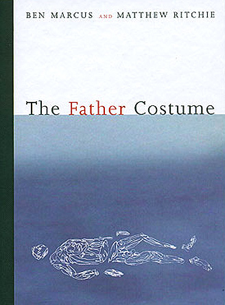
“The Father Costume” by Ben Marcus

Sunday, December 11th, 2011

.

.

This novella by Ben Marcus (with illustrations by the artist Matthew Ritchie) is currently unavailable except from a handful of used book dealers who are selling copies at forbidding prices. What a shame.

The Father Costume was published in 2002 by Artspace Books as part of a series featuring “collaborations of image and text by today’s most innovative artists challenging the culture in which we live.” Here’s how Marcus describes his interaction with Richie:

We got together and talked a little bit about stuff that interested us. He’s really into physics and creation stories and origin theories of the universe, yet his relationship to all that heavy stuff is really light and playful and subversive. When you look at his paintings, there’s certainly nothing didactic or overbearing about them. He wants painting, essentially, to visualize the first moments of time. We threw some ideas around and decided to make a book. I wrote something and I showed it to him. He made some images and we got together again to mess around some more. There’s the book.

The book ought to be brought back into print, for the simple reason that I can think of no more exemplary introduction to the accomplishments of Ben Marcus, a so-called “experimental” writer who in these 45 pages belies that label’s negative implication of inscrutability by producing a work of deep emotion and resonance.

On the immediate level The Father Costume is a family drama told from the awed perspective of a child who attempts to follow the unfathomable actions of his father. It is narrated by one of two brothers removed by their father from their ancient home to escape some amorphous danger. They embark on a sea voyage that takes an ominous turn. As strange and at the same time as genuinely moving as Donald Barthelme’s affecting tale, The Dead Father (1975), the book bears an even closer kinship to Jesse Ball’s The Curfew (2011) which centers on the bond between a father and his daughter and is also set in a time and place not exactly of this world. Marcus previously examined relationships within nuclear families in Notable American Women: A Novel (2002) and does so again in the upcoming The Flame Alphabet (2012).

Veteran readers of Marcus know that the author achieves his signature brand of queasy disconnection and anxiety by means of language manipulation. He moves way beyond the relatively simple language games of Lewis Carroll’s “Jabberwocky” (where nouns, verbs, adjectives, and adverbs, are replaced with nonsense word counterparts) — upping the ante by constructing sentences with familiar but “wrong” words, crafting images and actions that catch you off guard. Early in the The Father Costume the son notes, for example, “I dotted our windowsills with listening utensils, in case a message came in the night.” The reader must remain nimble in order to negotiate the uncertain ride of these games. What serves you best in this mythical and fantastical universe is a comfort level with surrealism and a willingness to tap into your intuitive side. As well you must also accept Marcus’ obsession over certain objects (here, cloth, costumes, lenses), rituals, and failures of communication. Early on the son explains, “I could not read fabric. I had a language problem.” He notes that “the antenna of our radio had been soaking in honey overnight.” Later he confesses, “My brother and I would have attacked my father with chopping motions until he had been silenced. Keeping maybe his hair, just in case.”

Some of this oddness is amusing, but all sense of playfulness disappears as the story reaches its climax with violence and death. That is when essential questions are unavoidable. What is the meaning of the cryptically-described “costumes” the father makes for himself and his sons? Are these their personas? Socially-imposed behaviors? God’s constraints? Can The Father Costume be viewed as a religious allegory, and a specifically Christian one? At the end of the story the surviving son wonders whether “there may be a father operating on the other side of the glass.” In an interview C. B. Smith conducted with Marcus devoted solely to The Father Costume the author explains: “The narrator has no idea what is really happening. That kind of innocence appealed to me, the trust you put in someone whose designs are beyond your comprehension.”

More telling to me is how in the final pages the narrator finds solace in reviewing his martyred brother’s voice: “And though I do not understand the words, I enjoy their defeat of silence . . . I know them to be the right ones, the ones that someone had to say. I am happy that they are mine now.”

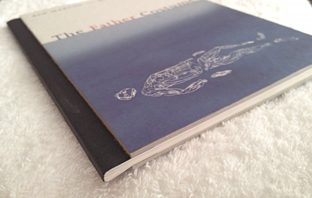
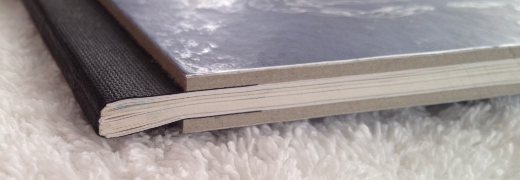
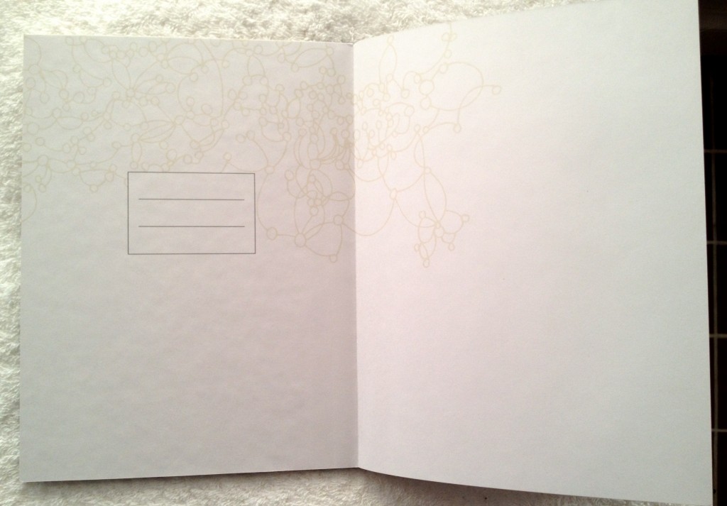
A few words on the book as a physical object. Fascinating to me is the book designer’s decision to take cues from childrens books of an earlier age. This includes retro 1950s-style thick cardboard covers whose edges are cut to expose gray paper pulp, as if this were much-handled book. Adding to the worn look is a spine wrapped in black cloth tape, as if Dad had repaired the falling apart pages with a trusty spool of old-style electrical tape. Inside the front cover is a place inviting the young owner to fill in his or her name in clumsy block letters. All of this adds a sense of innocence to a challengingly adult book.

.

.

.

.

“Mrs. Nixon: A Novelist Imagines a Life” by Ann Beattie

Tuesday, November 15th, 2011

.

.

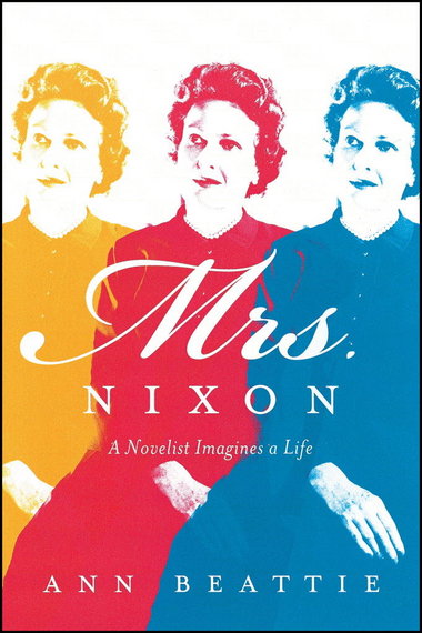
Ann Beattie set for herself a daunting challenge when crafting Mrs. Nixon: A Novelist Imagines a Life.

Three players occupy the book’s 300 pages — Ann Beattie, Richard Nixon, and Pat Nixon. Each of these persons is known for practicing a strain of obscurantism, deliberately preventing the facts or full details of something from becoming known. For Beattie this has been an aesthetic choice (Jay McInerney once described this choice as a “refusal to overdetermine her characters, her reluctance to explain their behavior”). For President Nixon the practice was a political strategy that ultimately led him to the brink of impeachment. For his wife Pat Nixon this behavior was an emotional defense, the means she chose to preserve personal dignity in the face of prying inquisitors.

Ann Beattie and Pat Nixon: for this Novelist to imagine that Life, and then to deliver a relatively satisfying reading experience, is something of an achievement. Beattie jettisons the staid narrative conventions she long since mastered in favor of boldly litting out for new territory. She wills Mrs. Nixon likewise to escape her comfort zone. What emerges is an imaginative literary concoction that initial critics have labelled, accurately, as unclassifiable, genre-bending, playful and polymorphous, and unlike anything Beattie’s written before.

What’s to like? If you’re a die-hard Beattie fan, my advice is dive right in. Part of your enjoyment will be finding just how suitably matched are the author and her subject (consider, for example, how many of Beattie’s stories contain the incomprehensible mystery of an oddly paired woman and man). Mrs. Nixon is made up of a well-paced series of chapters, over 40 in all, each representing another attempt by Beattie to conjure up something, anything, of the elusive, real Pat Nixon. There are autobiographical glimpses as well: of Beattie’s relationship with her mother, and husband; scenes set in the couple’s house in Maine.

What may be of interest to readers beyond the circle of Beattie acolytes are the chapters that interrupt the experimental fictions and turn instead to a general examination of the art of writing. In these pages Beattie engages in literary analyses of her favorite authors (Chekhov and Carver especially) and her favorite short short stories. Reading these terrific asides is like auditing one of Professor Beattie’s creative writing seminars at UVA. In a similar vein she offers haunting ruminations on the limitations of language and the limits, finally, of knowing anyone. All is not dour, however. The book is animated by Vaudeville-like antics, once its dark opening pages give way to story after story that reminded me of an experimental variety show. It’s a stylistically diverse exhibition whose theme is, Who was Pat Nixon?

Beattie tells us her guiding spirit for these proceedings is Donald Barthelme, a writer whose stories she admires for their mix fact and fiction, high and low, art criticism and gossip and comic strips. A few chapters adopt Barthelme’s brand of flash fiction, inserting Pat Nixon into exceptionally compact stories that focus only on incident rather than rolling out an arced narrative. You are in for a heady blend of serious dirge swirled with playful yelps (as in the chapter about Elvis’s visit to the White House). One delight: you’ll find Beattie’s mimicry of President Nixon’s speechifying (even in his private moments with Pat) to be as clever as that of Philip Roth in his Nixon-era satire, Our Gang. Her humor is more subtle, though, as apparent when she sums up Mr. Nixon: “This is not a little boy to whom you would have wanted to give an ant farm.”

I wondered if Beattie wasn’t also riffing on the Pirandello quandary of characters in search of an author. In a recent interview Beattie confessed: “I came to understand as I was writing that I too was a character in the book.”

What’s not to like? Well, Mrs. Nixon is not a book for history buffs nor is it a good choice for readers seeking a conventional biography. Beattie does not hold herself out as an historian, not even one of amateur status. She made little or no effort to uncover new facts or details about Pat Nixon and instead relied on existing published sources. In the Notes section she lists the material she read; the one book that looms largest is daughter Julie Nixon Eisenhower’s loving biography, Pat Nixon: The Untold Story (1986). I recommend that as your better bet, especially if you want a biography as a gift to please a traditional reader. Certainly be wary of “Mrs. Nixon” if you were resistant to Dutch: A Memoir of Ronald Reagan (1999), Edmund Morris’ unconventional and largely fictionalized biography of President Reagan. Mrs. Nixon is a book for the adventurous, literary minded reader.

A couple omissions should be mentioned. In an early chapter entitled “Major and Minor Events of Mrs. Nixon’s Life,” Beattie includes dozens of items but forgets to list the weddings of her two daughters. An odd oversight, I’d say.  Also, while the author says she was interested to find other writers who treated Pat Nixon imaginatively (for example, she includes a poem by David Kirby entitled, “Skinny-Dipping with Pat Nixon”) , she does not mention the John Adams opera, “Nixon in China,” whose libretto by Alice Goodman features Pat Nixon as perhaps its most fully formed character.

After the hit-or-miss quality of the middle sections of the book, I was struck by the simple power of its concluding two chapters. These serve as twinned goodbyes. In the first farewell Beattie presents some final personal thoughts on writing (“All writing is about altering time.” “You erase yourself every time you write.”). In the final goodbye Mrs. Nixon, “quietly loyal and enigmatic” to the end, is set free.

.

A shorter version of this review is posted on Amazon, here.

“Fame: A Novel in Nine Episodes” by Daniel Kehlmann

Tuesday, September 21st, 2010

.

.

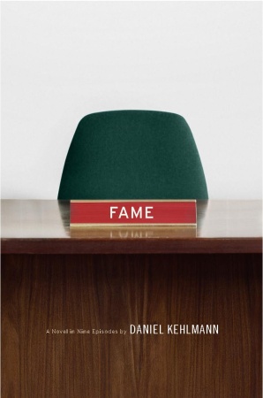
It’s not easy to convey in the space of a short review a sense of the experience of reading Daniel Kehlmann’s “Fame.” In part this is because the author has packed into its 173 pages an ambitious set of themes and variations. Reviews appearing in magazines and newspapers that I read in recent weeks made me apprehensive about picking up a book described as “formally experimental” and “a post-modernist exercise.” What were the chances, I wondered, that this would turn out to be a pleasure?

High, I discovered.

Kehlmann has talent to burn. Even more important, he has an unselfish desire to communicate clearly with readers. In this, his sixth book, he brings together nine “episodes” that capture the feel of life in contemporary society. At the same time, Kehlmann offers canny reflections on the increasingly blurry boundaries between reality and fiction, truth and falsehood, the real and the unreal. He handles these subjects deftly, self-mockingly, and, by book’s end, poignantly.

In a nod to post-modernist “metafiction” fashion, a few of the book’s tales place front and center the slippery relationship between the author and his characters. In one story, for example, a character begs the author not to plot her demise. In another episode a young woman (an assistant to a famous writer) fears ending up as a mere character in one of his stories. This interplay of real and unreal is not new territory: consider Pirandello’s drama, “Six Characters in Search of an Author” and, in a different creative medium, the Hollywood movies “The Truman Show” (1998) and “Stranger Than Fiction” (2006). It’s a captivating device that remains fresh in the hands of Kehlmann.

There is a debate buzzing around “Fame” about whether it is a true novel, or a set of short stories, or something in between. If you are uncertain, as I was, about Kehlmann’s decision to construct a “novel” with no protagonist and with only weak threads connecting its nine tales, my advice is to remember that a similar structure undergirds the films “Short Cuts” (1993), “Pulp Fiction” (1994), “Amores Perros” (2000) and “Babel” (2006). If disjunctions and flights of philosophy of this sort leave you cold, then by all means avoid “Fame.” But if you found one or more of those movies great experiences, and if you are comfortable with the narrative methods of such authors as Paul Auster, Donald Barthelme and Robert Coover, then “Fame” will provide a sure platform for your enjoyment.

“Fame” is much more than just a literary experiment. I was pleasantly surprised by how varied and yet how conventional are its strengths. The stories are full of humor and pathos. In one, the course of an adulterous affair (an oft-told tale) is updated to include the intrusions of email, cell phones and instant messaging. The first minutes of awkward seduction are described thus: “I said we could go and find a drink somewhere, the old well-worn formula, and she, as if she didn’t understand or as if I didn’t know she understood perfectly well, or as if she didn’t know I knew, said yes, let’s.”   Three of the book’s characters are authors, and this allows Kehlmann to knowingly track the shifting role of the writer in contemporary society. The vicissitudes of fame and the enigma of identity theft are explored. Keen insights abound: This is now “the age of the image, of the sounds of rhythms and a mystical dissolution into the eternal present–a religious ideal become reality through the power of technology.”

Appearing not once but twice is the Devil himself, and on both occasions he brings to the proceedings a jolt of guilty pleasure. Spying a mobile phone, the Devil notes: “Life is over so quickly — that’s what these little phones are for, that’s why we have all that electrical gadgetry in our pockets.”  Yet technology has also meant dislocation:

“How strange that technology has brought us into a world where there are no fixed places anymore. You speak out of nowhere, you can be anywhere, and because nothing can be checked, anything you choose to imagine is, at bottom, true. If no one can prove to me where I am, if I myself am not absolutely certain, where is the court that can adjudicate these things? Real places anchored in space existed before we have little walkie-talkies and wrote letters that arrived in the same second they were dispatched.”

The soul-sapping environment of today’s corporate offices and off-site conferences is sharply rendered: “People cannot work together without hating one another”. In most of the tales, disappointment and bitterness break to the surface, yet one story ends, magically and lyrically, with a sweet salvation.

A character named Leo Richter, a writer, is my candidate for hero of the book. Undoubtedly meant to serve as Kehlmann’s alter ego, Richter appears in the second, third, seventh and ninth episodes. He’s a terrific creation: funny, ruminative, mesmerized by the creative process, wise, and able to rise to the occasion. The reader is not shown much of Richter’s writing and so we are hard pressed to judge its quality, but I suspect it’s like Kehlmann’s, which is very fine indeed.

– – – – – –

An abbreviated version of this book review appears on Amanzon.com, here.

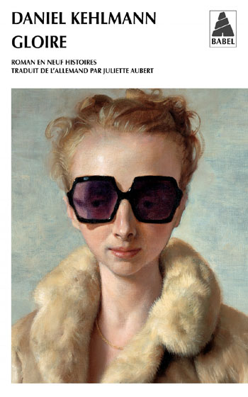
Below is the French edition of “Fame”.  It features on its cover a typically strange portrait (“Rachel in Fur,” 2002) by the contemporary American painter John Currin .

.

.

Rauschenberg’s “Signs” – An Appreciation

Sunday, March 29th, 2009

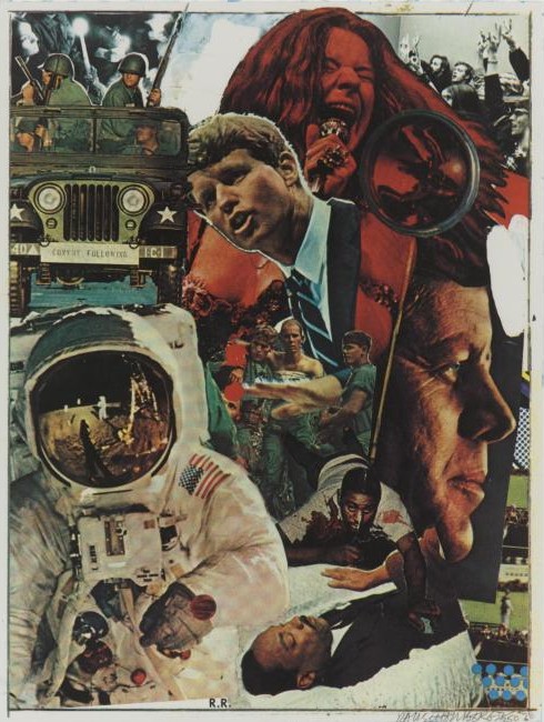
This is the first piece of art I bought.  It’s a silkscreen print created by Robert Rauschenberg.  He titled it “Signs.”
 rauschenberg-signs-for-blog


Rauschenberg conceived of “Signs” as a summation of the 1960s.  The piece was an aborted commission for a magazine cover. Rauschenberg released the work in June, 1970, through his gallery affiliation, Castelli Graphics, in an edition of 250 signed impressions. 

The 60s had turned Rauschenberg into a politically engaged artist, and he probably welcomed the challenge of coming to terms with a decade of seering experiences.  Exercising his natural affinity for collage, he would try to make sense out of an explosive arc of events that most observers felt defied all sense.  Raushenberg said the print “was conceived to remind us of love, terror, violence of the last ten years.  Danger lies in forgetting.”

I see “Signs” as an achievement at once topical and timeless.  Topical, obviously, since the artist has brought together a dozen immediately recognizable 60’s images — photos that were then still fresh with pain and joy.  Topical in a slightly broader manner as well, since the picture serves to encapulate the baby boomer generation’s creation myth.  But timeless also, thanks to the artist’s genius in re-fashioning stark images into something whole, something coherent, something aspiring to the redemptive.  

“Signs” belies the rap too often laid on Rauschenberg — that he surrendered to an aesthetic of “messiness.”  I was surprised to find such trash talk being repeated by the perceptive Louis Menand in his recent essay on Donald Barthelme, a modernist author who, Menand argues, boldly borrowed Rauschenberg’s collage approach, and with it made a notable contribution to literature.  (The article, “Saved From Drowning; Barthelme Reconsidered,” appeared in the February 23, 2009 issue of The New Yorker, available online here.) 

Distinguishing Rauschenberg’s methods from those of previous collagists, Menand makes the following assertions:  “[T]raditional collage arranges fragments into a form, and Rauschenberg’s collages are not organized in any ordinarily legible manner.   …  Most of Rauschenberg’s work … has no center.  Form, in the conventional sense of a hierarchical order, is one of the things he is trying to eliminate.”  Menand sees Rauschenberg’s signature work as embracing “the  illogic . . . the apparent absurdity . . . the arbitrary juxtapositions of radically disparate materials.” 

My purpose in this post is not to quibble with Menand’s characterizationHis article focuses on style, not on the decipherment of any particular work of visual art.  And who can deny that “messiness”  nicely recapitulates the ’60s decade itself. 

Rather, my purpose is to celebrate Rauschenberg’s triumph over formlessness when constructing “Signs.”  I want to praise his decision not to echo chaos or succumb to absurdity. I want to show how he chose instead to commandeer art’s arsenal against entropy.

How did he do this?  Through compositional devices,  juxtapositions,  reconciliations, and slights of hand that are deft, resonant, poignant, and funny.  Logic, not illogic, informs this work of art.  It’s there for all to see:

Tripartite form:   I think even on first encounter the viewer senses both stability and energy in “Signs.”  A feeling of stability derives chiefly from Rauschenberg’s reliance on a structure of three vertical segments nestled in a rectangular confinement.  Up the left side we see a moon-walking Buzz Aldrin claiming a large chunk of space in the frame; above and behind Aldrin is a four-man Army jeep, and above and behind that is a candlelight peace vigil.  The right side is topped with another black-and-white photo, this one of students attending an anti-war teach-in (the left and right corners are nicely balanced).  Below this the artist has positioned a professional photo portrait of a visionary-looking John F. Kennedy, tucked beneath which are a few stills from the Zapruder film that captured JFK’s assassination.  Sandwiched between left and right flanks are puzzle pieces that rise like a totem pole.  Starting from the base, this central composition comprises five elements: (1) the body of Martin Luther King as he lay in state at the U.S. Capitol; (2) a fallen victim of an urban riot; (3) two Vietnam soldiers flanking and supporting a wounded comrade; (4) Bobby Kennedy in earnest oration; and (5) Janis Joplin in wild performance.  The five stations of this central vertical segment are strengthened by an overlapping and interweaving of its parts:  for example, two arms, one begging, one blessing, reach over MLK; RFK’s hand slices through the Vietnam scene, in a call to halt the bloodshed.

Hierarchical order:   This piece most definitely has a “center.”  The central totem is a well-ordered pillar of life, a hierarchy of energy, a flow of life force.  It begins in silence with a photo of MLK in his coffin, his blood stilled by death.  It steps up to the bloodied man fallen in an urban riot.  It rises next to a trio of troops, wounded, bleary, yet upright.  It climbs to catch Robert Kennedy in the middle of an impassioned but controlled speech.  It crescendos with the ecstatic singing of Janis Joplin.  Think of it also as a fountain of youth —  all of its featured players are young (MLK, 39; RFK, 42; Joplin, 27) —  but one tinged with irony.  Only a few months after Rauschenberg completed his composition and released it to the world, Janis Joplin, his friend and fellow escapee from Port Arthur, Texas, died of a drug overdose.  With that death, the vector of the totemic form was altered.  No longer an unstoppable upward force, it now circles back on itself.  It has become a circle of life. 

Cohesion through repeated motifs:  With the possible exception of eyes, the human organ or appendage most crucial to an artist is, I would argue, the hand.  “Signs” is largely a composite portrait, which means it is all about faces.  But to my eyes it is the hands in “Signs” that resonate most strongly.  Notice how Rauschenberg emphasizes their physical meaning while also teasing out their symbolic importance.  A hand may choose to grip a bayoneted rifle to control others, or hold a candle in a hopeful prayer, or grasp a tool of communication (a microphone) to express freedom.  A hand’s fingers may splay to signify peace or extend to confer a blessing over the dead.  Our pride in seeing the iconic image of an American astronaut standing on the lunar surface is tempered when we realize that the sole visible hand of Buzz Aldrin is, in fact, not visible at all.  The hand is protected, swaddled like a mummy, rendered uncommunicative, unlike the vulnerable but expressive hands of earthlings here below.  As for the “face” of America’s technological triumph, it too is so denatured by protective gear as to become literally a “faceless” achievement.  

Unifying  light:  The strong sun and shadow on Buzz Aldin’s space suit blend seamlessly with the other wholly disparate components of the assemblage.  Rauschenberg achieves compositional coherence by making two tears in the material, at the top and right edges, to reveal a white underlayer.  We “read” this exposure as the source of bright light unifying all parts of the composition.  In addition to its formal function, the light poignantly supplies a sacred nimbus around the late RFK’s head.  It may remind us of a painfully ironic fact:  in the 1960’s, men of heart were extinguished, one after another, by head wounds. 

Meaning through color, direction, and tilt:   To begin with the most obvious color cliche, Janis Joplin is red hot.  Then, in the upper left corner’s overlapped images, note how the intense color of the guards gives way to calmer gray tints of a time-hallowed prayer for peace.  Consider also the way in which the dull unlit eyes of the vehicle’s headlights are shamed by the insistent glow of lit candles.  See how the quartet of uniformed men looks left (symbolically toward the past), their eyes shrouded from view, while the lone female representative of the vigil crowd turns her face rightward to meet the future.   If you stare at “Signs” long enough may experience a mild case of vertigo, as there appears to be no pure vertical line anywhere in the composition, no steadying plumb line straight down to the earth.  With the possible exception of the central image of wounded troops, every component is tilted slightly, as if confounding gravity and the comfort of rest.  This floating quality is consistent with Rauschenberg’s practice, in art works he called “combines,” of eschewing a sense of up or down.  In “Signs,” I think these off-kilter notes lend energy and flow to the work.  This is an appropriate way to express a dynamic, unstable period.

Surface versus depth:  In their original condition, the dozen photos that Rauschenberg selected to fill the rectangle differed in their objectively measurable proportions, lighting sources, coloration, and focus, and many other inherent qualities — not to mention differences in the sensibilities of a dozen different photographers responsible for the images. There is every reason for the assemblage to fly off in all directions beyond the frame.  Yet somehow the pieces settle into position, inviting the viewer to proceed with decipherment.  One thing that locks the parts into place is a bit of legerdemain, namely, the appearance of a round, clear glass paperweight on the flattened surface plane, just to the right of Joplin’s microphone.  Its clever purpose is to arrest fugitive movement.  We also notice a scraped trail, yellow in color, leading up to the paperweight’s current resting place, suggesting that the weight recently migrated diagonally from a position atop the fallen riot victim, stopping atop Janis’s tossed hair — hair the large convex lens magnifies and swirls into a psychedelic hallucination.

Generosity of details:  After all these years there are parts of “Signs” that newly intrigue me.  I’ve mentioned the intricate interweaving of imagery in the central “totem” which required careful scissoring of figures; why then is the JFK photo the only one with a sharp right angled corner left intact?  Why no contouring, no integration of that photo?  And is that a snippet of a Lichtenstein pop art painting under the President’s nose?  What is the meaning of  the eleven blue dots in the lower right corner, traditionally the location for the creator’s signature?  Bullet holes?  Is it fair to say the decade was “signed” by gun violence?  

Irony and humor:   Ironic visual juxtapositions abound in Rauschenberg’s work.  Here, in the upper left a military jeep purports to escort a trailing “CONVOY,” while the only group that’s “FOLLOWING” is a peace vigil in repose.  Also on display is tongue-in-cheek ribaldry.  Note how RFK’s mouth, at a moment formed into a suckling shape, approaches Joplin’s breast.  The rectangle’s black border can sturdily contain every image, except for two forces that pierce the top margin: the thrust of a bayonet (does its violation of the skin of the piece account for the drops next to RFK’s hand?) and the force, like rising red molten lava, of a volcanic Janis Joplin.  In a final flourish, the artist asserts his dominance: small block letter initials — R.R. — resting on the bottom margin, are so powerful that their strength can lift up, and playfully tilt, a hero astronaut.

____________________________________________________

“Signs,” screenprint (silkscreen, silk screen, screen print) in colors, 1970, signed in pencil, numbered [my impression is numbered 40/250] and dated, lower right, on wove paper, published by Castelli Graphics, New York, 35 1/4 by 26 5/8 inches; 895 by 677 mm.  Purchased from Makler Gallery, Philadelphia,  March, 1977.  I first saw the work not at a gallery but at a museum exhibition, the 1976 Rauschenberg retrospective exhibition staged at the Smithsonian’s National Collection of Fine Art (now the National Museum of American Art) in Washington, DC.  One room in the show was devoted to prints, one of which was “Signs.”  I was so bowled over by its power that I vowed to acquire an impression of the print, at whatever sacrifice it took.

__________________________________________________________

UPDATE 06-14-2009:  Today I came across a blog posting that provides additional background on the genesis of “Signs,” including key details that I believe had not previously been published.  According to an article posted on hamiltonselway.com on July 21, 2008, entitled “Rauschenberg – part 1,” the work was initially commission by Time magazine:

“’Signs,’ 1970, was originally created as an illustration for a Time magazine cover that would herald the 1970s. Rauschenberg felt, however, that the 1970s was really a continuation of the 1960s and inserted images of Janis Joplin, Martin Luther King, the moon landing, and the Kennedy Assassination. The cover was rejected by the Time Magazine editors who wanted to look forward to hopefully better times than the tumultuous 60s. Leo Castelli (Rauschenberg’s dealer at the time) stepped in and published a photosilkscreen edition of the collage.”

I’m struck by the joy expressed by Rauschenberg enthusiasts, as in this essay by John Haber on the occasion of the Rauschenberg retrospective in NYC over a decade ago: http://www.haberarts.com/rschberg.htm.   Can any other recent artist match him?